Design Goals
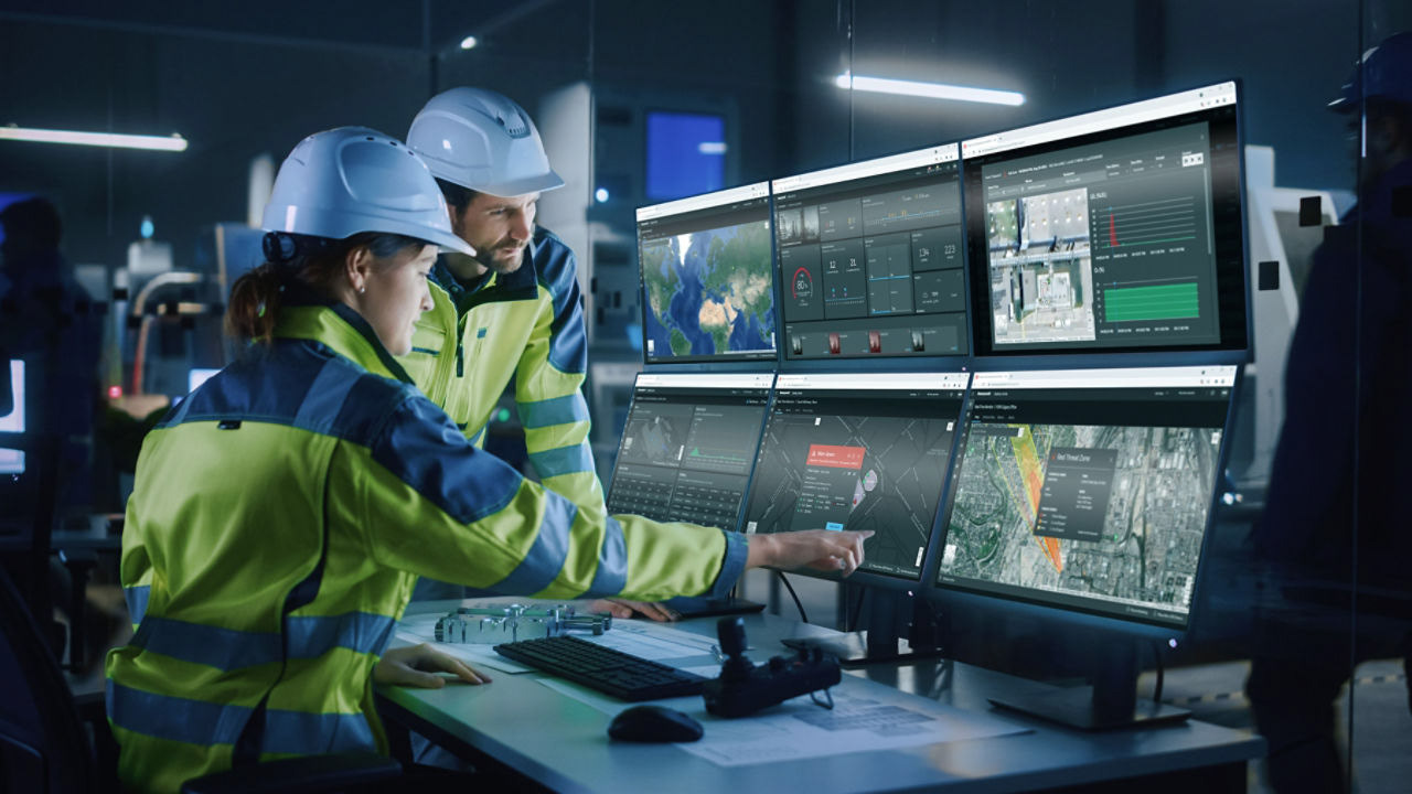
Transform the next-generation of Honeywell’s Safety Suite, a global gas detection and safety management platform.
The goal: transform a fragmented legacy ecosystem into an intelligent, connected experience that empowers industrial workers, safety managers, and technicians through AI, NFC, and a modern design system.
I led the user interface strategy and design — defining the onboarding flow, AI interactions, dashboard systems, and helping shape the integration of Honeywell Forge 2.0 across the new experience.
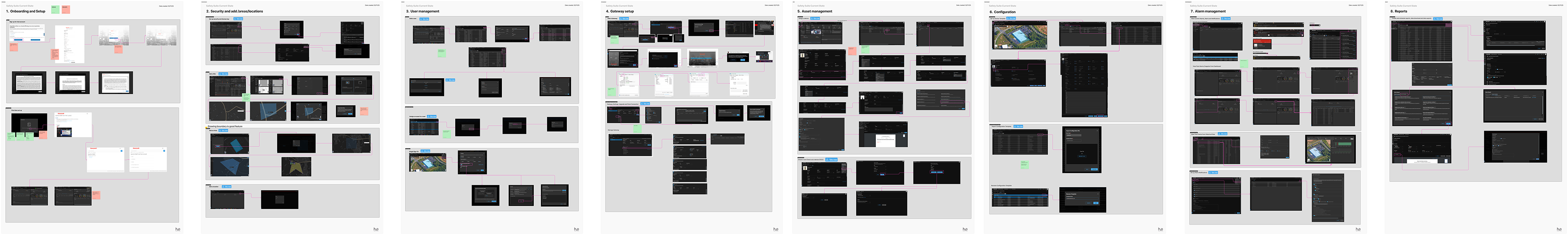
Current state workflows
I deconstructed Safety Suite’s existing screens and workflows for:
• Device setup and configuration
• Check-in / Check-out (device assignment)
• Fleet management
• Real-time monitoring
• Safety outcomes and reporting
• Device setup and configuration
• Check-in / Check-out (device assignment)
• Fleet management
• Real-time monitoring
• Safety outcomes and reporting
This analysis revealed deeply nested flows and redundant paths — many users had to switch between desktop apps, mobile apps (Safety Communicator, Device Configurator), and docking stations just to perform simple tasks like firmware updates or alarm calibration.
Key friction points identified:
• Inconsistent BLE pairing experiences
• Confusion around data upload via gateway vs. dock vs. mobile connectivity
• Assigning devices to users and lack of onboarding guidance
• Fragmented data between real time data, device usage, and compliance data
Key friction points identified:
• Inconsistent BLE pairing experiences
• Confusion around data upload via gateway vs. dock vs. mobile connectivity
• Assigning devices to users and lack of onboarding guidance
• Fragmented data between real time data, device usage, and compliance data
These insights became the baseline for mapping improvement opportunities.
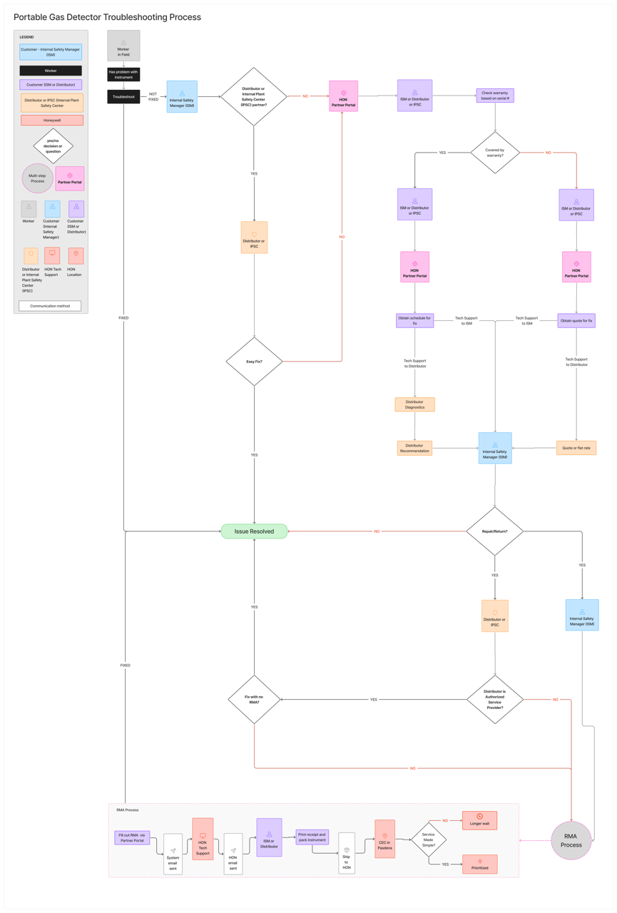
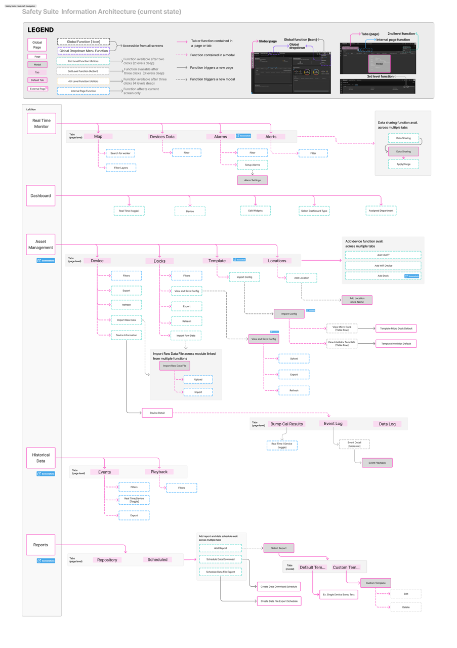
Mapping the Legacy System
Before jumping into design, I needed to fully understand how Safety Suite’s legacy experience functioned — not from documentation, but from the user’s lived perspective.
To do that, I mapped the entire Safety Suite ecosystem using a unified visual language of boxes, arrows, and a custom legend.
Each color and symbol represented a specific interaction type:
• Pages – primary views or dashboards
• Modals – secondary, task-based interactions
• Navigation paths – directional arrows showing user journeys
• Tabs – nested content areas
• Subprocesses – loops or dead-end flows where users often got stuck
This model became a “single source of truth” for understanding how all modules connected — including Device Configurator, Fleet Manager, Real-Time Monitoring, and Safety Outcomes.
Findings from the Workflow Map
Once visualized, patterns began to emerge:
• The system had overlapping entry points for similar tasks (e.g., device configuration accessible from multiple menus).
• Key workflows like “Assign Device” and “Add Site” were buried two or three layers deep.
• There were multiple redundant loops, especially in setup and reporting, that added unnecessary clicks and confusion.
This mapping exercise clarified why users felt lost — not because the product lacked capability, but because its architecture had grown organically over time without a unified IA strategy.
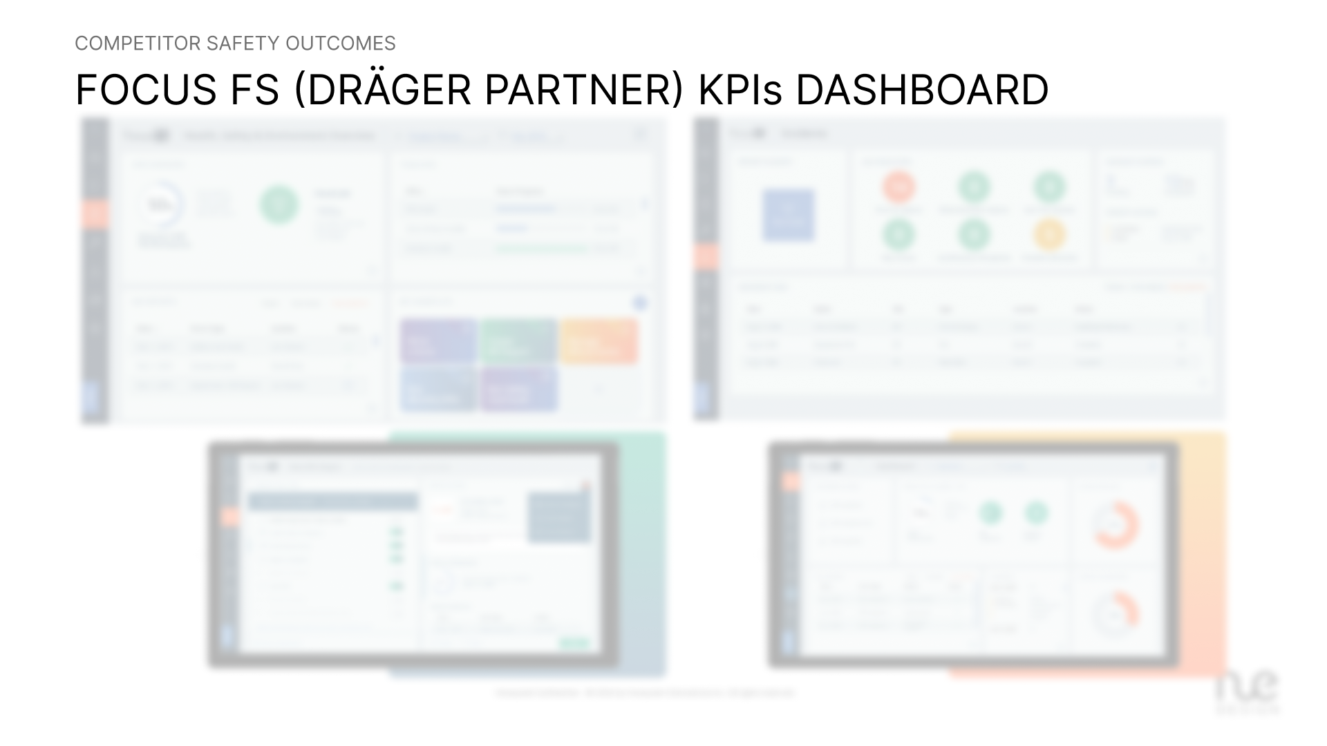
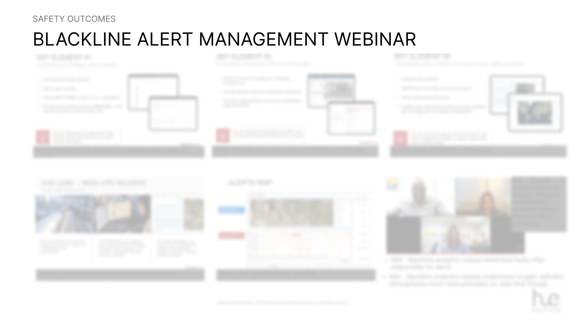
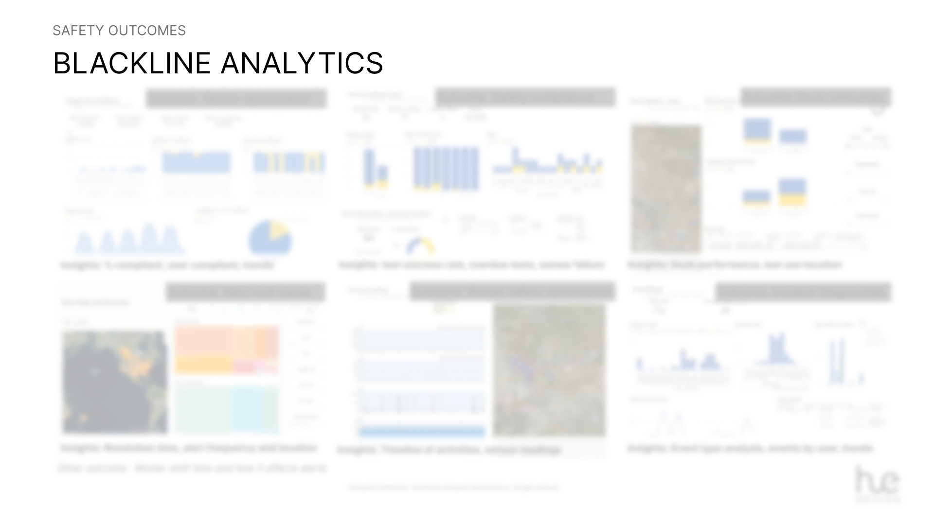
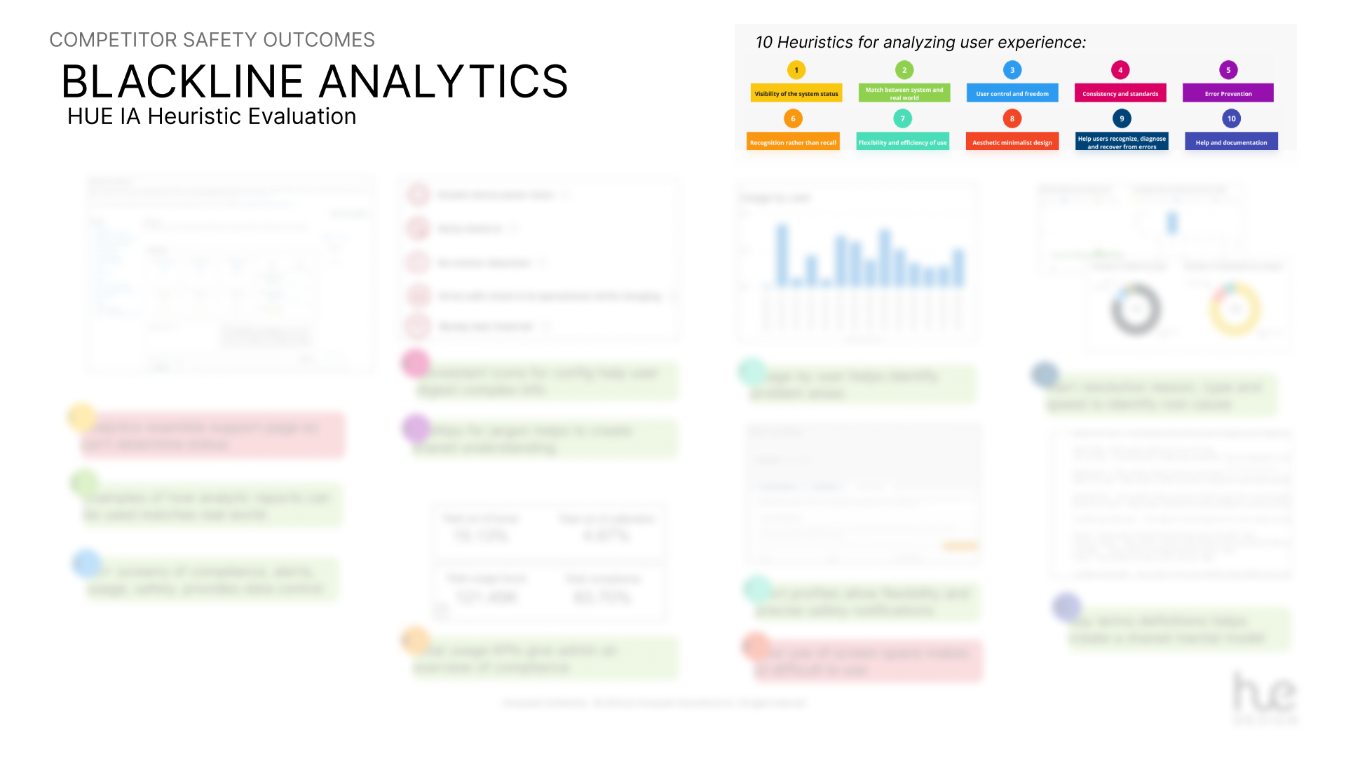
Competitive Analysis — Benchmarking Best-in-Class Safety Systems
Next, the UX team and I compared Honeywell’s experience with leading safety platforms
Each had distinct advantages:
• Competitor 1: RFID/NFC-based digital check-in/out
• Competitor 2: Real-time cloud dashboards and analytics
• Competitor 3: Cloud-based monitoring with role-based permissions
• Competitor 4: Compliance kiosks with NFC tap-to-assign simplicity
• Competitor 1: RFID/NFC-based digital check-in/out
• Competitor 2: Real-time cloud dashboards and analytics
• Competitor 3: Cloud-based monitoring with role-based permissions
• Competitor 4: Compliance kiosks with NFC tap-to-assign simplicity
By plotting these differentiators against Honeywell’s current UX, the team and I identified four experience gaps to address:
1. Simplified onboarding (reduce steps and technical jargon)
2. Smart device assignment (NFC/QR tap-based pairing)
3. Unified visibility (fleet + worker + compliance in one dashboard)
4. Guided AI assistance (reduce dependency on support)
1. Simplified onboarding (reduce steps and technical jargon)
2. Smart device assignment (NFC/QR tap-based pairing)
3. Unified visibility (fleet + worker + compliance in one dashboard)
4. Guided AI assistance (reduce dependency on support)
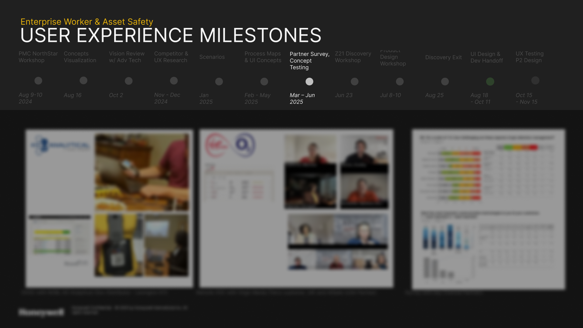
Safety Suite Usability Testing — Validating Pain Points
We conducted usability walkthroughs with field technicians, product SMEs, and support engineers using the current Safety Suite.
Sessions included real-world tasks such as:
• Connecting gas devices
• Assigning a worker to a device
• Exporting calibration data
Findings:
• Error handling was weak — users often abandoned the setup when pairing failed or contacted support.
• System feedback was unclear as generic error messages appeared even when the connection wasn’t established.
• Navigation between modules (Device Configuration, Asset Management, Compliance Data) lacked hierarchy or a clear mental model.
• Users expressed frustration regarding setup and configuration.
These observations directly informed the guided onboarding, progressive setup indicators, and AI-driven contextual help.
Translating Insights into Design Improvements
By combining the workflow inefficiencies, competitive benchmarks, and usability testing insights, we created a clear set of UX goals
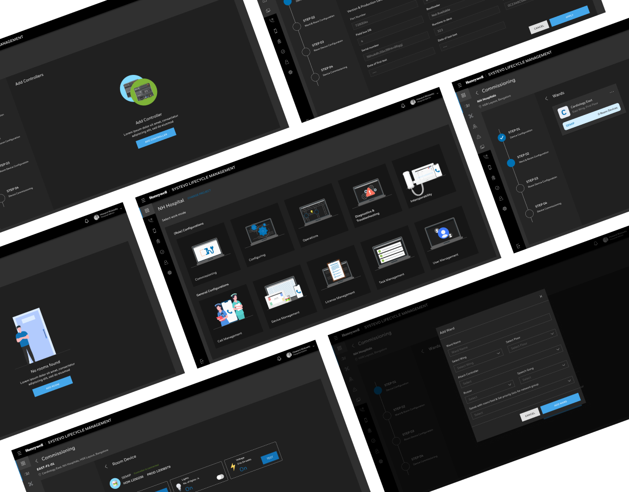
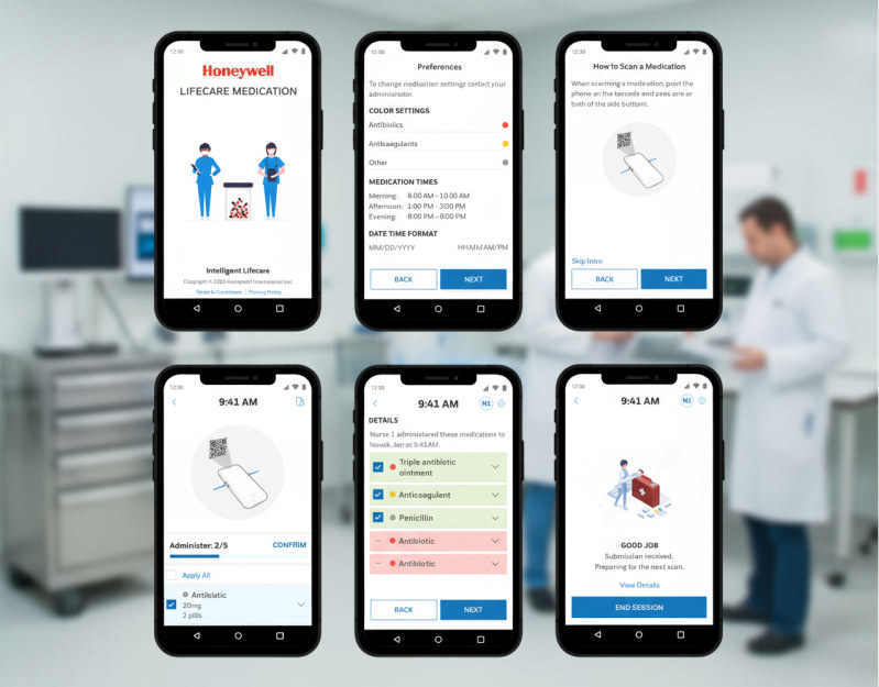
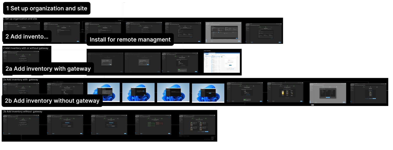
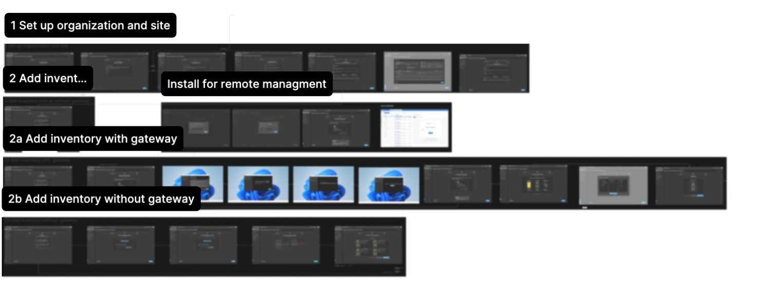
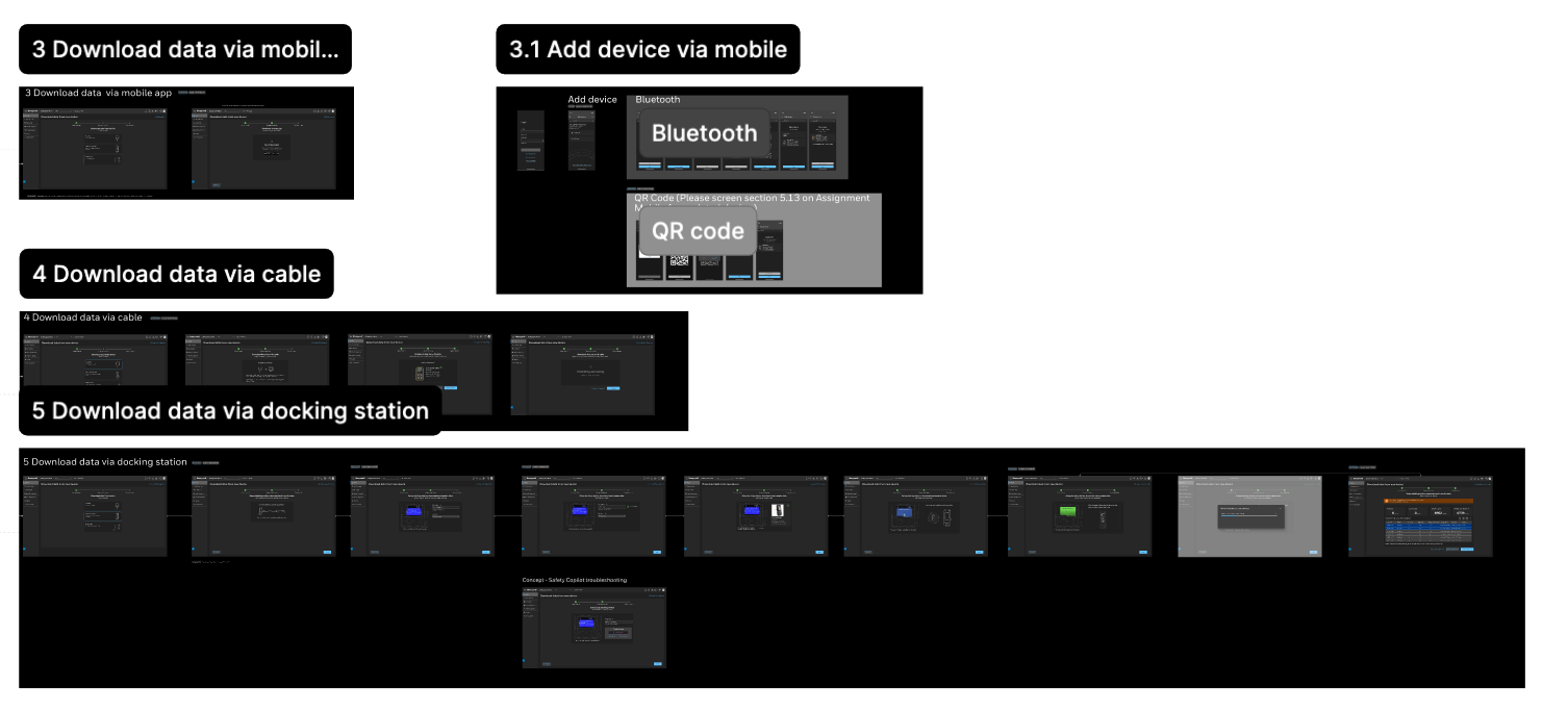
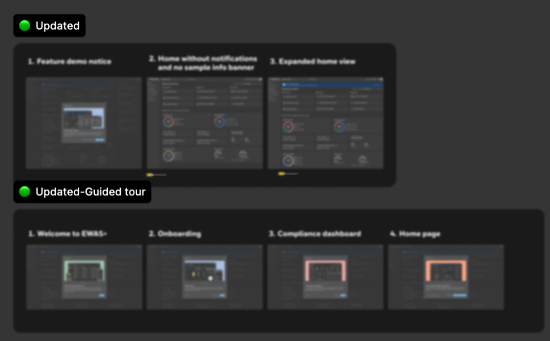
Designing the Onboarding Experience
We completely reimagined how devices and users join the platform.
The old multi-step manual setup became a guided, adaptive onboarding journey informed by pre-qualification questions and real-time connectivity detection.
The old multi-step manual setup became a guided, adaptive onboarding journey informed by pre-qualification questions and real-time connectivity detection.
Highlights
• Pre-qualification flow: Users answer short setup questions — site type, worker roles, real-time needs — to generate a tailored setup sequence.
• Smart connection detection: Automatically recommends the best connection type (gateway, mobile, or wired).
• AI-guided troubleshooting: Provides instant feedback when a connection fails — suggesting likely fixes and tutorials.
• Interactive onboarding tour: Contextual help and guided walkthroughs reduce training time for new users
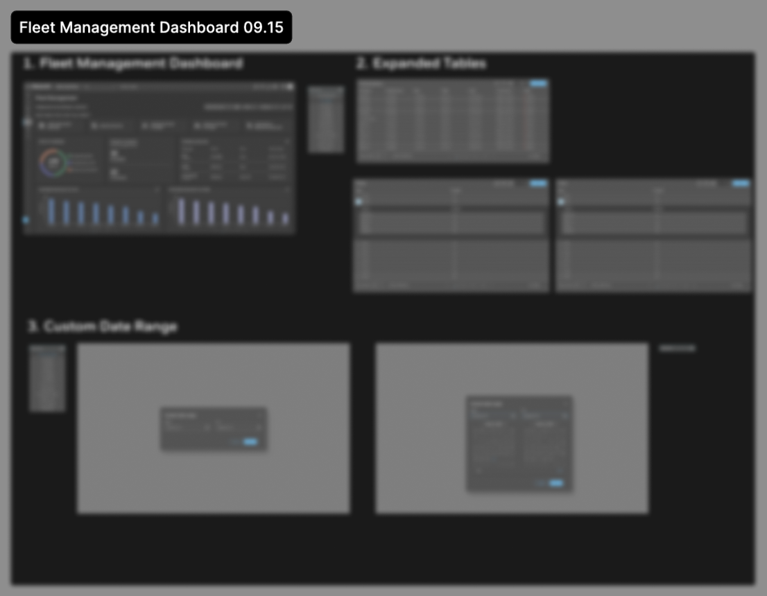
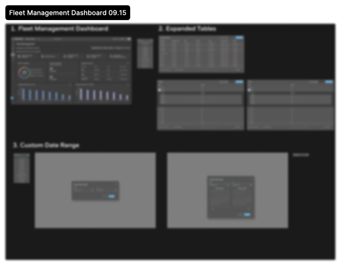
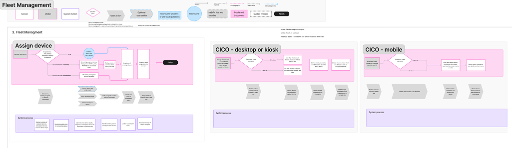
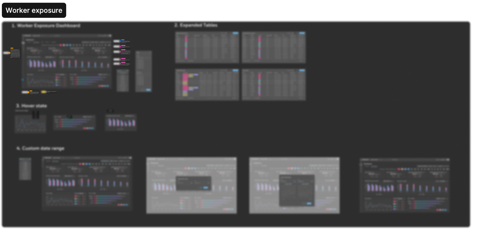
Fleet & Asset Management Redesign
We rebuilt the Fleet Management dashboard with visibility into:
• Device status, calibration health, and battery life
• Worker assignments and site locations
• License management and compliance summaries
• Device status, calibration health, and battery life
• Worker assignments and site locations
• License management and compliance summaries
The dashboard leverages Honeywell Forge 2.0 components for data consistency and performance, blending cloud analytics with edge intelligence for low-latency insights.
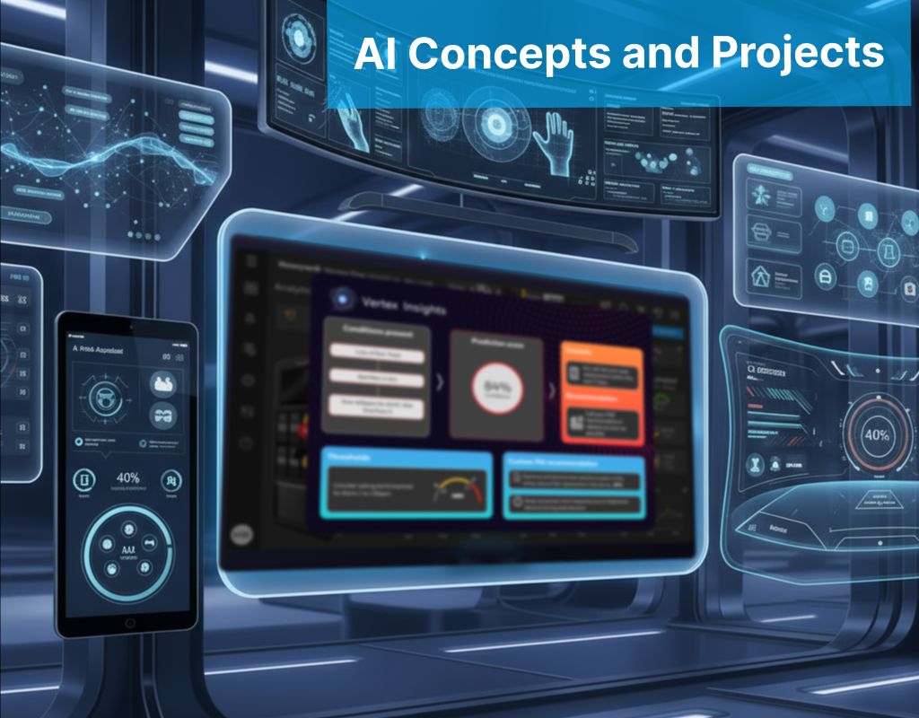
AI in the Experience
AI served both as a design partner and a product capability.
I used MS Copilot to accelerate ideation:
• Summarized complex gas concepts like calibration, bump testing and correction factors.
• Synthesized data points from VOC, field notes, and app reviews
• Explored scenarios with product SMEs
• Summarized complex gas concepts like calibration, bump testing and correction factors.
• Synthesized data points from VOC, field notes, and app reviews
• Explored scenarios with product SMEs
2. AI in the Product
• Maintenance Assist: Context-aware AI that explains setup errors, recommends configuration sequences, and assists in troubleshooting.
• Predictive Analytics: AI models infer fleet readiness from calibration/test logs.
• Behavioral AI: Worker data helps predict risk patterns — balancing productivity and safety.

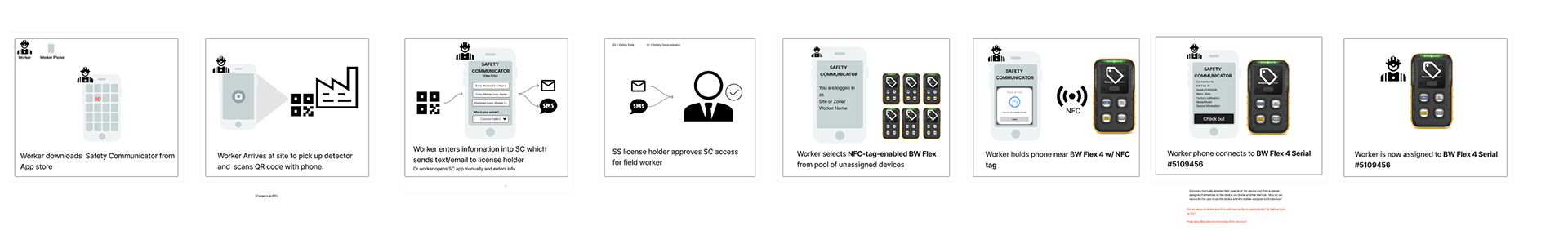
NFC / QR Innovation
A key competitive differentiator was introducing NFC and QR-based device assignment.
How it Works
• Workers tap or scan a detector to instantly assign it before a shift.
• Auto check-in/out updates worker-device pairing in real time.
• The system syncs with cloud fleet management even when offline.
• Workers tap or scan a detector to instantly assign it before a shift.
• Auto check-in/out updates worker-device pairing in real time.
• The system syncs with cloud fleet management even when offline.
Benefits
• Eliminated manual entry errors
• Improved accountability
• Simplified shift handoffs
• Strengthened compliance traceability
• Eliminated manual entry errors
• Improved accountability
• Simplified shift handoffs
• Strengthened compliance traceability
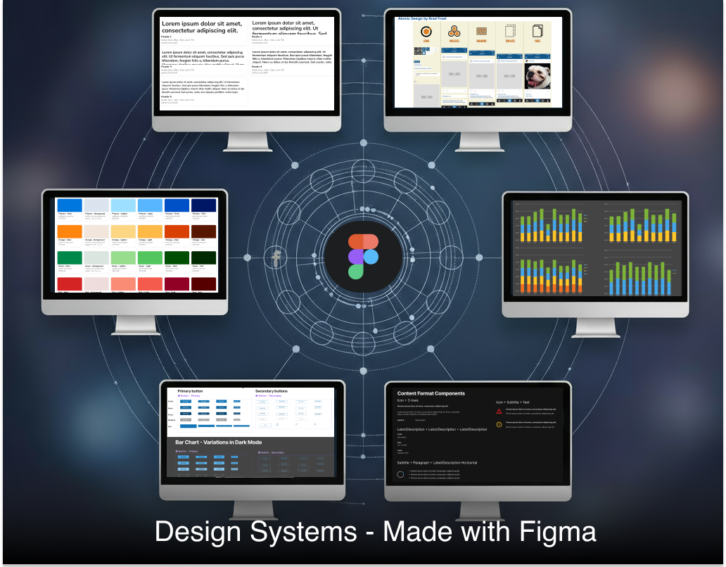
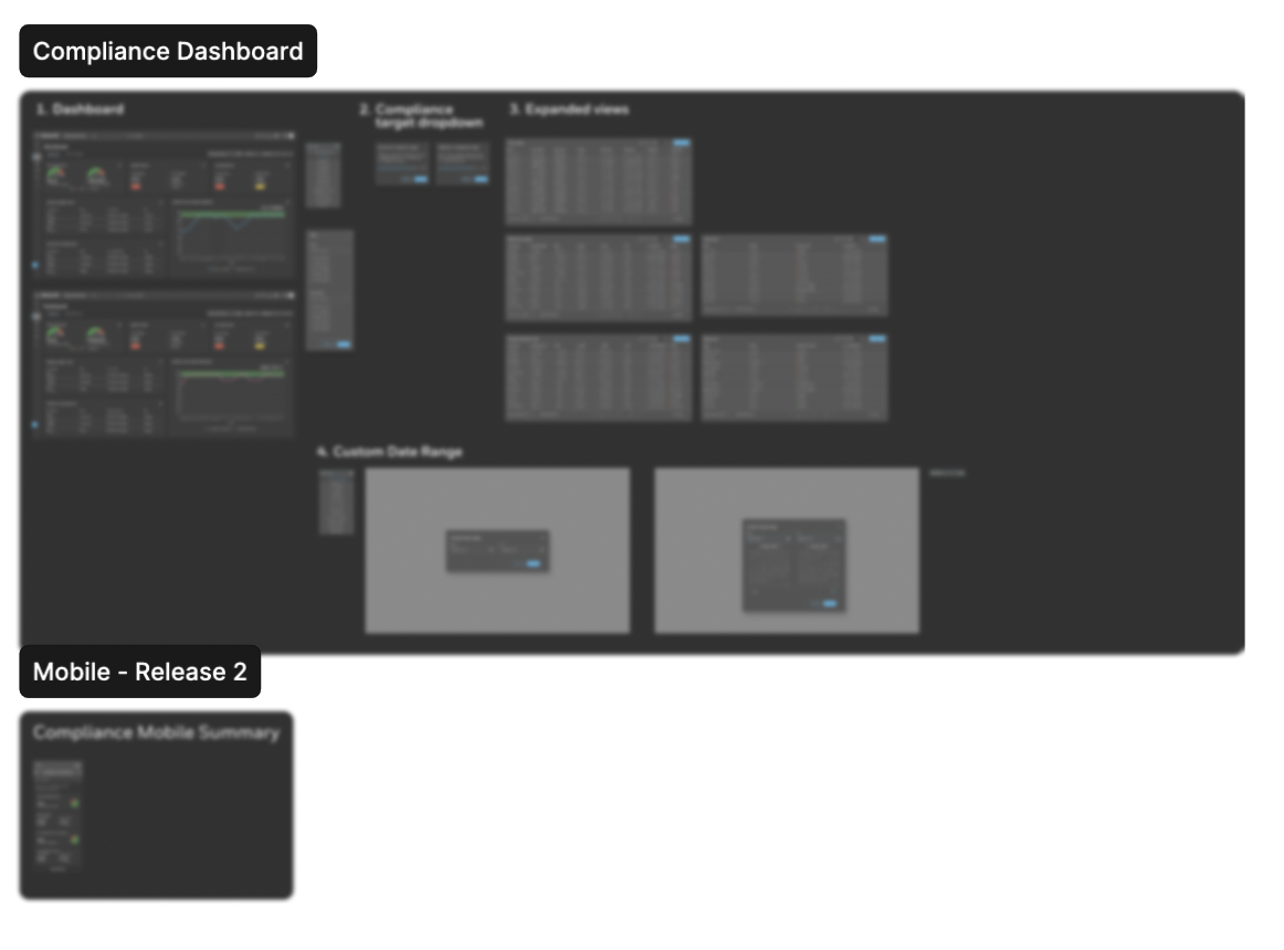
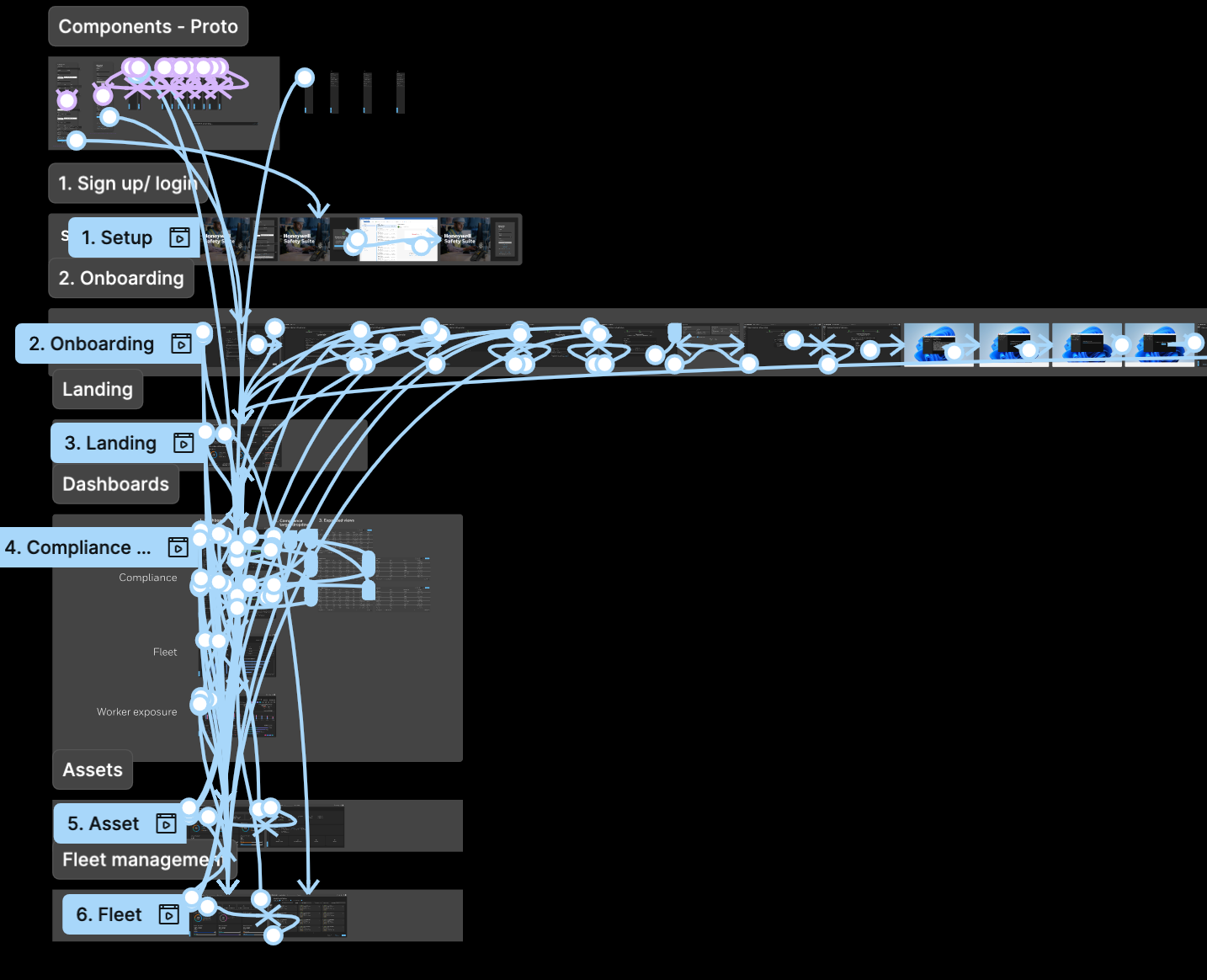
Design System, Dashboards, and Prototypes
We implemented the Honeywell Forge 2.0 Design System for visual and interaction consistency:
• Modular cards and analytics widgets
• Accessible color palette and high-contrast data visuals
• Scalable layouts for desktop and mobile
• Health and compliance dashboards for worker, fleet, and asset insights
• Modular cards and analytics widgets
• Accessible color palette and high-contrast data visuals
• Scalable layouts for desktop and mobile
• Health and compliance dashboards for worker, fleet, and asset insights
Prototyping brought it all together by linking all 150 screens including onboarding to a hub prototype so we were able to keep everything in sync.


Reflection
This project taught me that AI in industrial design isn’t about automation — it’s about augmentation.
By merging research, empathy, and intelligent systems, we created a more human, transparent, and scalable way for teams to stay safe and productive.
By merging research, empathy, and intelligent systems, we created a more human, transparent, and scalable way for teams to stay safe and productive.
Next Steps
• Integrate Maintenance Assist directly into Forge
• Expand NFC/QR to fixed detection devices
• Launch AI-driven compliance reports and predictive maintenance modules
• Integrate Maintenance Assist directly into Forge
• Expand NFC/QR to fixed detection devices
• Launch AI-driven compliance reports and predictive maintenance modules