Overview
Role: Senior UX Designer → Lead UX Designer
Timeline: 2019 – 2021
Company: Ecomdash (acquired by Endurance Group / Constant Contact)
Team: Product Manager, UX/UI Designer, 4 Developers, QA, Marketing
Mission: Redesign and modernize the Ecomdash e-commerce management platform, improving usability and conversion rates through research, data-driven design, and design-system standardization.
Background
Ecomdash helps small to mid-size online retailers automate listings, inventory, and order fulfillment across channels like Amazon, eBay, and Shopify. When Endurance acquired the company, the goal was to modernize the UX, improve onboarding, and align the experience with Constant Contact’s e-commerce enablement vision. Ecomdash's interface made even simple tasks feel complicated. My role was to reimagine how small business owners could confidently scale their online stores without feeling overwhelmed. I was tasked with redesigning the experience, establishing UX best practices, and introducing measurable improvements that would help both the business and its customers.
The Challenge
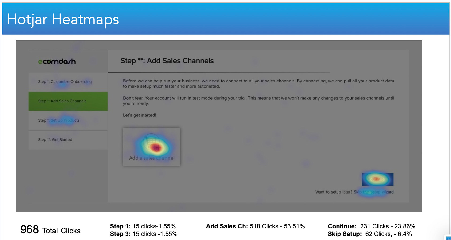
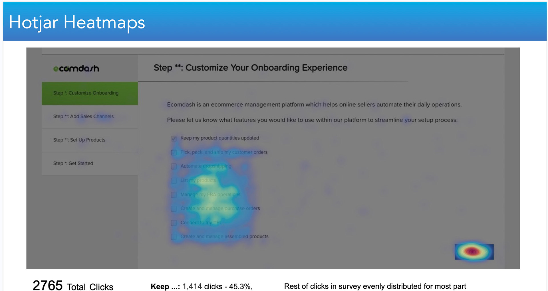
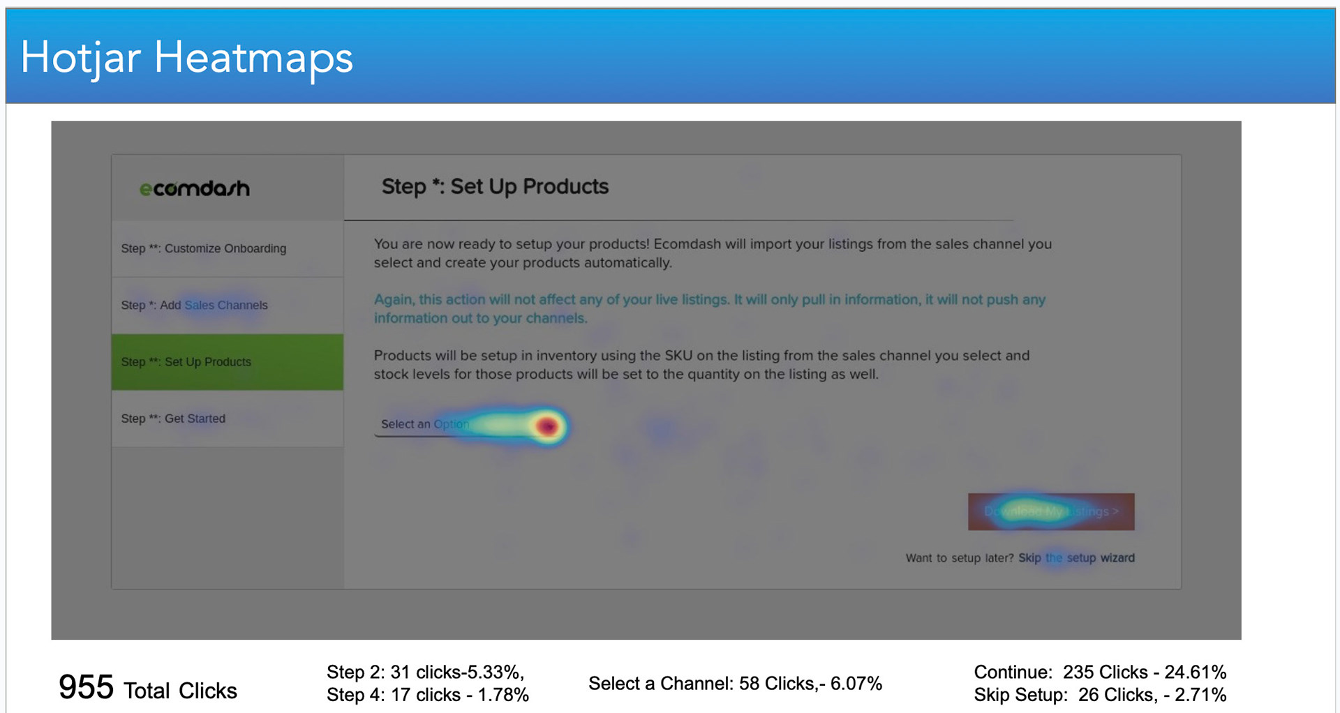
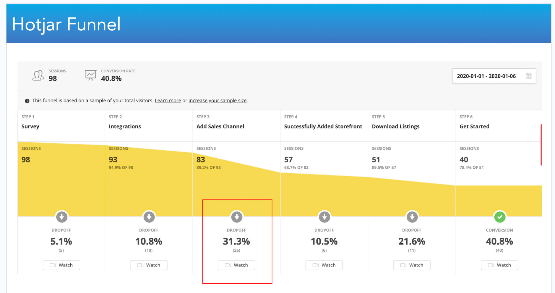
The original interface was functional but cluttered and inconsistent. Onboarding was confusing, key workflows were buried under dense tables, and navigation lacked hierarchy. Analytics showed that many new users abandoned the product before completing setup — often after struggling to connect their first sales channel. For Endurance Group, this was more than a design problem; it was a growth barrier. The company wanted to integrate Ecomdash with Constant Contact’s marketing tools and needed a modern, intuitive experience that could convert new users and build trust.In addition, Ecomdash had a strong technical foundation but a poor first impression. Onboarding included multiple screens with technical jargon and key workflows like product listing and inventory sync were cluttered and hard to navigate.
My challenge was to simplify the onboarding process, improve conversion, and create a design system that made the platform scalable and easy to maintain.
Understanding the Users
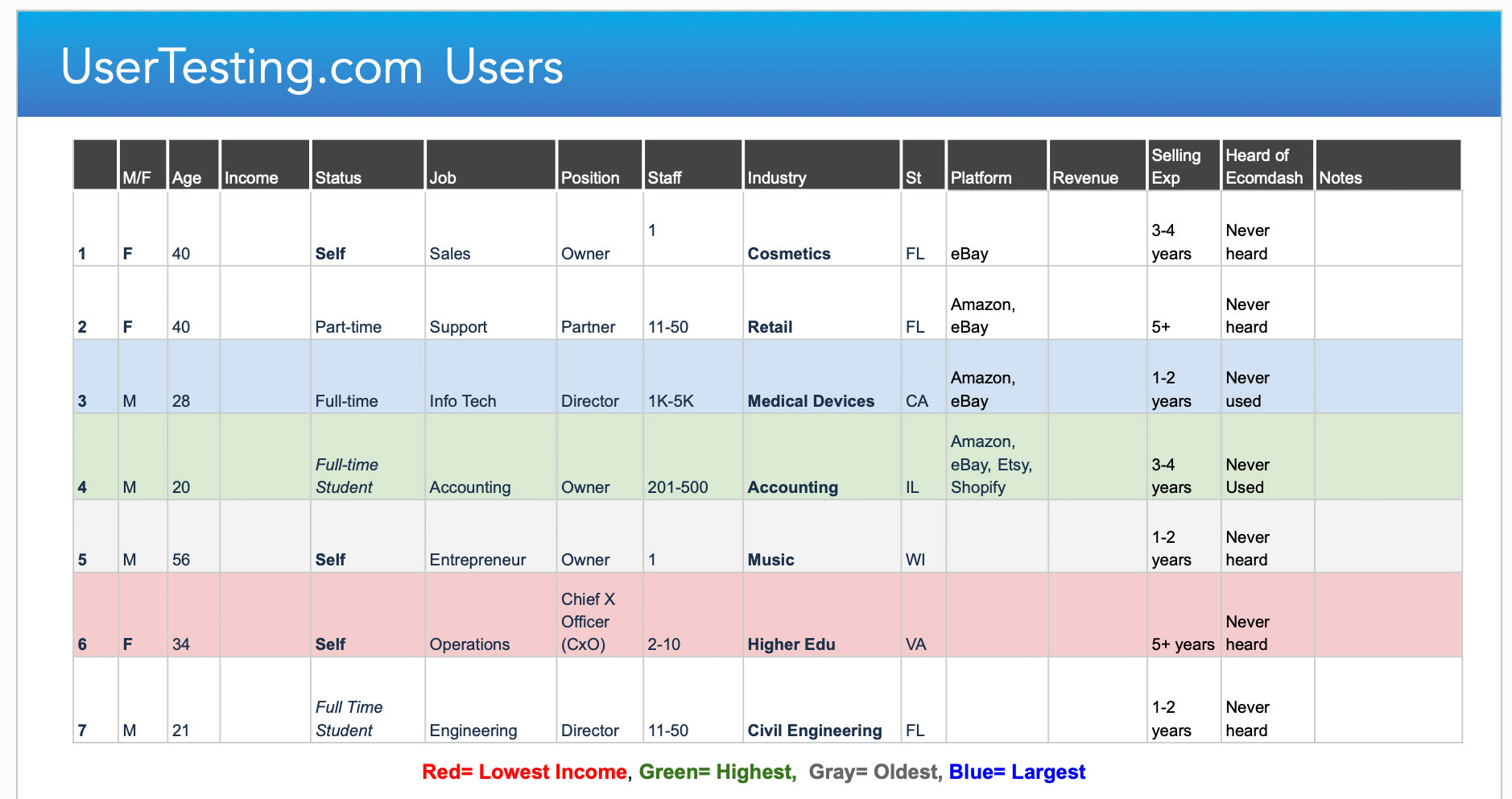
Before diving into design, I spent several weeks learning from the people who used Ecomdash every day — small business owners, warehouse coordinators, and internal support staff. Most users were not designers or engineers — they were entrepreneurs juggling multiple storefronts, trying to keep orders synced while minimizing manual work.
Their biggest frustrations were:
• Getting lost during setup
• Confusing or inconsistent language
• Difficulty seeing order and inventory status across channels
• Getting lost during setup
• Confusing or inconsistent language
• Difficulty seeing order and inventory status across channels
In addition, after analyzing further, I noticed:
• Important actions like “connect to eBay” or “sync inventory” were hidden behind jargon-heavy menus
• Support tickets often cited confusion around the same three workflows — onboarding, product setup, and reporting
• Important actions like “connect to eBay” or “sync inventory” were hidden behind jargon-heavy menus
• Support tickets often cited confusion around the same three workflows — onboarding, product setup, and reporting
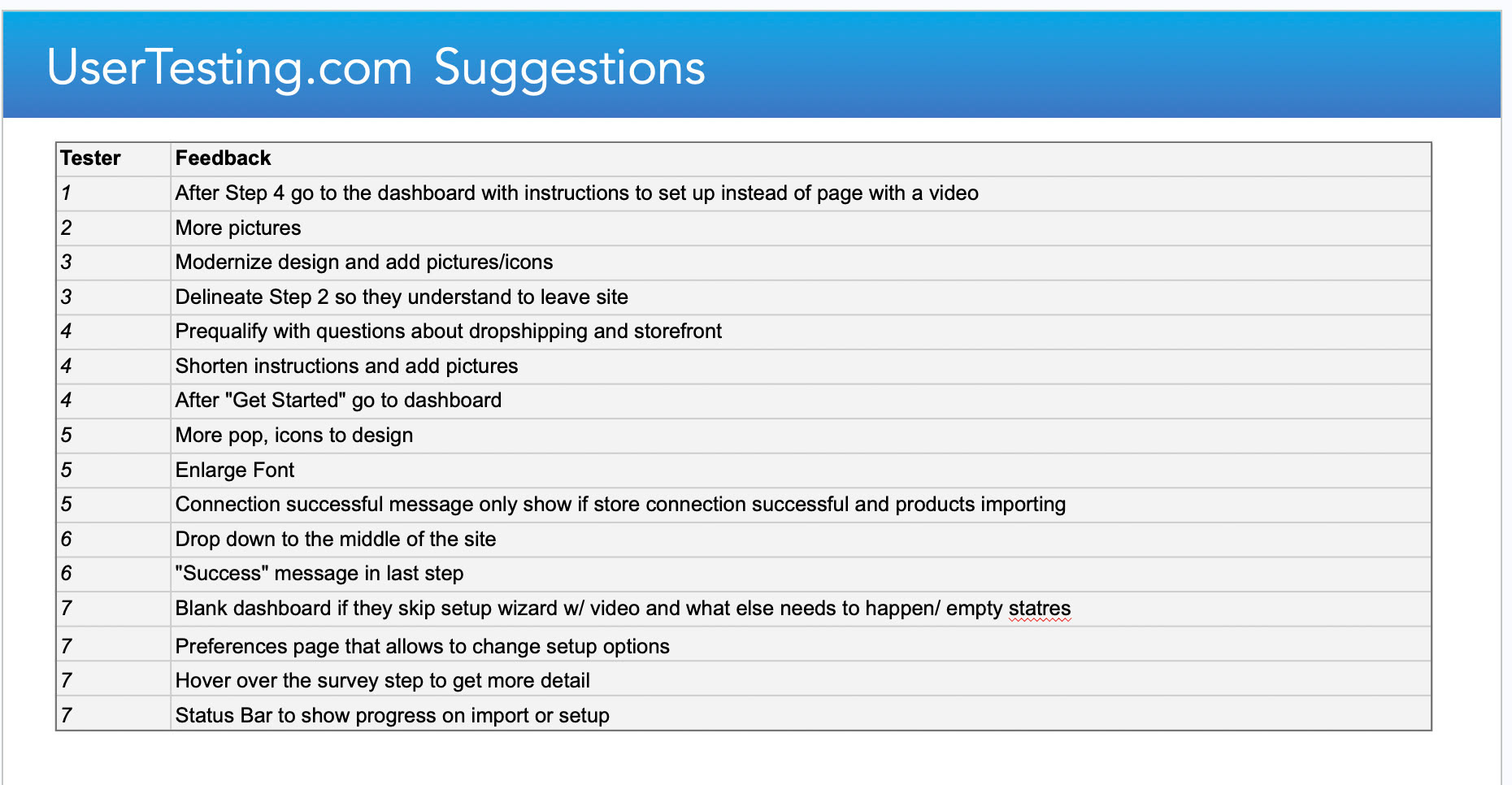
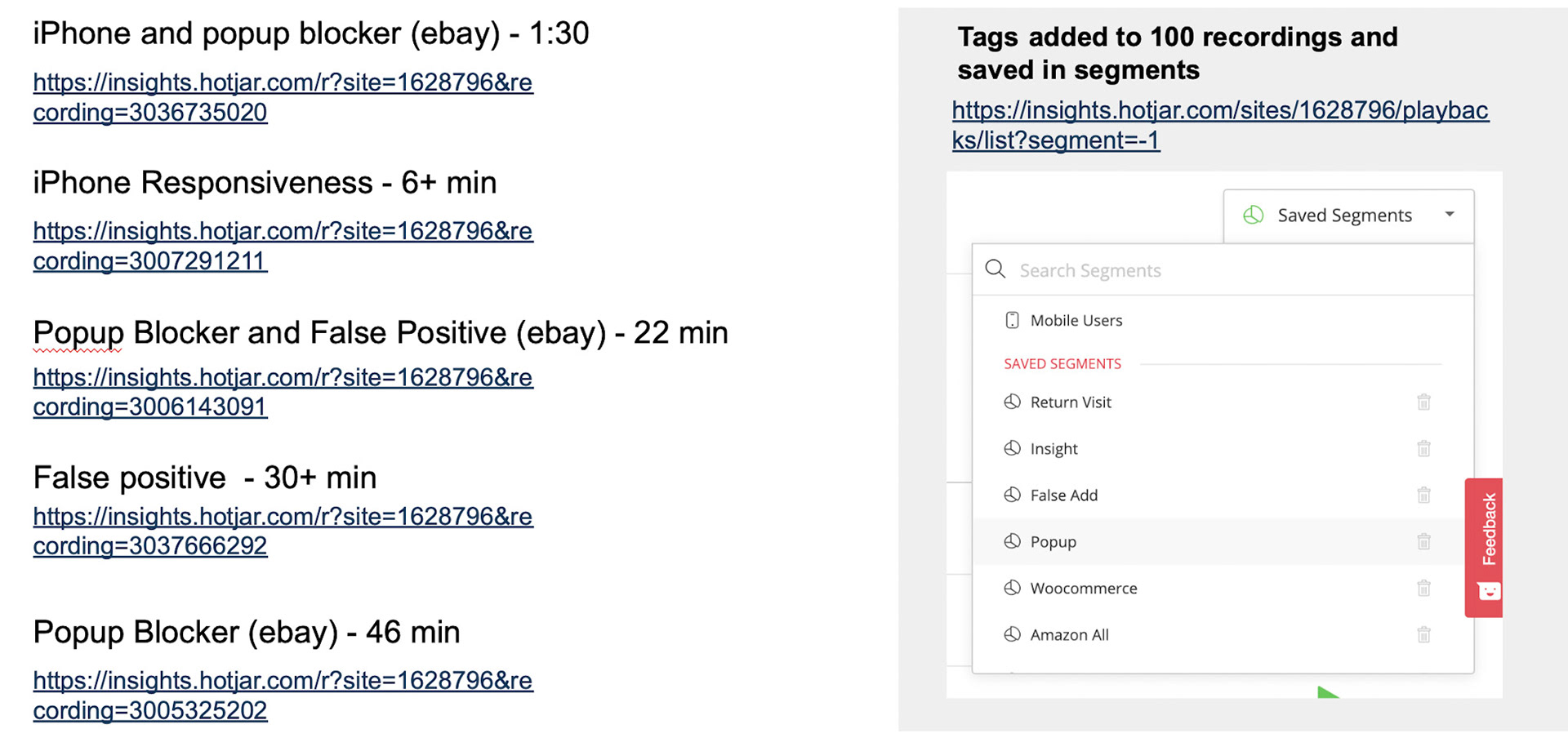
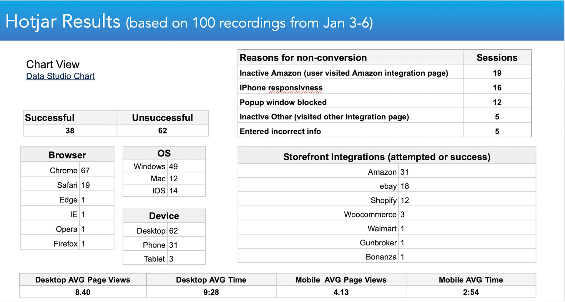
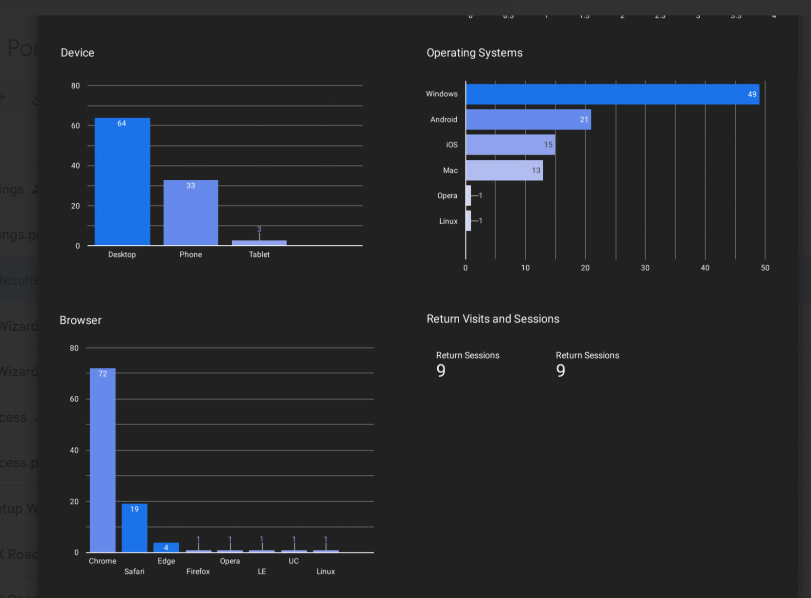
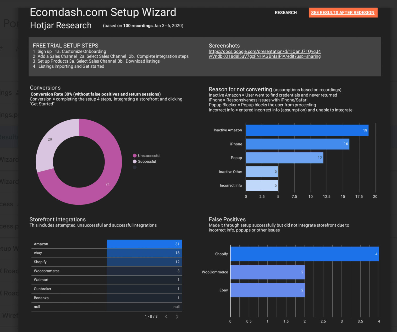
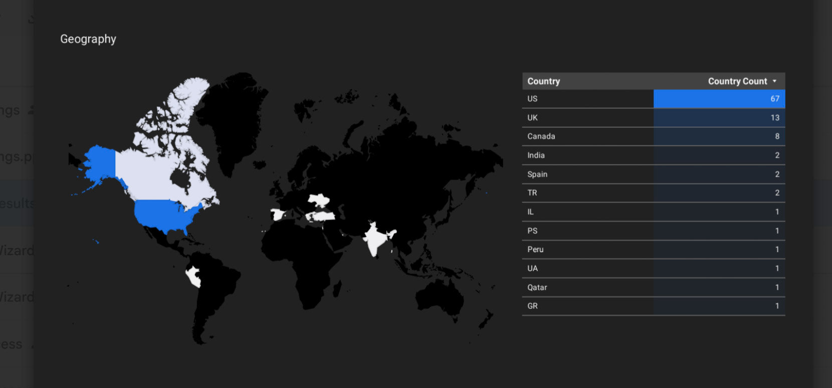
To ground these insights in data, I analyzed Hotjar heatmaps, Google Analytics behavior flows, and user testing videos.
Competitive Analysis
When Ecomdash was acquired by Endurance Group (Constant Contact), one of the business goals was to elevate the platform’s UX maturity to compete directly with modern SaaS e-commerce tools like Shopify, Sellbrite, ChannelAdvisor, and Skubana. As part of the redesign, I led a competitive UX audit to understand where Ecomdash stood in terms of onboarding, visual design, and workflow efficiency.
Objectives
The competitive analysis focused on four key dimensions of the user experience:
• Onboarding & Setup: How quickly can a new user connect channels and start selling?
• Information Architecture: How intuitive are the navigation and menu hierarchies?
• Workflow Efficiency: How easy is it to perform recurring tasks (listing, inventory sync, fulfillment)?
• Visual Design & Feedback: How do modern competitors use hierarchy, color, and interaction to communicate system state and guide behavior?
Process
I conducted heuristic walkthroughs and screen captures of each competitor’s flow from sign-up to first order, using a mix of trial accounts, YouTube demos, and UX teardown frameworks. I mapped out each journey side by side in Figma, annotating strengths, friction points, and patterns Ecomdash could adopt or differentiate from. Each competitor was evaluated against 10 usability heuristics (Nielsen Norman framework) and 3 design system criteria (consistency, accessibility, responsiveness).
I conducted heuristic walkthroughs and screen captures of each competitor’s flow from sign-up to first order, using a mix of trial accounts, YouTube demos, and UX teardown frameworks. I mapped out each journey side by side in Figma, annotating strengths, friction points, and patterns Ecomdash could adopt or differentiate from. Each competitor was evaluated against 10 usability heuristics (Nielsen Norman framework) and 3 design system criteria (consistency, accessibility, responsiveness).
Key Findings
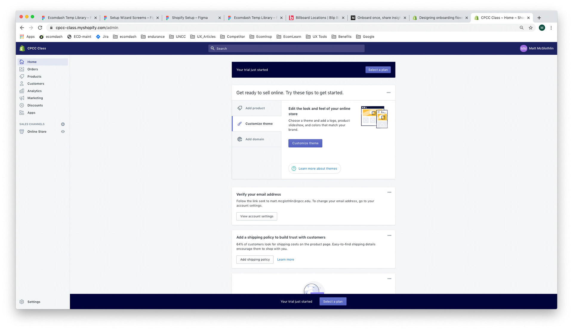
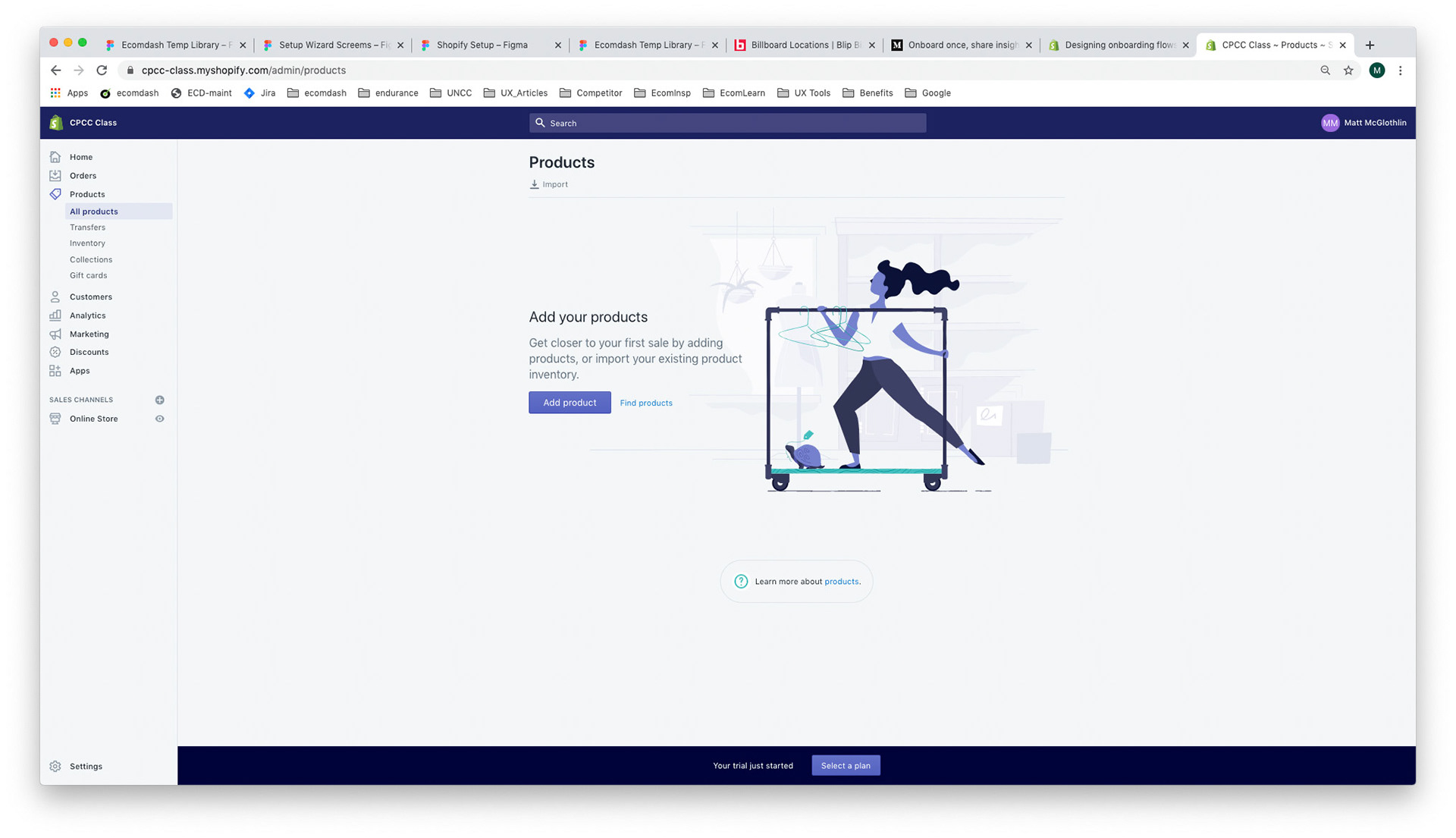
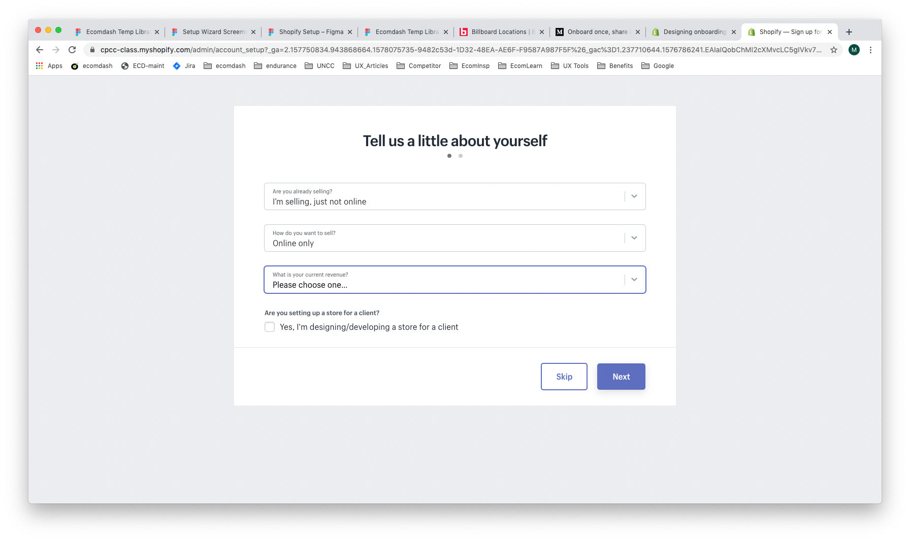
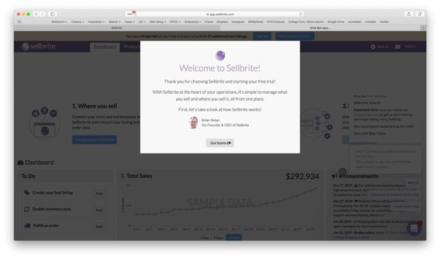
Shopify
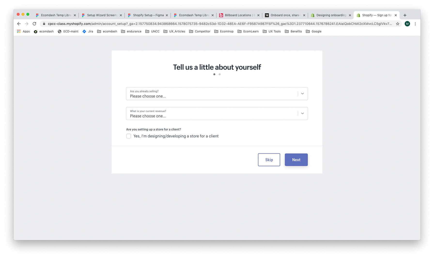
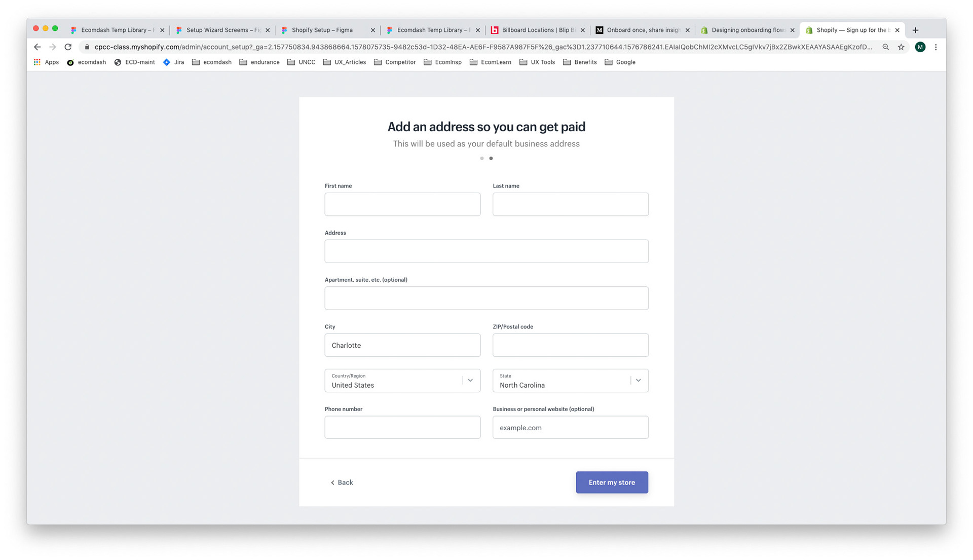
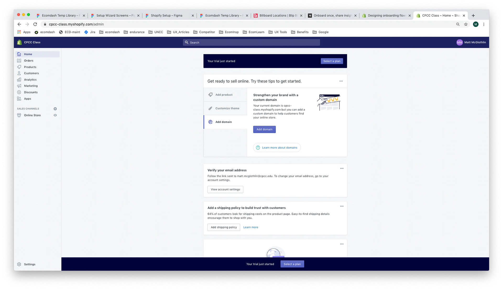
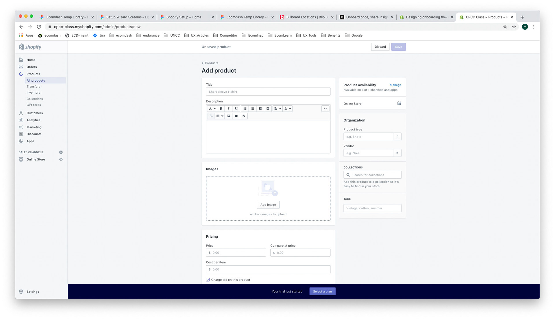
• Best-in-class for onboarding simplicity
• Strengths: Linear, guided setup with clear progress states and contextual tooltips
• Takeaway: Reduce the number of setup screens and provide a “completion sense” to motivate users
Action for Ecomdash: Introduce a guided, step-by-step onboarding wizard with inline help and a success checklist
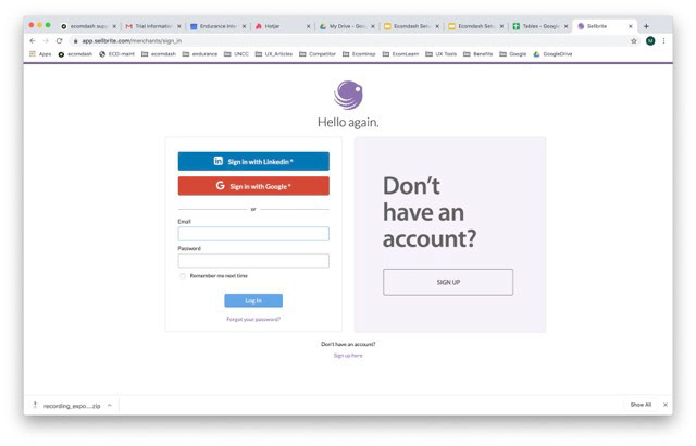
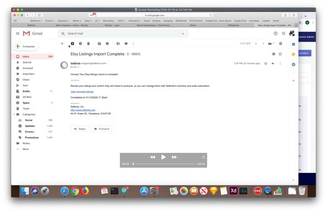
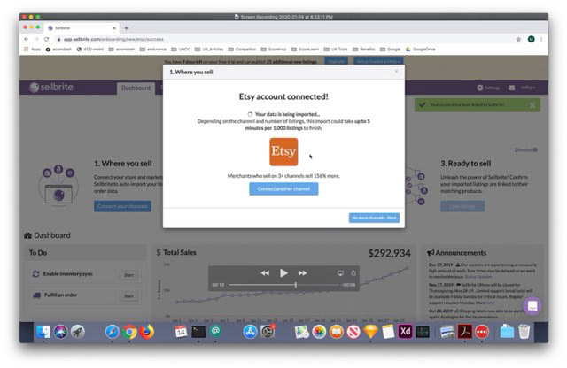
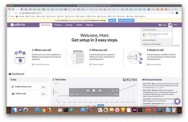
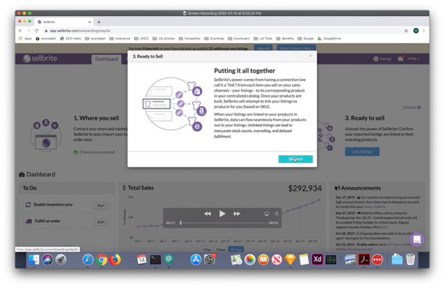
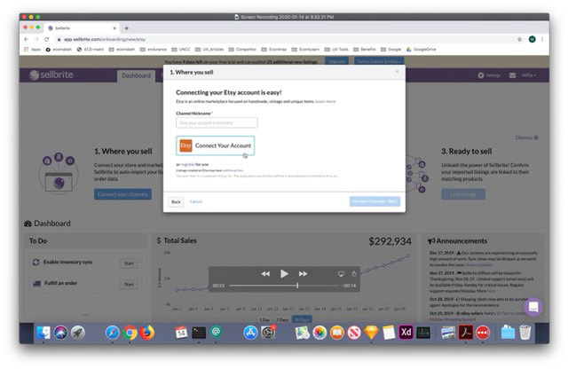
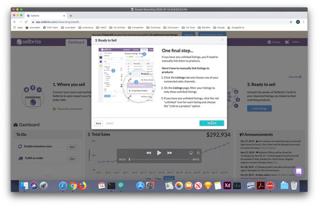
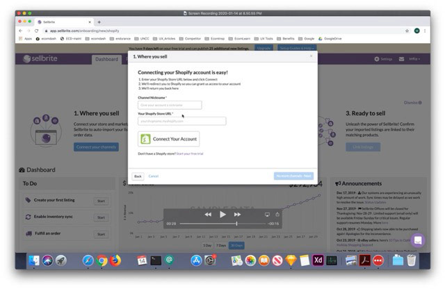
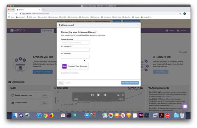
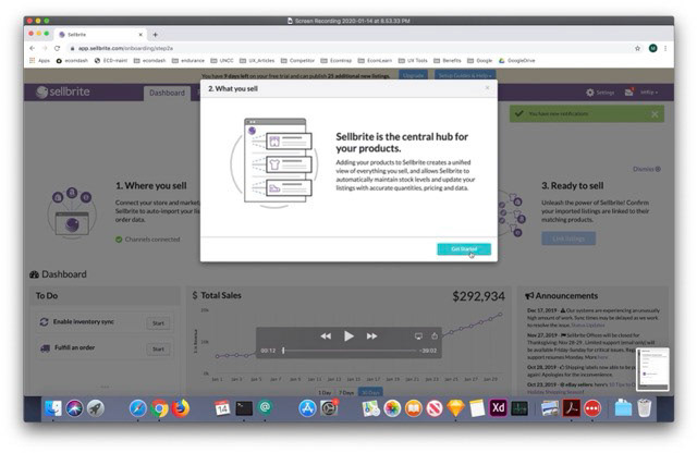
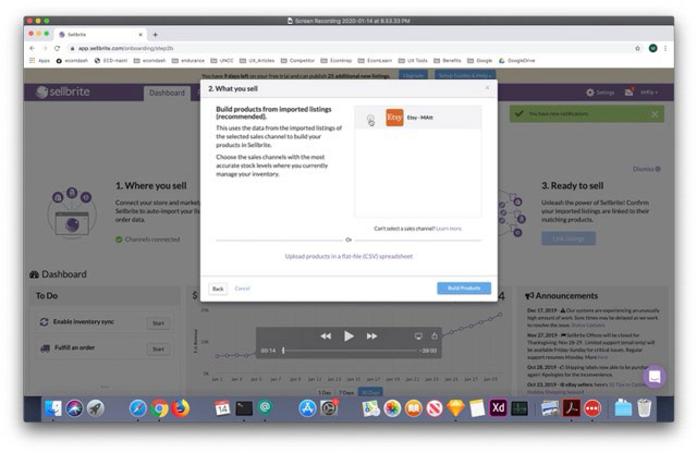
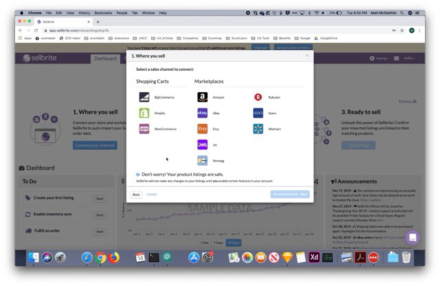
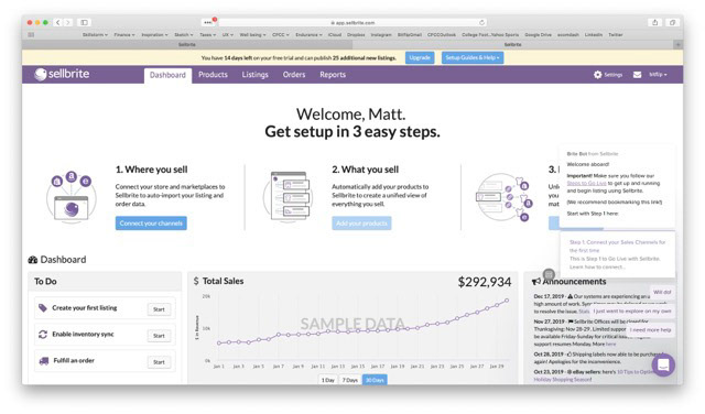
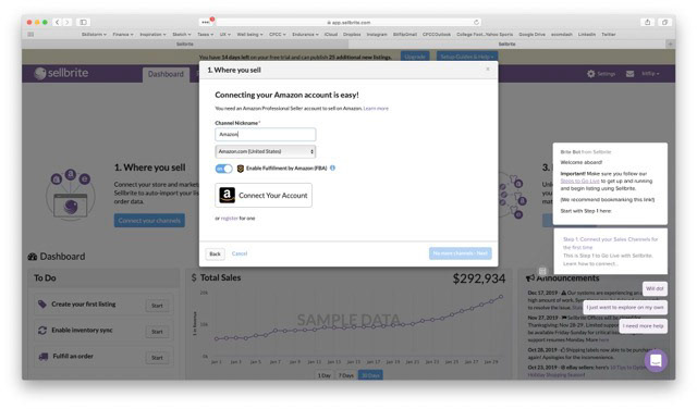
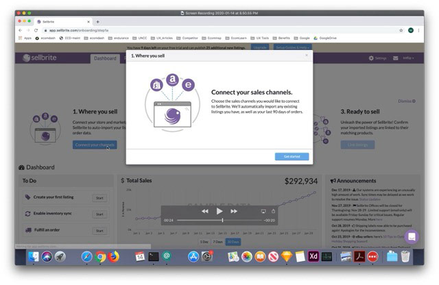
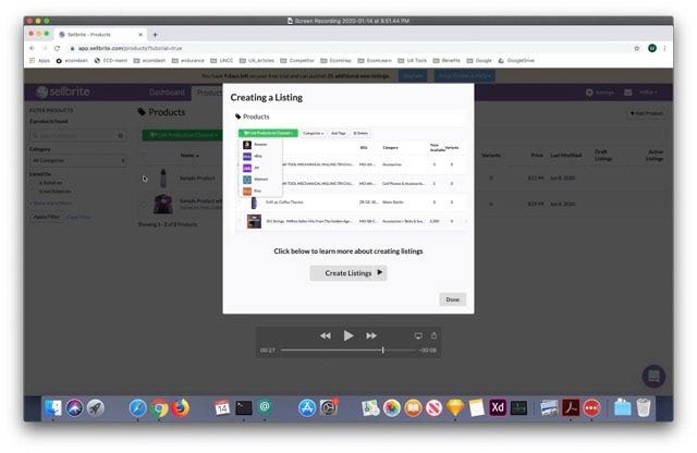
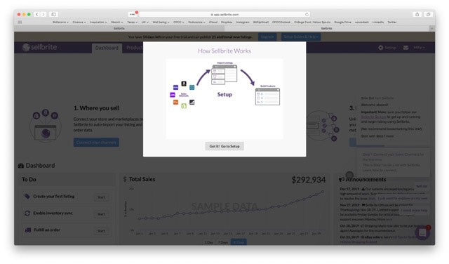
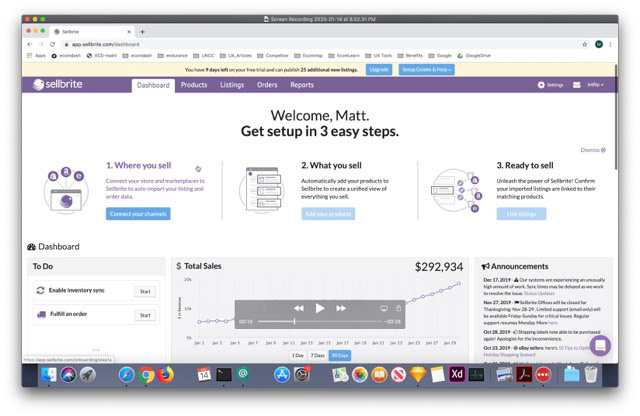
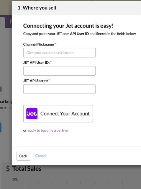
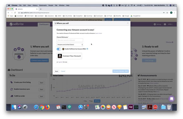
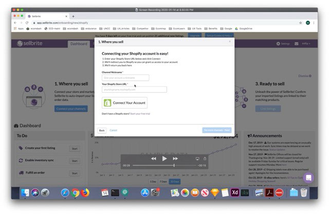
Sellbrite
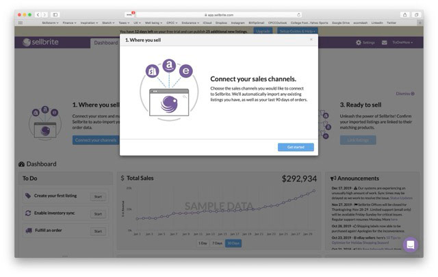
• Strong cross-channel integrations, but poor visual hierarchy
• Strengths: Solid integration with Amazon, eBay, and Etsy
• Weaknesses: Dense tables, poor spacing, inconsistent feedback during syncs
• Takeaway: Reinforce information hierarchy using typography, color, and progressive disclosure
Action for Ecomdash: Apply visual design standards to differentiate primary and secondary actions

Designing a Better Experience - Wireframes
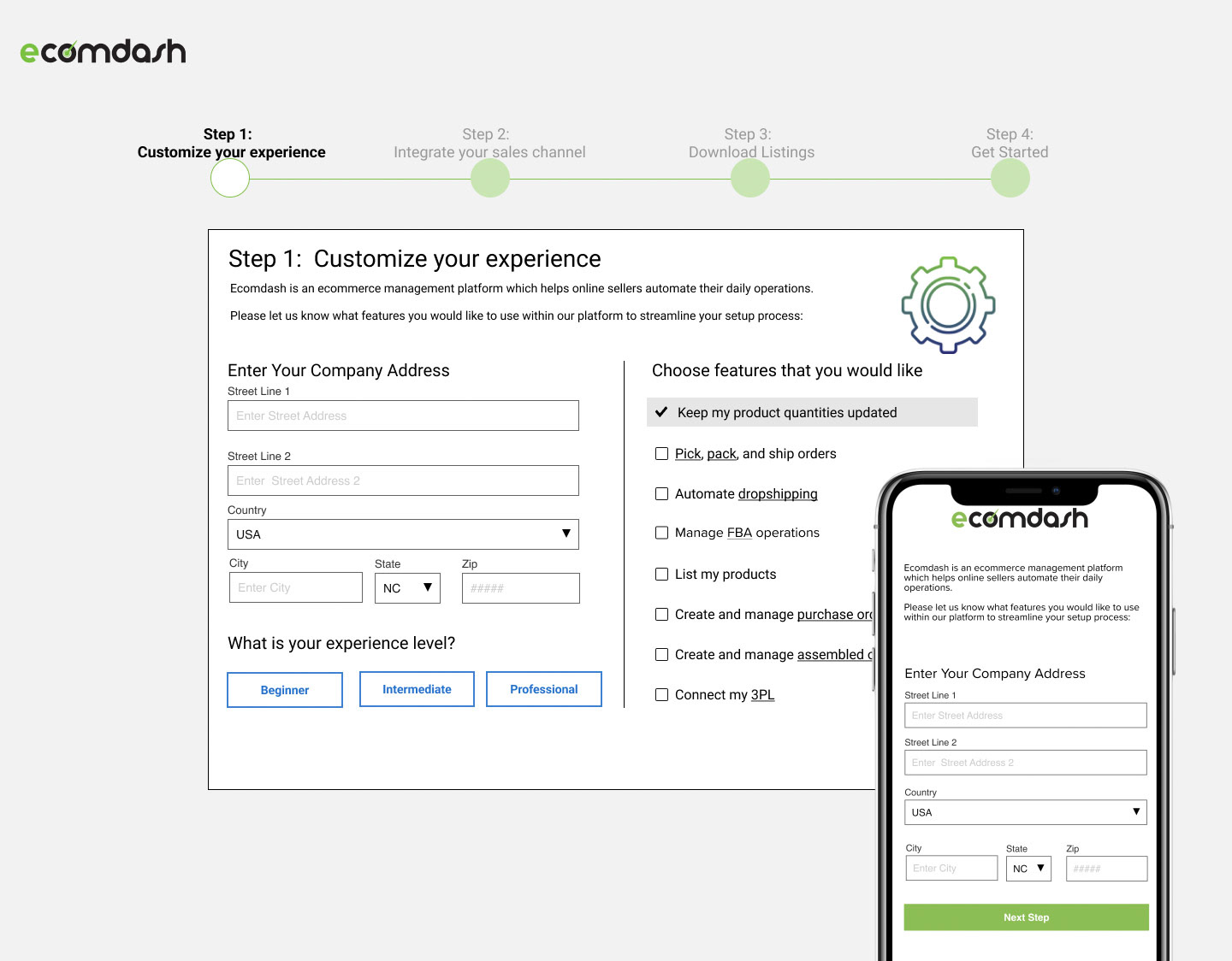
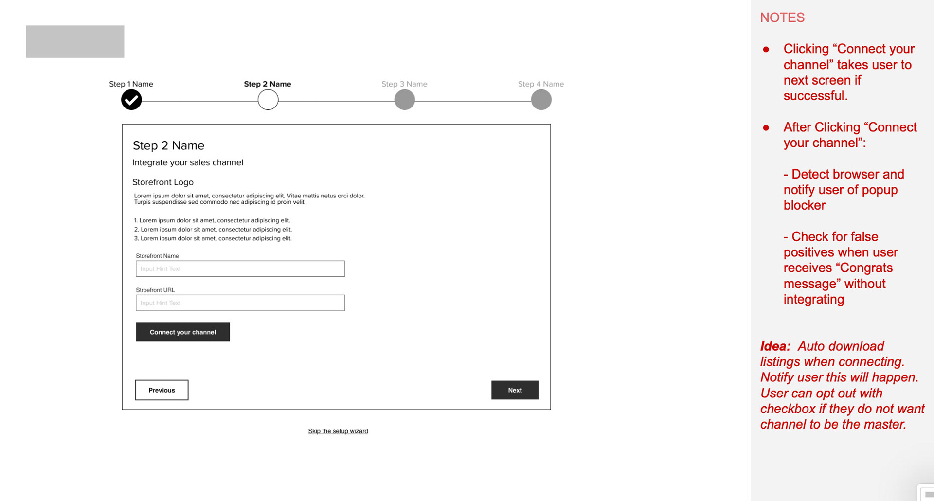
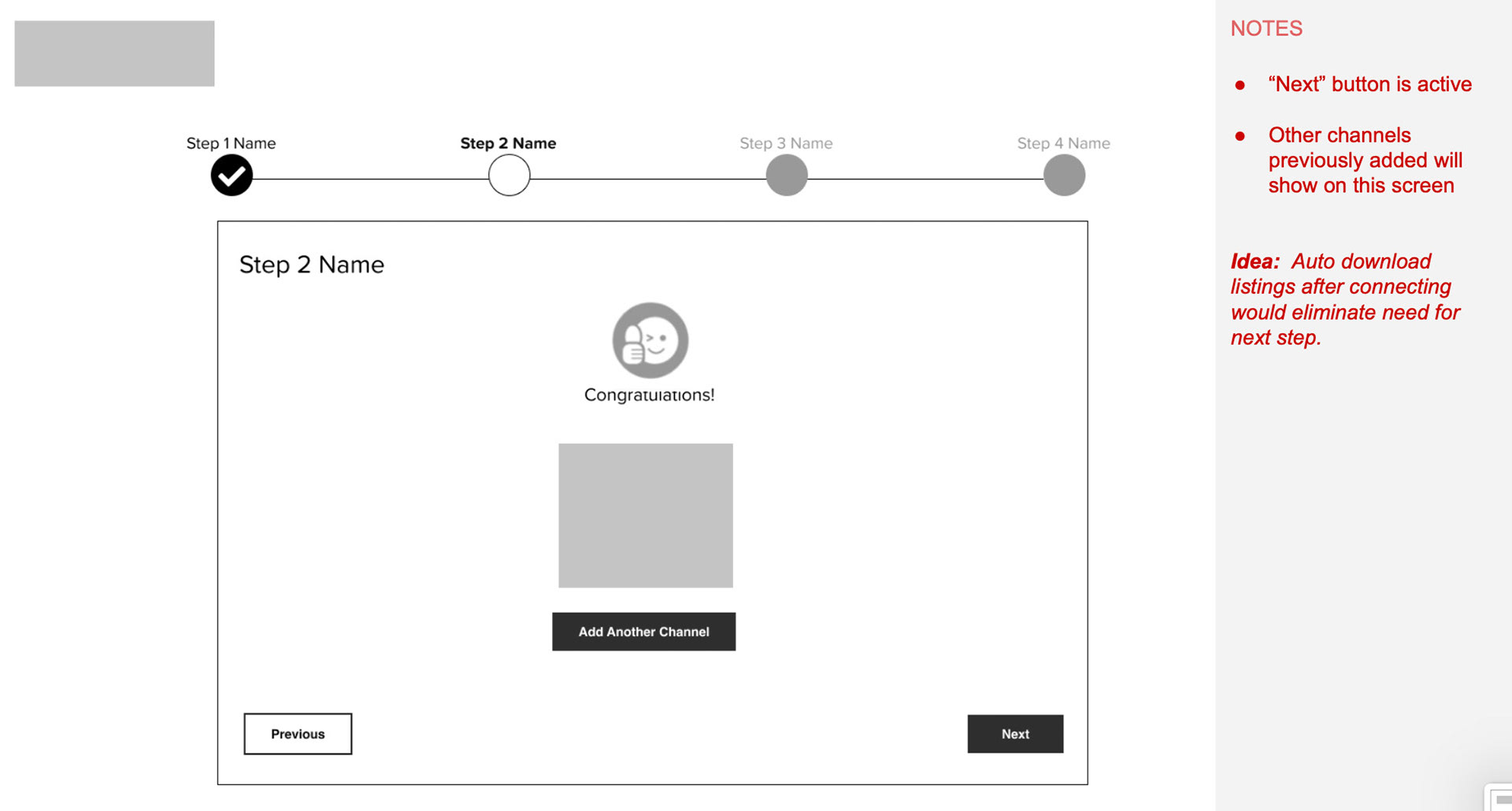
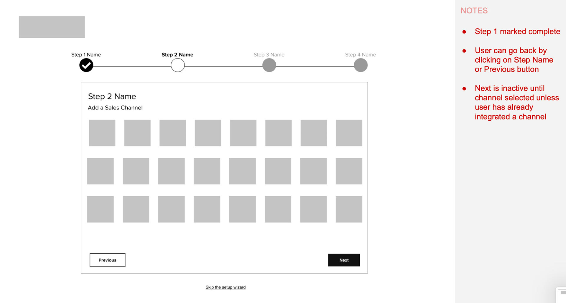
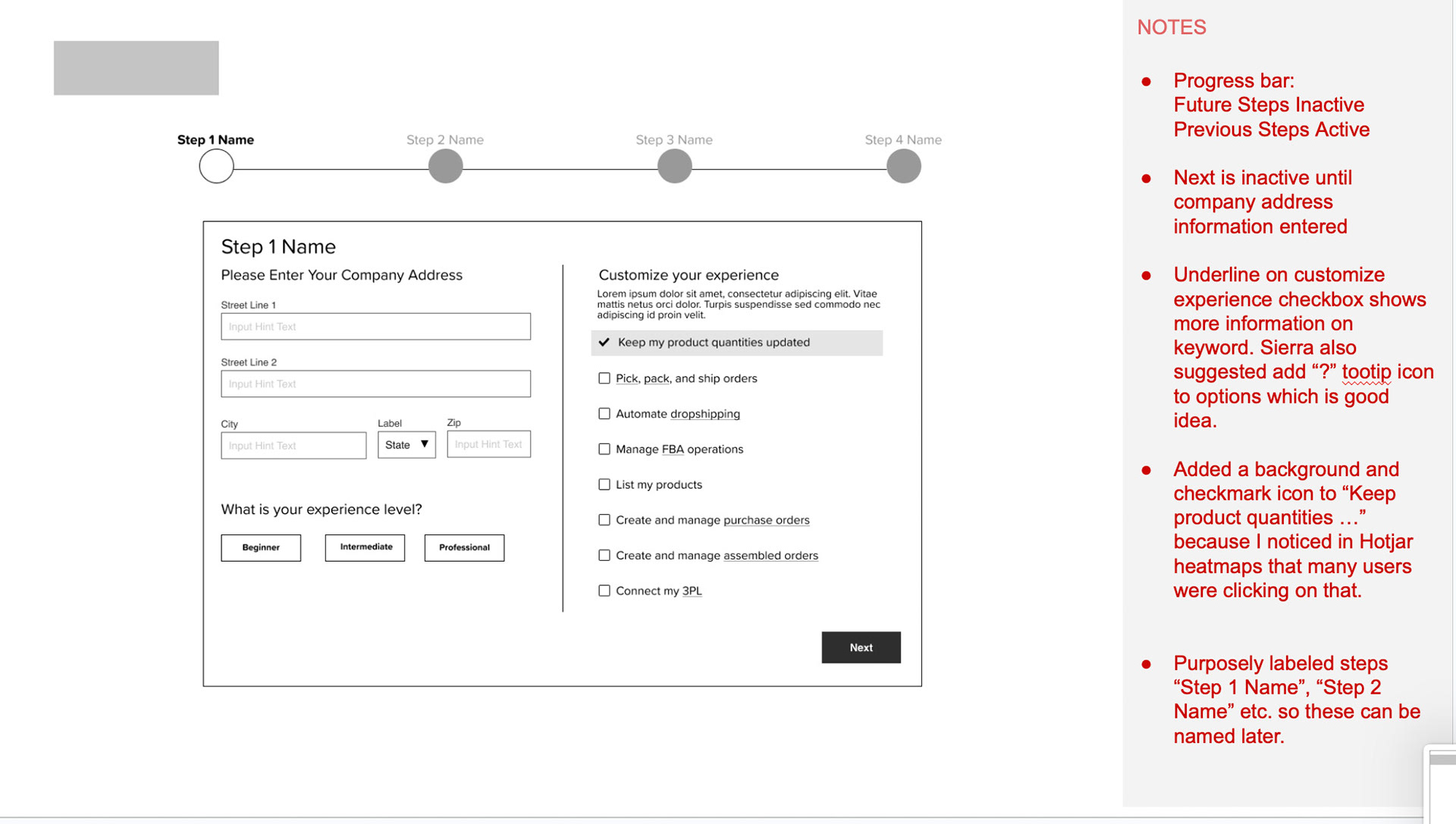
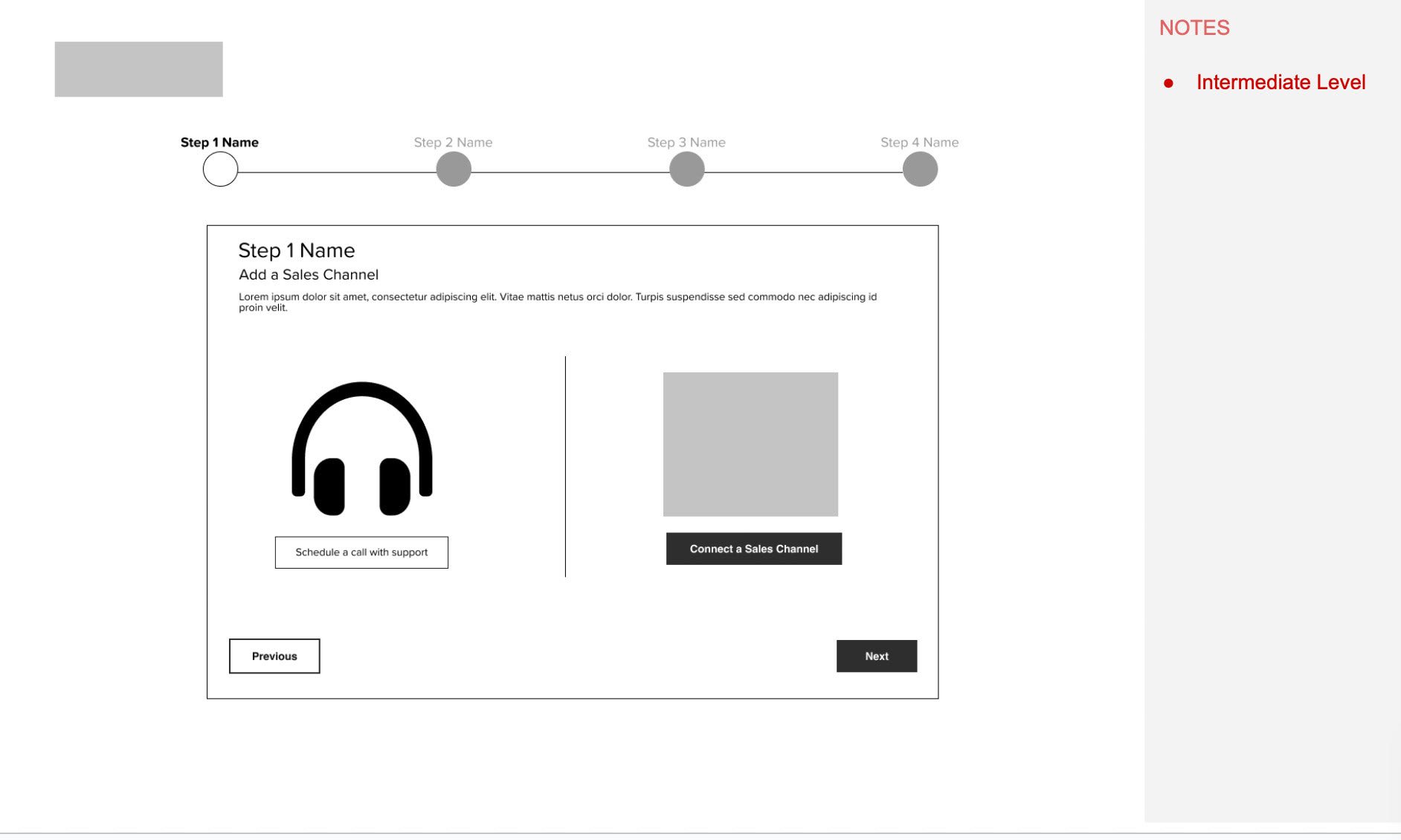
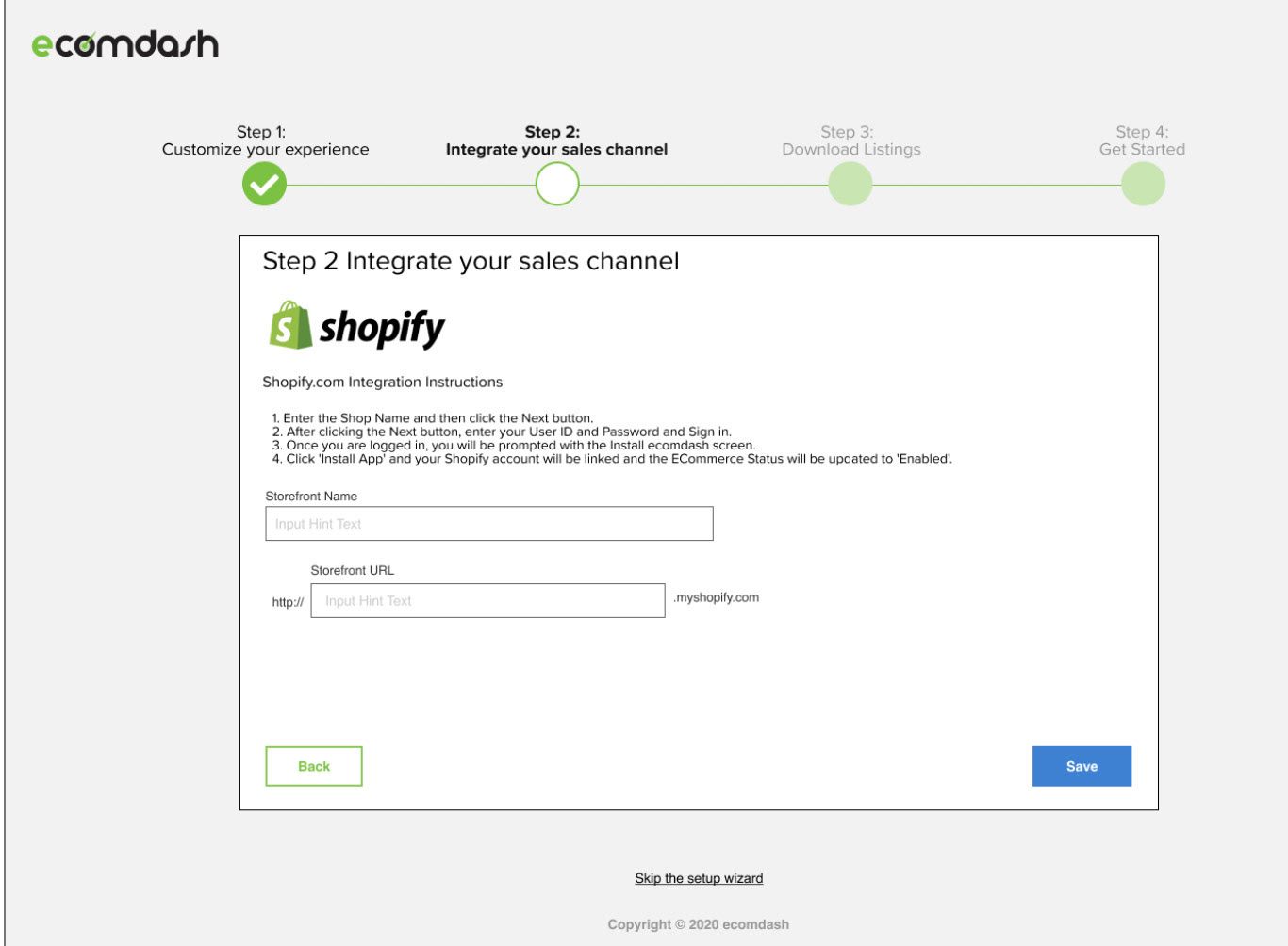
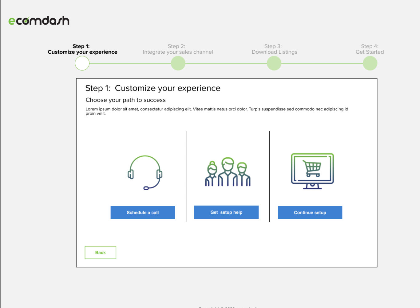
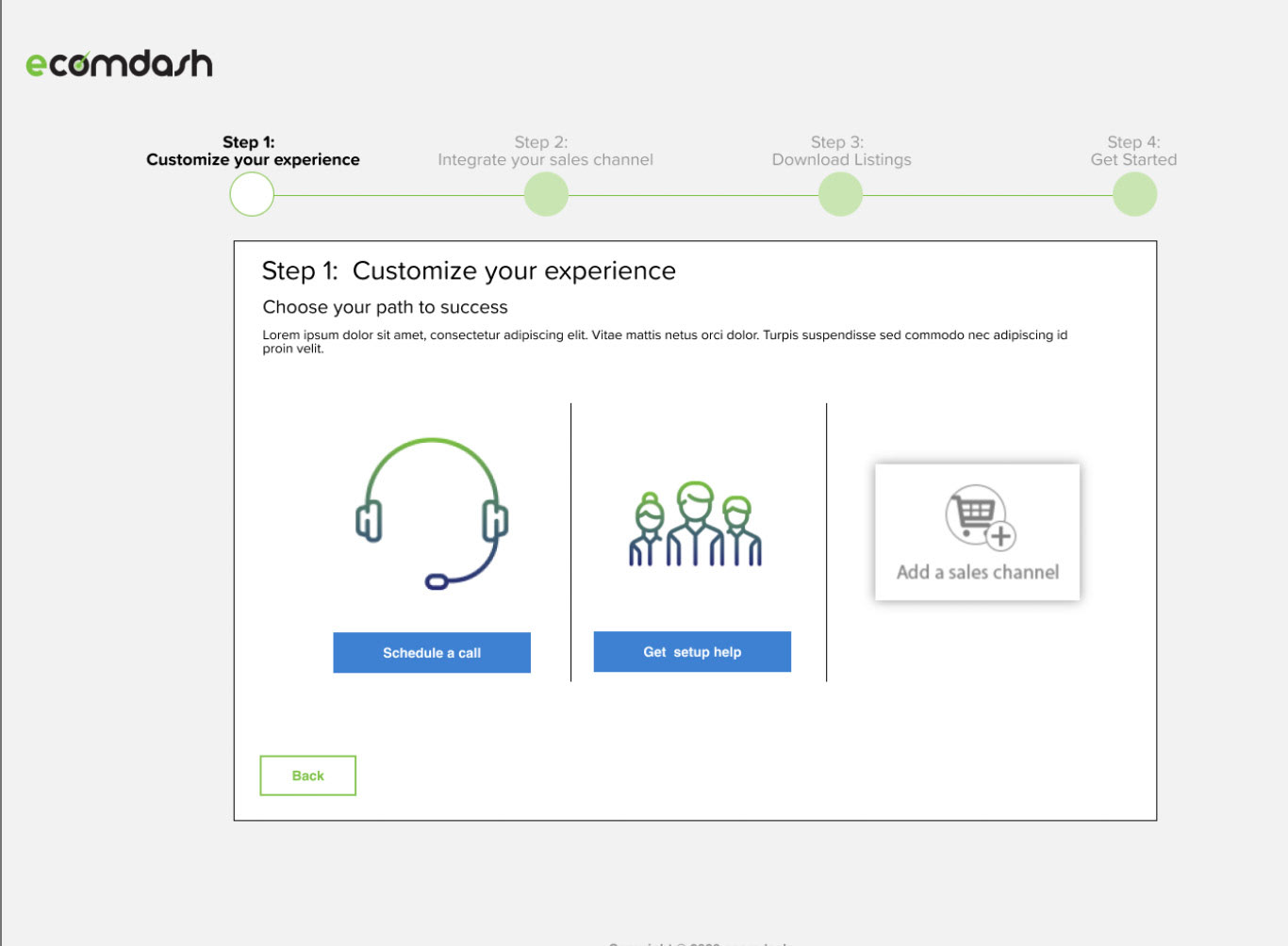
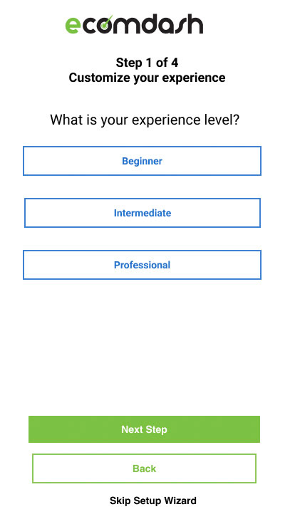
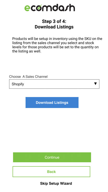
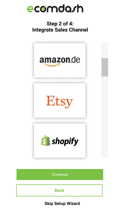
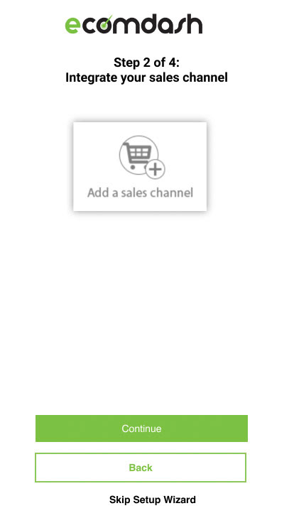
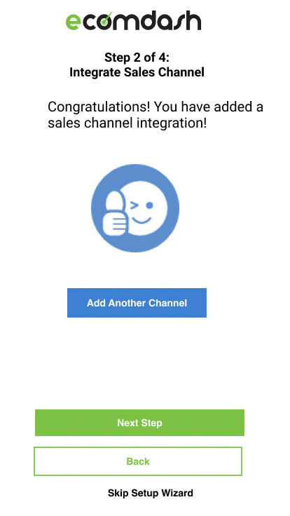
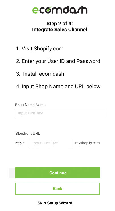
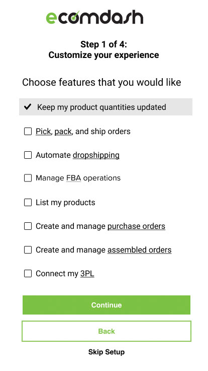
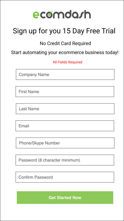
I started with low-fidelity wireframes in Figma, mapping out a simplified navigation and linear onboarding flow. The goal was to help users connect their sales channels, import products, and fulfill orders within minutes — not hours.
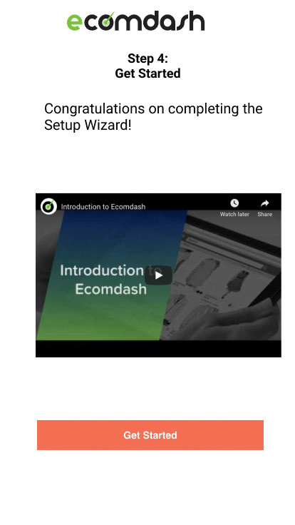
We introduced a guided setup with progress indicators, inline tips, and contextual help panels. For the main dashboard, I focused on clarity and confidence — transforming a grid of raw data into a more human, status-driven view with clear alerts and call-to-actions.
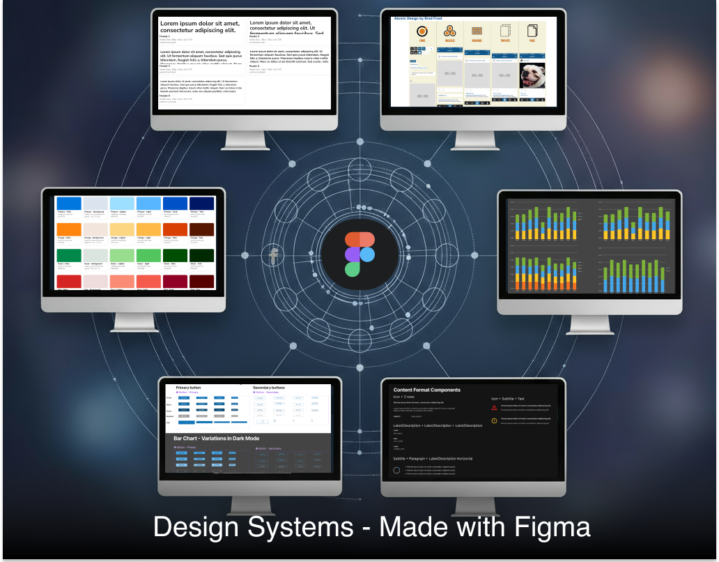
Once the structure was validated, I created high-fidelity prototypes and built out a Figma-based design system. This included reusable components (buttons, tables, modals, typography tokens, and color styles) that mirrored what developers were building in React.
The design system not only streamlined collaboration — it also laid the foundation for Ecomdash’s integration into Constant Contact’s larger product ecosystem.


Web and Mobile App Completed Screens
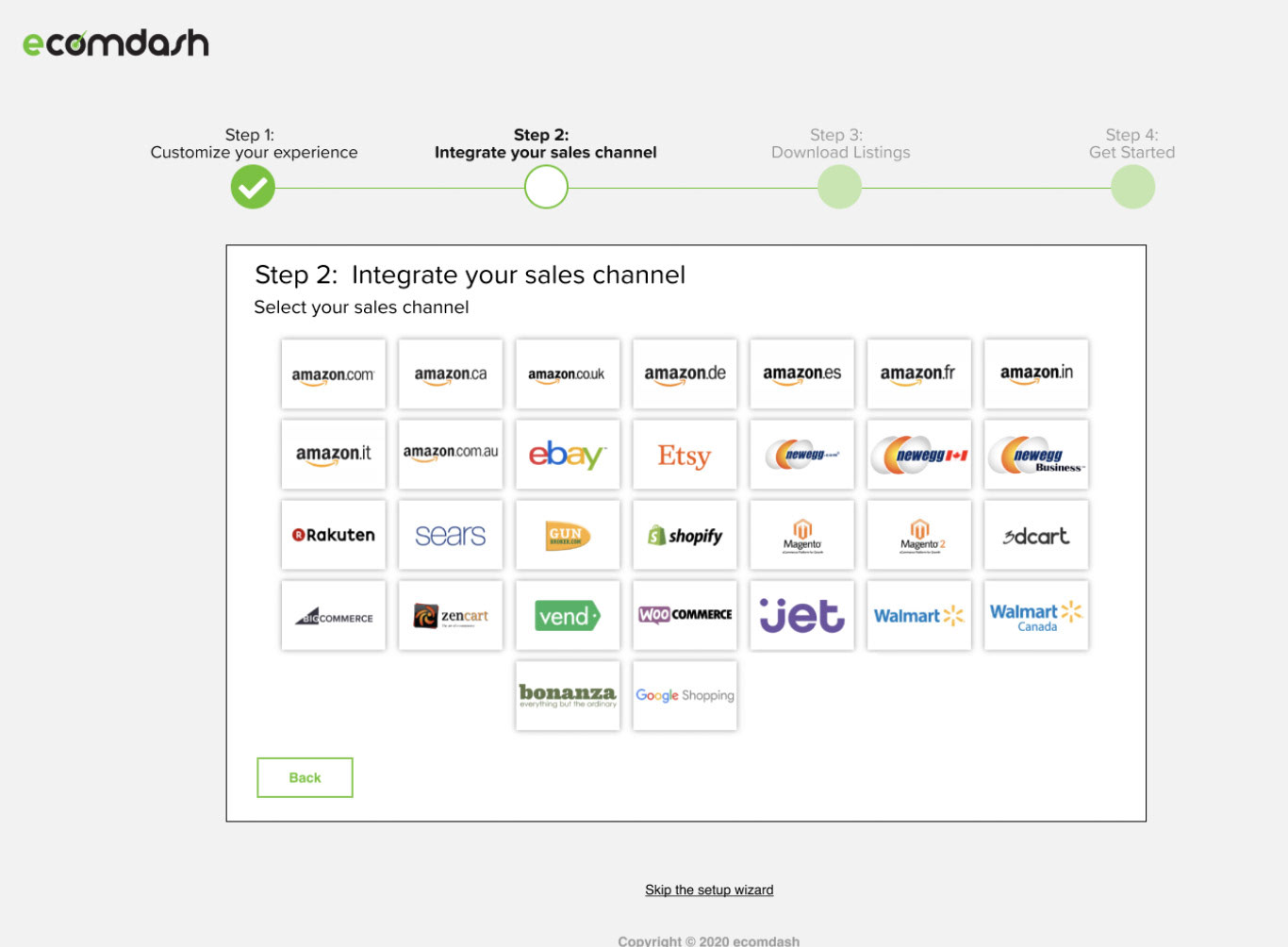
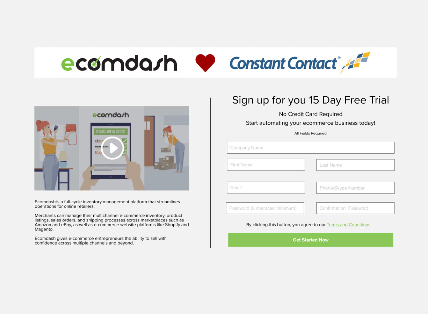
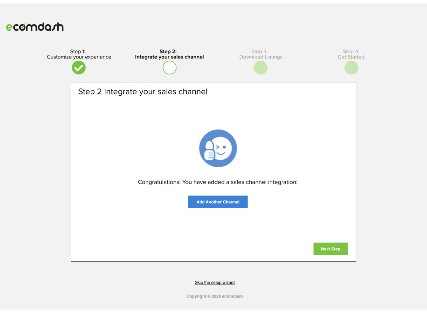
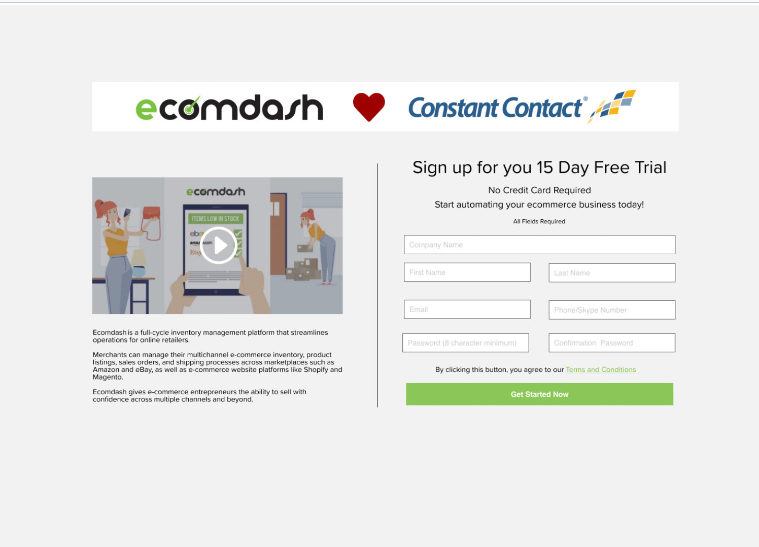
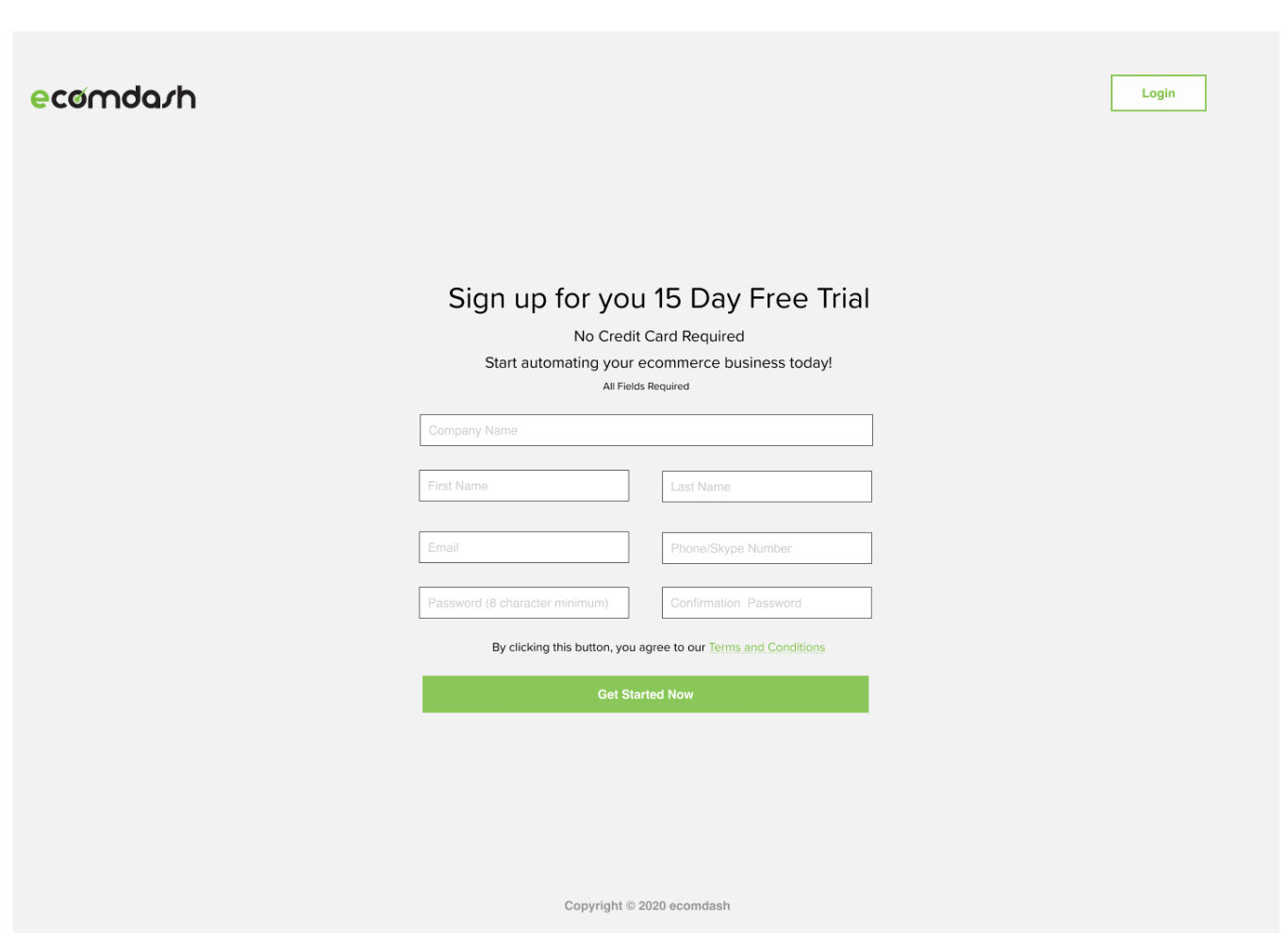
Prototype
Impact
Within three months of release:
• Trial-to-paid conversion increased by 20%
• Trial-to-paid conversion increased by 20%
• Onboarding time dropped significantly, with a noticeable reduction in customer support tickets
• New design system was adopted across teams, reducing UI inconsistencies and speeding up development
• Ecomdash’s visual language aligned seamlessly with Constant Contact’s brand, supporting broader integration goals.
These improvements were a turning point — proving that user-centered design could directly drive business growth.
Reflections
Ecomdash was where I learned how to balance startup scrappiness with enterprise rigor. In a small team, I had to play the roles of researcher, designer, prototyper, and advocate — often within the same sprint. I discovered that even modest changes, when grounded in research and collaboration, can make measurable differences in both user satisfaction and conversion.
“Good UX isn’t about adding polish — it’s about giving people the confidence that they’re in control.”
That mindset guided the redesign of Ecomdash and has shaped how I approach every project since — from industrial systems at Honeywell to enterprise applications in healthcare and safety.
