Overview
Role: Lead UX Designer
Timeline: 2022-2023
Company: Honeywell
Mission: Design a mobile-first medication management app that ensures accurate delivery and traceability of medications for healthcare and industrial environments.
Timeline: 2022-2023
Company: Honeywell
Mission: Design a mobile-first medication management app that ensures accurate delivery and traceability of medications for healthcare and industrial environments.
Background
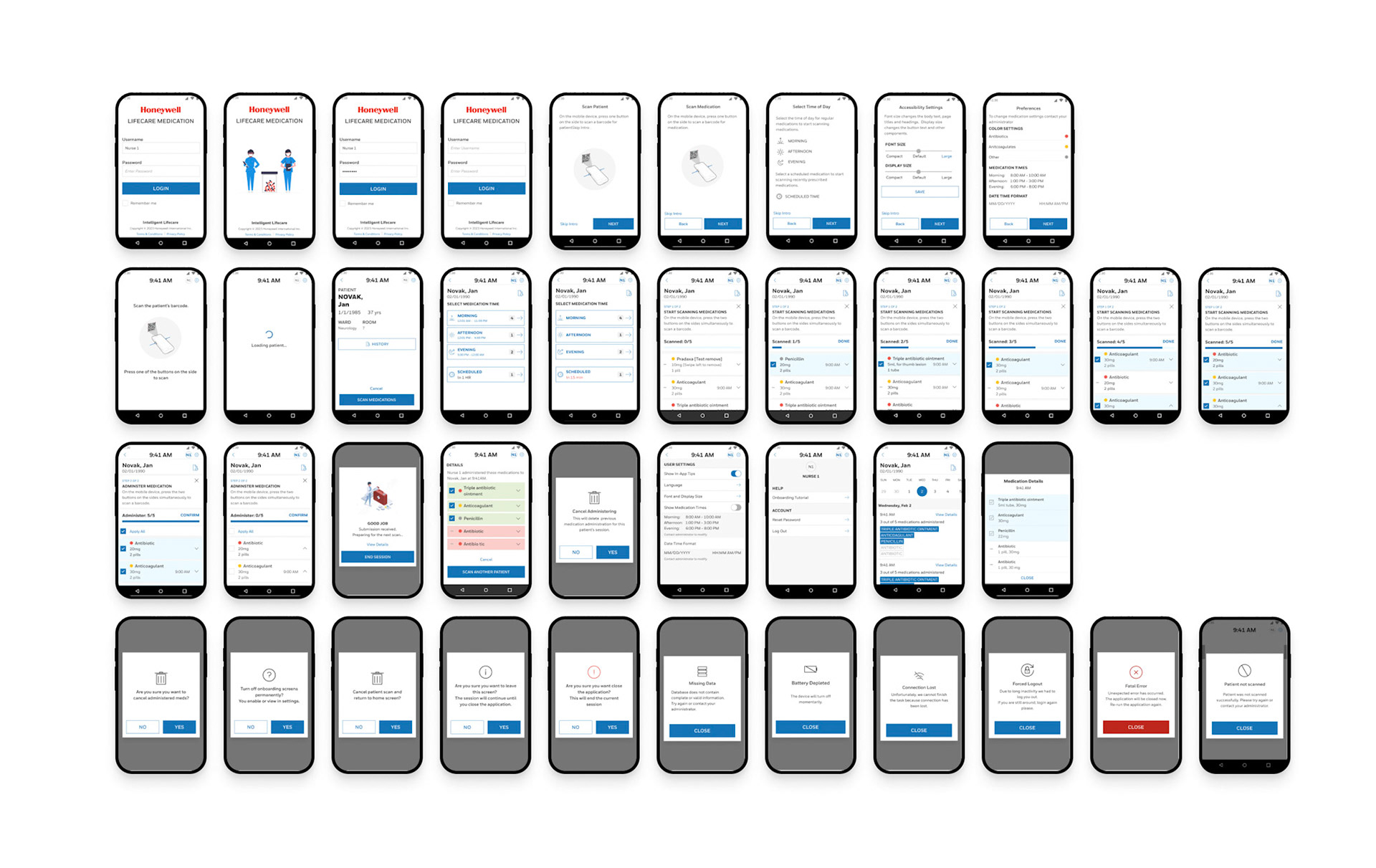
The original tablet application for medication logging was built around technician workflows rather than clinical needs. Nurses found it cumbersome, confusing, and inconsistent in how it displayed dosage, patient info, and logging confirmations.
This concept was developed as part of Honeywell’s Industrial Life Care initiative. While it was not publicly released, the design will informfuture connected healthcare efforts across the organization.
The ILC Medication App was designed for Honeywell’s Integrated Life Care division to ensure safer and more efficient medication administration in clinical environments. Nurses and technicians rely on Honeywell handheld devices to scan patient wristbands and medication barcodes—helping them confirm dosage, timing, and compliance at the bedside.
As the lead UX designer, I was responsible for redesigning the user flow, onboarding experience, and accessibility framework to reduce scanning errors, improve clarity, and meet stringent healthcare compliance standards
The Challenge
Nursing staff across several pilot hospitals reported workflow friction in the existing medication scanning process. The initial app was designed by previous team. I saw some issues when brought into the project, and we made life-saving changes.
Key issues included:
• Disjointed flow between scanning patients and medications.
• Cluttered confirmation screens leading to delayed administration.
• Limited accessibility—font scaling and contrast insufficient for real-world conditions.
• Confusion between “Submit” and “End Session” actions, creating risk for incomplete logs.
Additionally, the interface needed to satisfy FDA 21 CFR Part 11 electronic records compliance, ensure HIPAA protection, and maintain traceable design documentation for regulated audits.
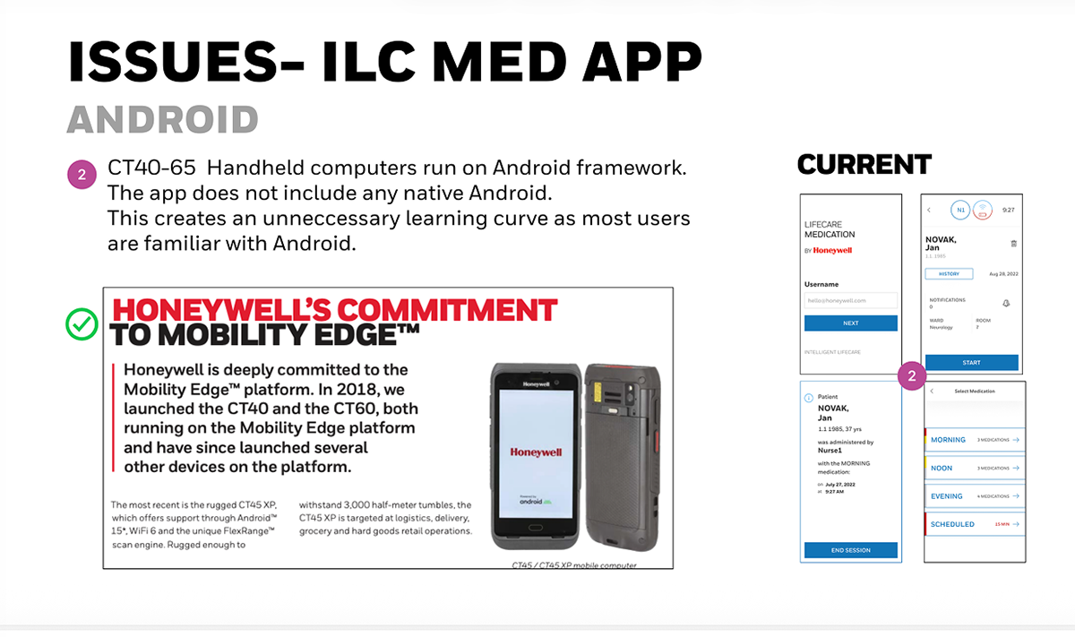
Current app design doesn’t take advantage of Android native functions
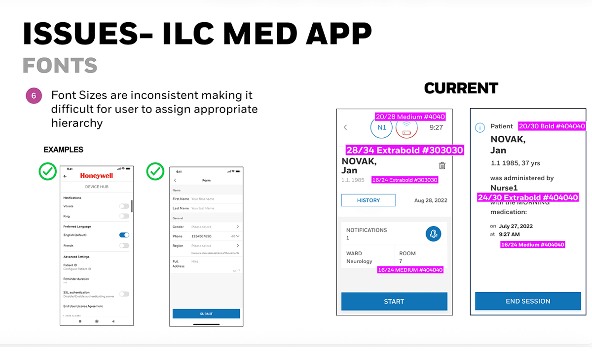
Font sizing issues
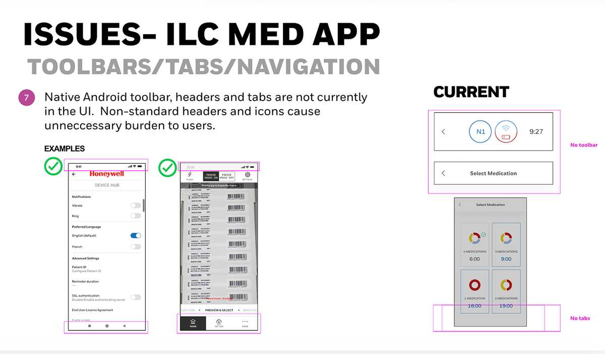
Non-native headers
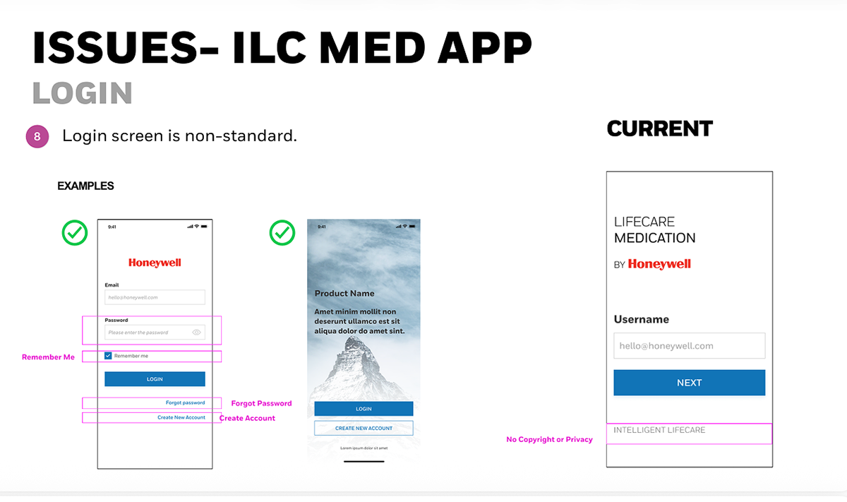
Login screen doesn’t follow standards which weakens brand
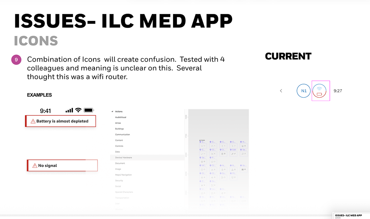
Confusing icon meanings
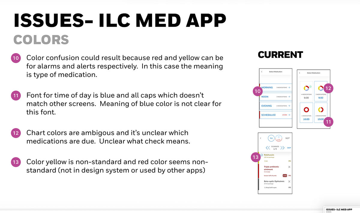
Color confusion as red,yellow has several meanings within current design. Time of day inconsistencies. Chart colors mixed with alarms
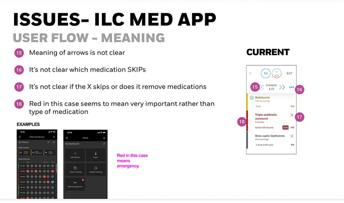
Ambiguous workflow due to lack of steps
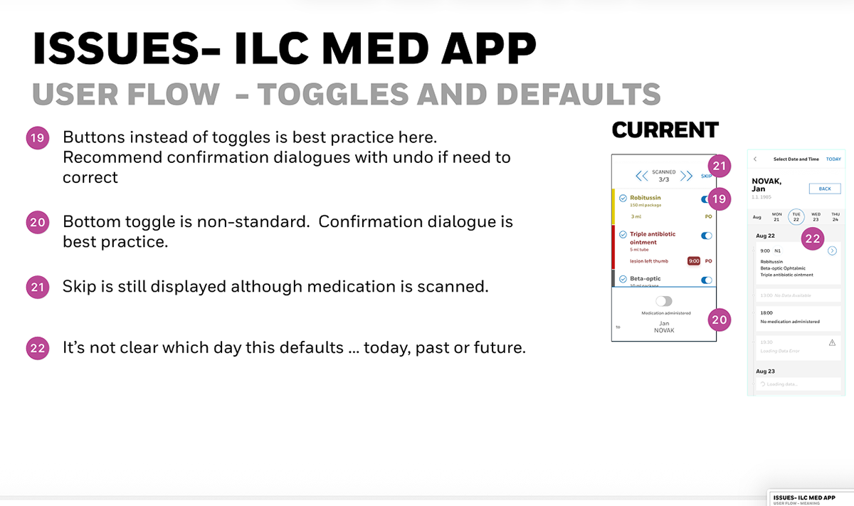
Unclear what is the default today, past or present from history
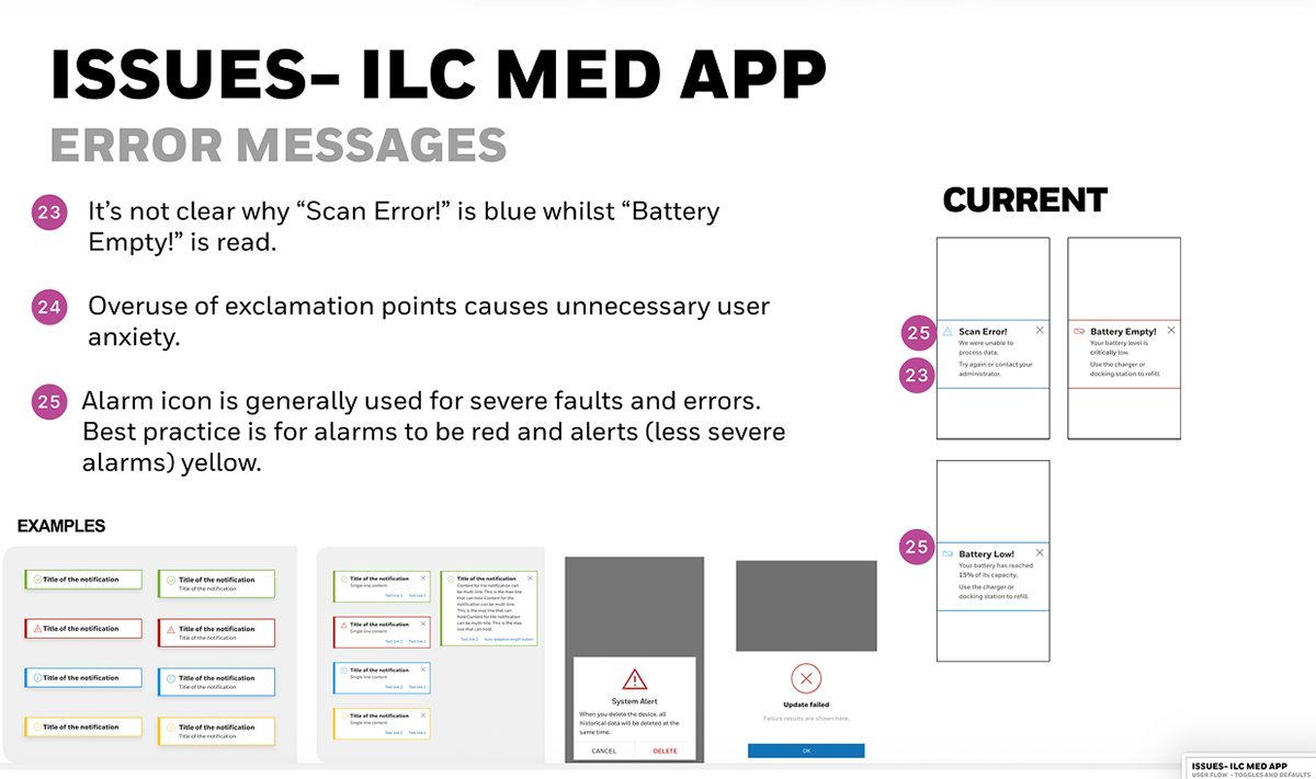
Overuse of exclamation points and alarms did not show consistent icons for severity
Research and Discovery
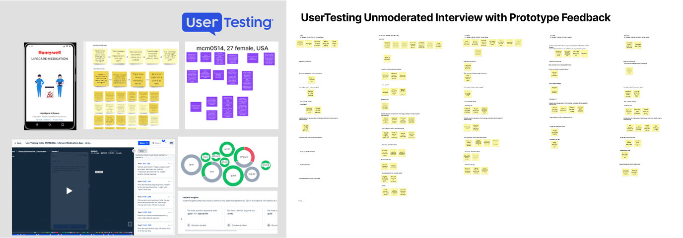
Research combined contextual inquiry, documented field feedback, and UserTesting.com prototype testing.
Key insights from field research
• Nurses performed 15–25 scans per shift under time pressure, often wearing gloves and balancing multiple devices.
• Many relied on muscle memory, expecting a linear progression: Scan Patient → Scan Medications → Confirm → End Session.
• Visibility under bright hospital lighting required high-contrast text and color-coding by medication type.
Journey Map
We mapped the end-to-end medication process to:
Identify patient
Verify prescription
Administer medication
Log dose and lot number
Update central database
Identify patient
Verify prescription
Administer medication
Log dose and lot number
Update central database
Heuristic Evaluation
I also conducted a heuristic evaluation of the existing app against healthcare UX standards (EHR / FDA 21 CFR Part 11 compliance) and found major issues around:
Task flow interruptions
Poor confirmation dialogs
Lack of feedback after saving records
Key insights from UserTesting.com sessions
Participants were asked to complete scanning and confirmation tasks using an interactive Figma prototype.
• 90% of users preferred the new linear flow, citing that it “felt more natural and less like a checklist.”
• Auto-closing toast notifications after scanning were appreciated for reducing clutter (“I don’t have to tap to move on—it just works”).
• Users valued the “View Details” link before confirming, saying it gave confidence to verify before proceeding.
• Accessibility prompt linking to system font-size controls improved satisfaction for users with visual strain.
• Minor confusion arose around “Scheduled” vs. “Regular” medications, prompting clearer labeling in the next iteration.
Design Goals
1. Simplify scanning workflow for nurses under pressure.
2. Reduce error risk by ensuring clear confirmation and hierarchy.
3. Align with accessibility standards (WCAG 2.1, Android Accessibility APIs).
4. Minimize friction through auto-advancing states and consistent spacing.
5. Document all changes for regulatory traceability and engineering handoff.
My goal as UX lead was to redesign the experience to feel intuitive, trustworthy, and aligned with healthcare workflows — bridging the gap between industrial software and clinical-grade usability.
Design Process
Information Architecture
Based on workflow mapping and user testing, I restructured the app into five primary steps:
1. Scan Patient
2. Scan Medication
3. Administer
4. Confirm
5. End Session
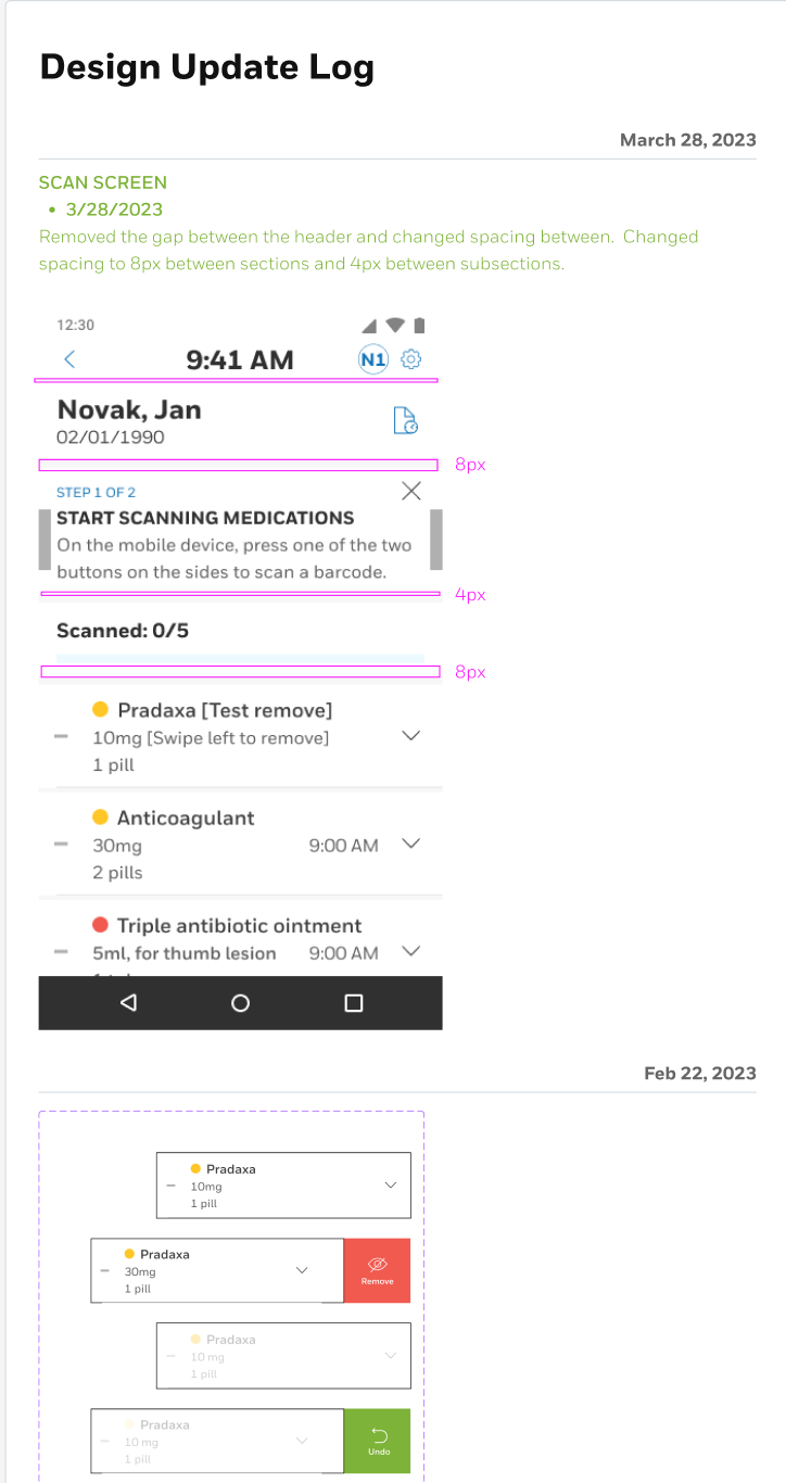
To improve rhythm and legibility, I applied a consistent 8px spacing between sections and 4px between subsections . Toast notifications for “Medication Found” were timed to auto-close after 1.5 seconds, minimizing cognitive interruption while maintaining awareness
Onboarding & Accessibility
The onboarding experience, redesigned from the ground up, guided users through key app functions using five progressive screens :
• Scanning patients and medications
• Choosing medication times (Morning, Afternoon, Evening)
• Adjusting accessibility settings (font size, contrast)
• Linking directly to Android’s Font Size menu
• Explaining schedule configuration for hospital administrators
Onboarding appeared on the first three logins, as documented in your design. Users could “Skip Intro” to accelerate access once familiar.
Interaction & Visual Design
Iterative refinements were tracked through the Design Log Template:
• Button heights standardized to 48px for glove compatibility.
• Icons recolored to blue for improved visibility.
• Confirmation buttons relabeled (“End Session” vs. “Submit”) for clarity.
• In-app help consolidated under a new Profile screen, including onboarding replays and admin contacts.
• A success animation was added post-administration to reinforce completion and provide positive feedback.
The visual design system aligned with Honeywell’s industrial design language—emphasizing functional clarity, soft contrasts, and intuitive icons consistent with medical-grade interfaces:
1. Simplify scanning workflow for nurses under pressure.
2. Reduce error risk by ensuring clear confirmation and hierarchy.
3. Align with accessibility standards (WCAG 2.1, Android Accessibility APIs).
4. Minimize friction through auto-advancing states and consistent spacing.
5. Document all changes for regulatory traceability and engineering handoff.
My goal as UX lead was to redesign the experience to feel intuitive, trustworthy, and aligned with healthcare workflows — bridging the gap between industrial software and clinical-grade usability.
Design Process
Information Architecture
Based on workflow mapping and user testing, I restructured the app into five primary steps:
1. Scan Patient
2. Scan Medication
3. Administer
4. Confirm
5. End Session
To improve rhythm and legibility, I applied a consistent 8px spacing between sections and 4px between subsections . Toast notifications for “Medication Found” were timed to auto-close after 1.5 seconds, minimizing cognitive interruption while maintaining awareness
Onboarding & Accessibility
The onboarding experience, redesigned from the ground up, guided users through key app functions using five progressive screens :
• Scanning patients and medications
• Choosing medication times (Morning, Afternoon, Evening)
• Adjusting accessibility settings (font size, contrast)
• Linking directly to Android’s Font Size menu
• Explaining schedule configuration for hospital administrators
Onboarding appeared on the first three logins, as documented in your design. Users could “Skip Intro” to accelerate access once familiar.
Interaction & Visual Design
Iterative refinements were tracked through the Design Log Template:
• Button heights standardized to 48px for glove compatibility.
• Icons recolored to blue for improved visibility.
• Confirmation buttons relabeled (“End Session” vs. “Submit”) for clarity.
• In-app help consolidated under a new Profile screen, including onboarding replays and admin contacts.
• A success animation was added post-administration to reinforce completion and provide positive feedback.
The visual design system aligned with Honeywell’s industrial design language—emphasizing functional clarity, soft contrasts, and intuitive icons consistent with medical-grade interfaces:
Using Figma, I created a clean, touch-optimized interface with:
Large action buttons for gloved operation
Color-coded safety states (green = confirmed, yellow = pending, red = missing info)
Step-by-step flow mirroring real medication rounds
Searchable patient lists with profile photos and ID verification
Barcode scanning integration for medication lot tracking
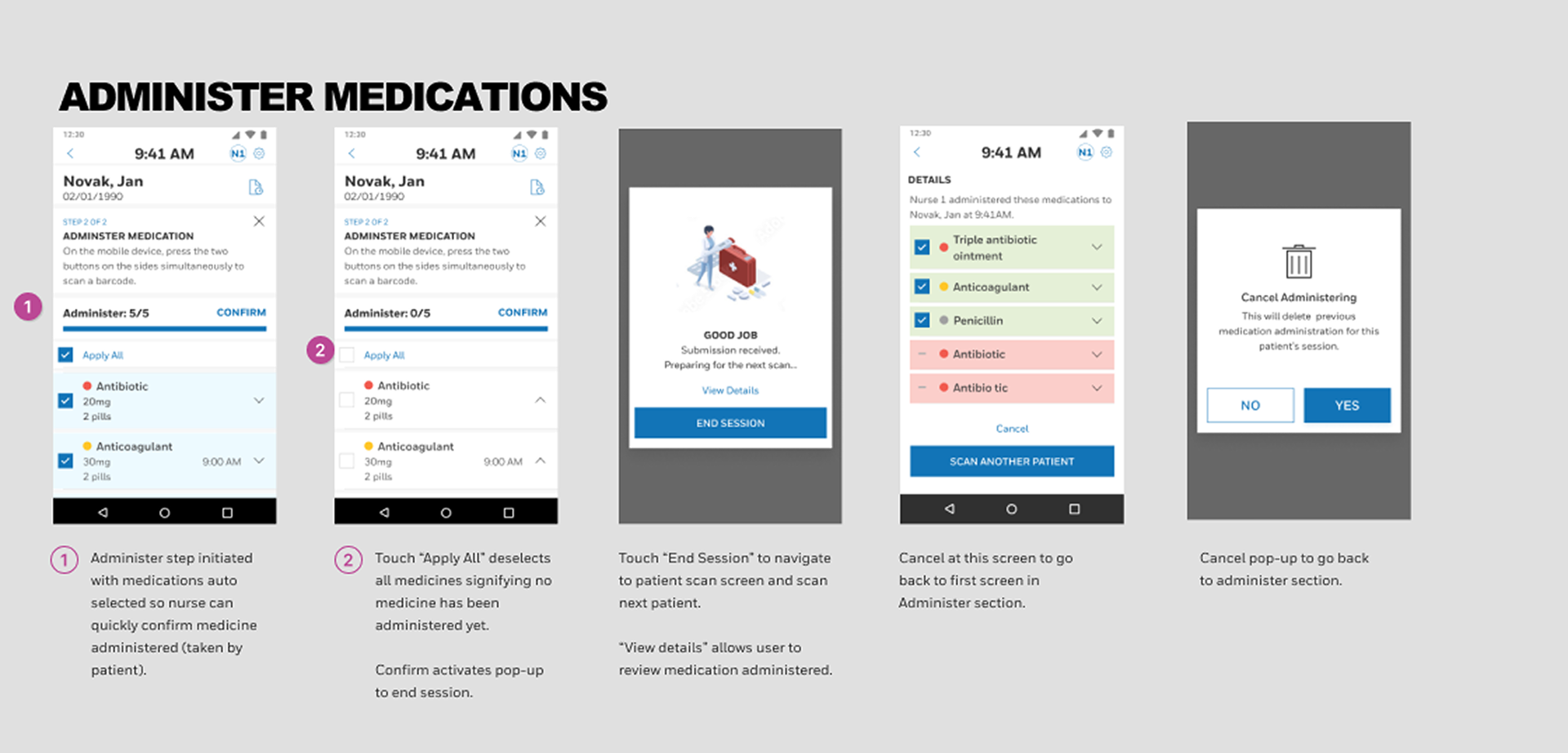
1. Meds automatically selected for administer so the nurse can be more efficient and confirm all meds taken 2. Quickly unselect if patient refuses to take the scanned medications 3. End Session confirmation and view details allows one final chance to change anything in case the patient did not take the medication
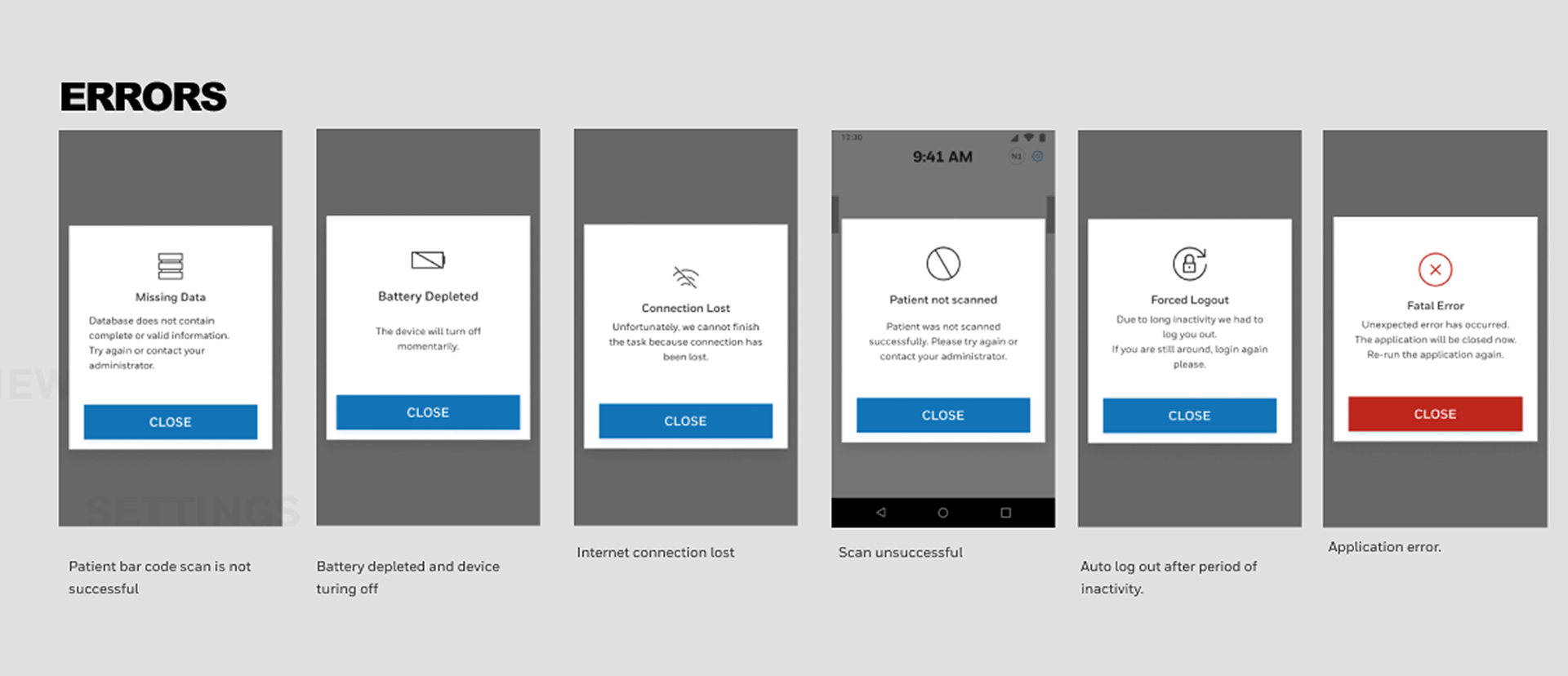
1. More descriptive error messages 2. Standard iconography and error messages
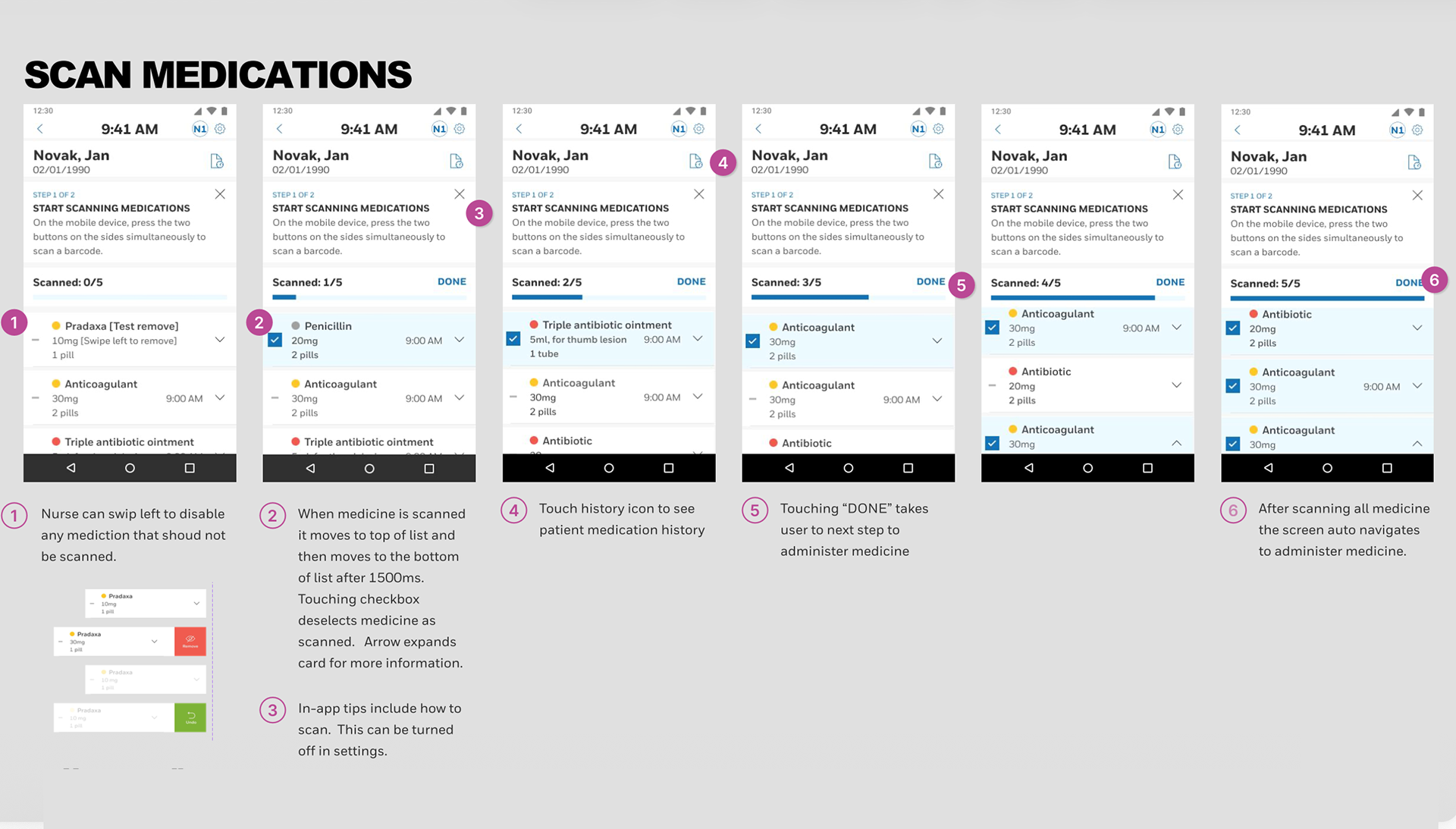
1. Linear flow with 2 main steps - Scan medications and administer medications 2. Can swipe left to disable any medication that should not be scanned.Scanned medications move to the top 3. Scan medications progress to show how many more need scanning. Nurse can correct errors by unselecting scan 4. In-app tips which can be disabled in settings 5. It’s more obvious that done takes user to next step of administration
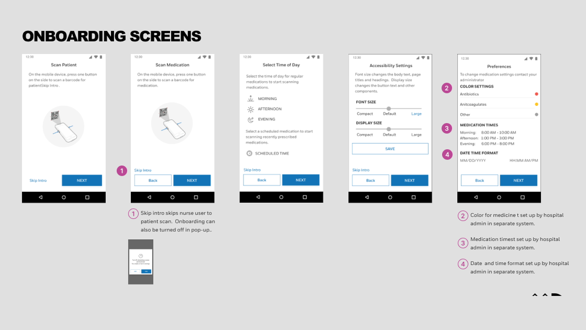
1. Instructions of how to scan for patient using the Honeywell device 2. Skip intro screen if nurse knows how to use 3. Allowed for font-size settings for older nursest 4. Color for medications is set by hospital to reduce confusion for red color or yellow color
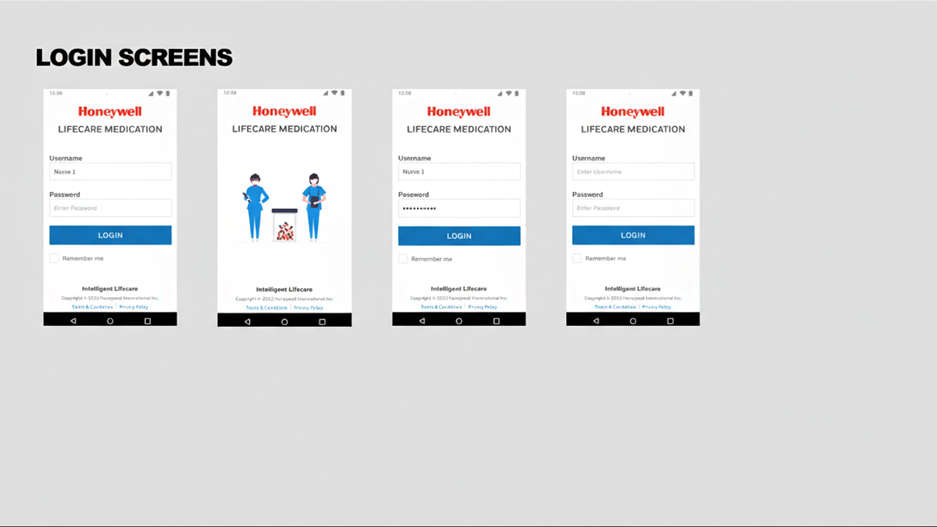
Login screens aligned to Honeywell design system
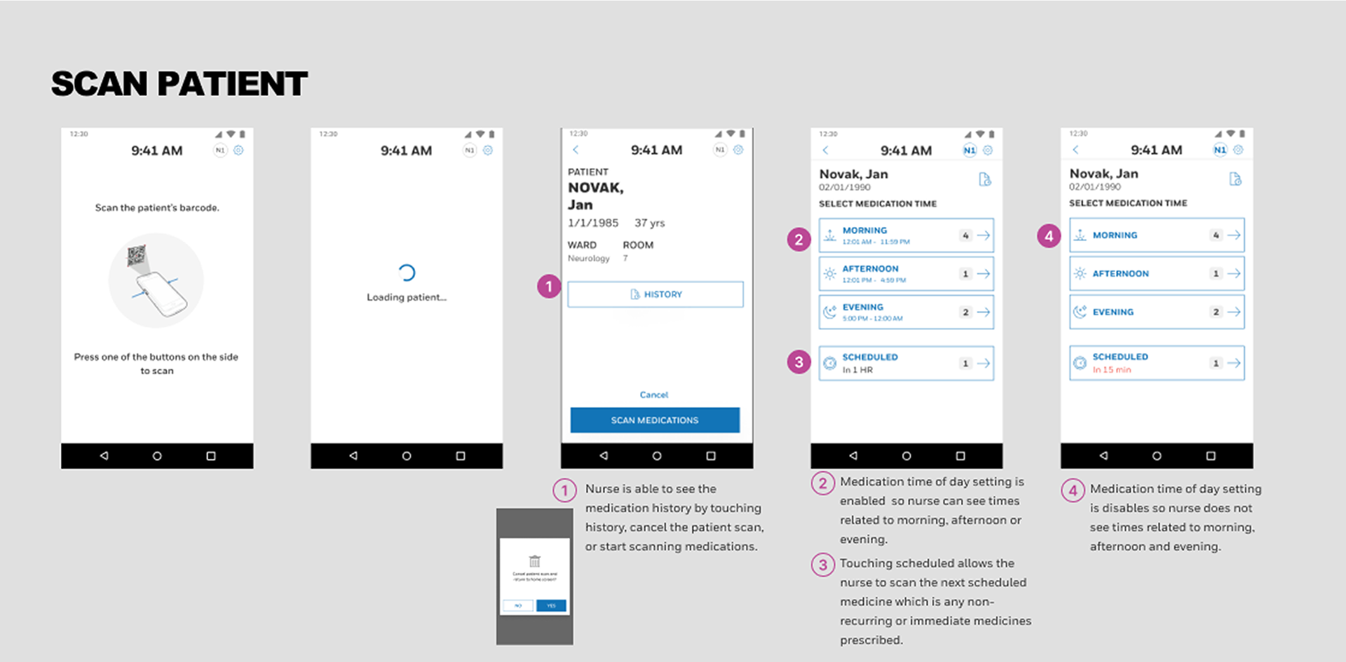
1. Nurse empowered to correct mistakes with ability to cancel patient scan, view patient history or start scanning 2. Medication times shown vs. medication times hidden 3. Scheduled is for any medication that is recently prescribed from doctor 4. Show how many medications need to be administered before touching time of day
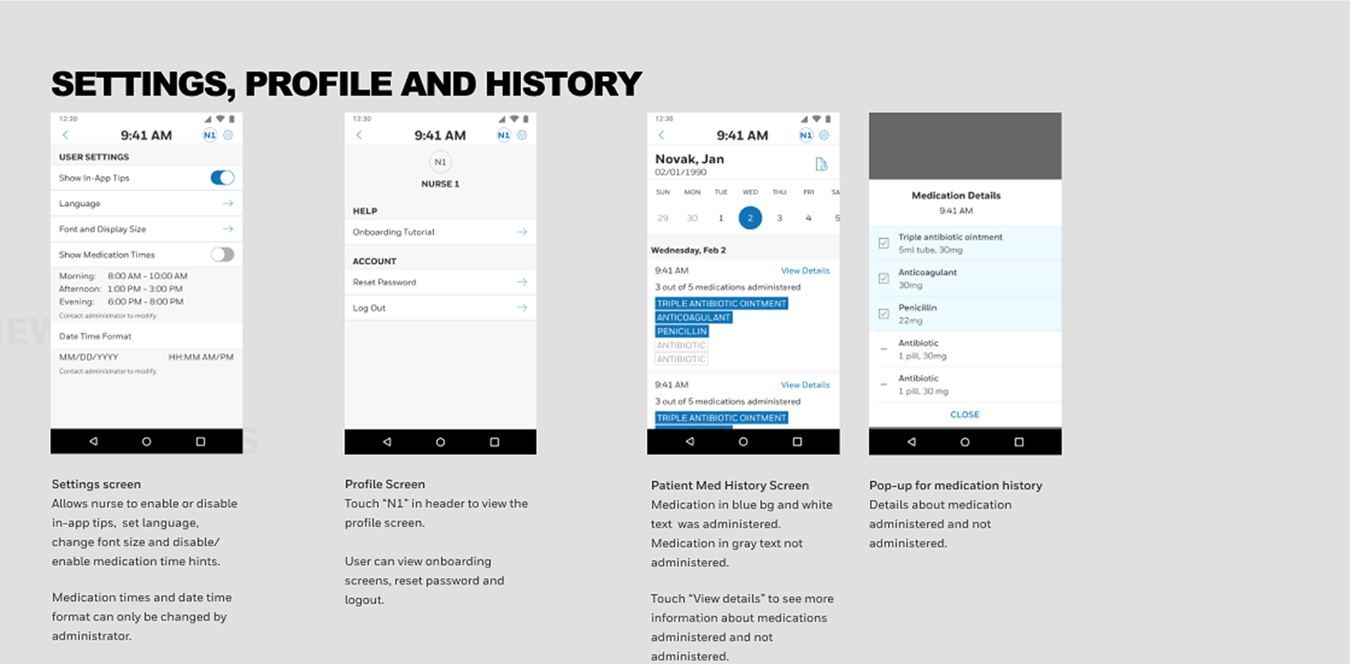
1. Enable or disable in-app tips 2. Date formats and language settings 3. Show or hide medication times in case morning means different to different hospitals 4. More obvious which medications were administered in the history
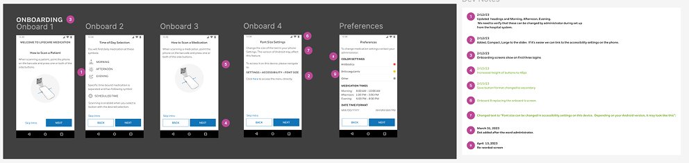
Updated documentation so developers can keep up with any changes
Design update log helped developers keep track of changes.
Prototyping and Validation
Following internal QA, an unmoderated UserTesting.com session validated the prototype against real nurse workflows:
• Task success rate: 93% completion without external aid.
• Error reduction: 2.5x fewer mis-taps compared to baseline app.
• Time on task: 28% improvement in average scan-to-confirm sequence.
• User sentiment: Participants described it as “faster,” “less stressful,” and “easy to follow.”
• Task success rate: 93% completion without external aid.
• Error reduction: 2.5x fewer mis-taps compared to baseline app.
• Time on task: 28% improvement in average scan-to-confirm sequence.
• User sentiment: Participants described it as “faster,” “less stressful,” and “easy to follow.”
Outcome
The redesigned ILC Medication App improved workflow efficiency, confidence, and compliance across hospital pilots.
Key outcomes included:
• Faster scanning performance and reduced training time.
• Higher accessibility satisfaction among staff with visual challenges.
• Consistent feedback loops through built-in help and profile tools.
• Regulatory audit readiness through documented design traceability and UI logic.
This redesign now serves as a benchmark for Honeywell’s future Life Care UX standards.
Impact
The ILC Medication App redesign directly improved nursing efficiency, accuracy, and confidence during medication administration — a critical, high-stakes task in healthcare operations.
• Error reduction: The simplified, linear workflow decreased scanning and documentation errors during validation testing.
• Speed: Average scan-to-confirm time improved by 28%, helping nurses complete rounds faster and with fewer interruptions.
• User trust: Post-test interviews reported that nurses “felt more confident the device was doing the right thing,” indicating stronger adoption likelihood.
• Accessibility: Font scaling and larger touch targets made the system inclusive for nurses with visual strain or working under bright lighting conditions.
“It’s much easier to follow — I don’t feel like I’ll lose my place.”
— Nurse feedback from UserTesting.com session
— Nurse feedback from UserTesting.com session
Reflection
Designing for clinical safety taught me that simplicity is an ethical imperative in healthcare. Every decision—spacing, timing, label—can impact a nurse’s confidence and a patient’s safety.
I learned to:
• Translate real-world urgency into clear, reliable flows.
• Balance compliance and usability through documentation rigor.
• Use UserTesting.com feedback loops to validate clarity before code.
• Translate real-world urgency into clear, reliable flows.
• Balance compliance and usability through documentation rigor.
• Use UserTesting.com feedback loops to validate clarity before code.
The project strengthened my skill in regulated UX, blending design empathy with technical precision—an essential combination for industrial healthcare innovation.