Overview
Project name: HTRAM (Honeywell Transmission Risk Air Monitor)
Role: UX Lead
Timeline: 2021–2022 (or approximate timeframe)
Team: Cross-functional - hardware, firmware, analytics, BMS (building management) integration, business stakeholders
Mission: Design an intuitive user experience web and mobile application for a CO₂ / air-quality-based risk monitor that alerts classrooms and indoor spaces when ventilation conditions may increase airborne transmission risk of respiratory illness.
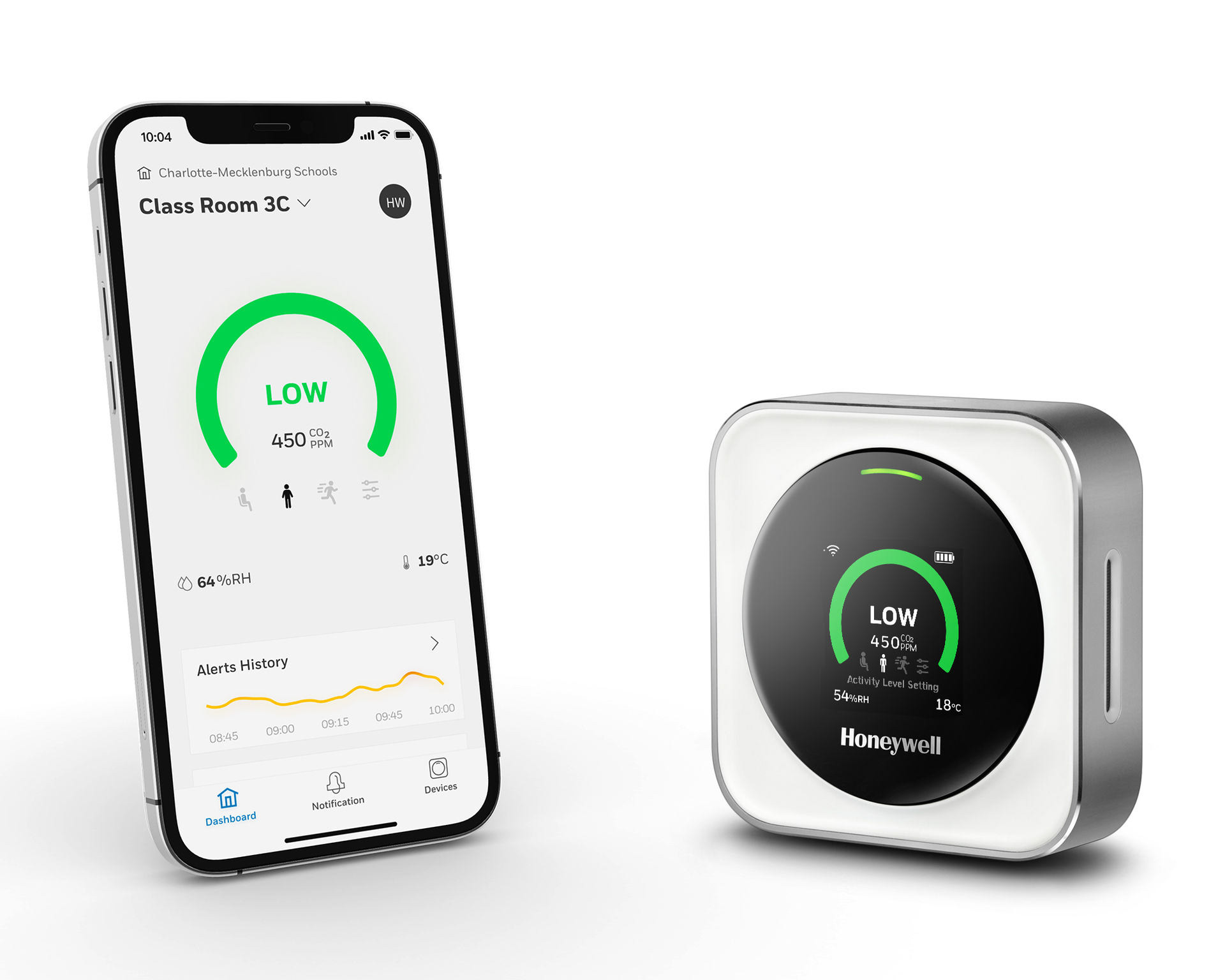
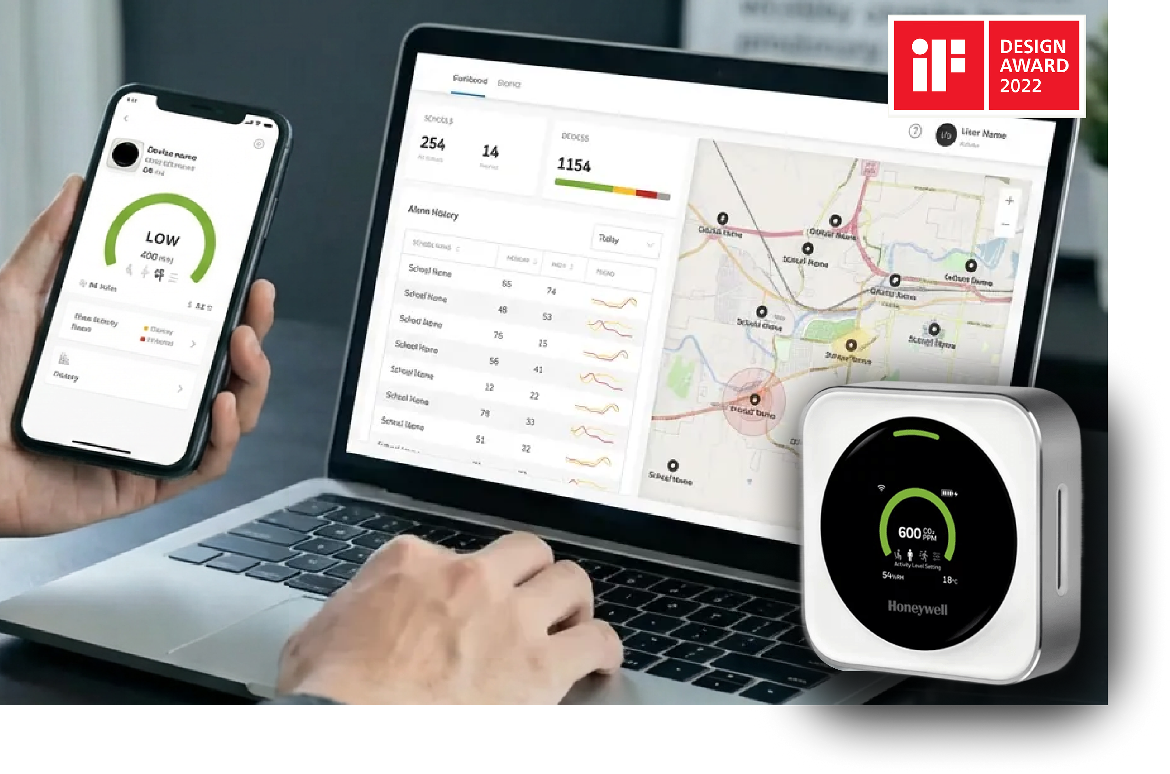
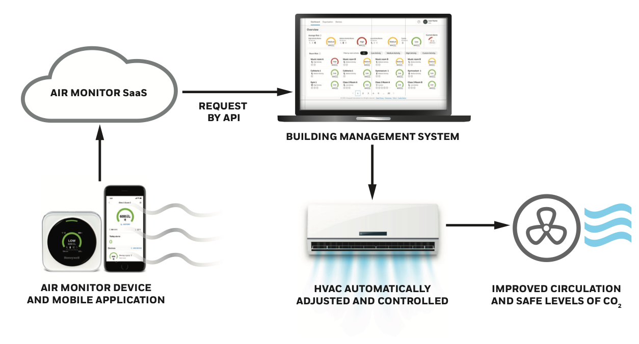
The TRAM measures CO₂, temperature, and humidity, uses three pre-programmed activity-level settings, and gives traffic light visual cues + sound alerts. It's a user-friendly monitor that alerts users when indoor air conditions may present increased risk factors” for airborne virus transmission in schools, restaurants, etc. In a Honeywell “Success Story” document, the product was integrated with the Niagara framework to automate ventilation via BMS control based on alarm thresholds.
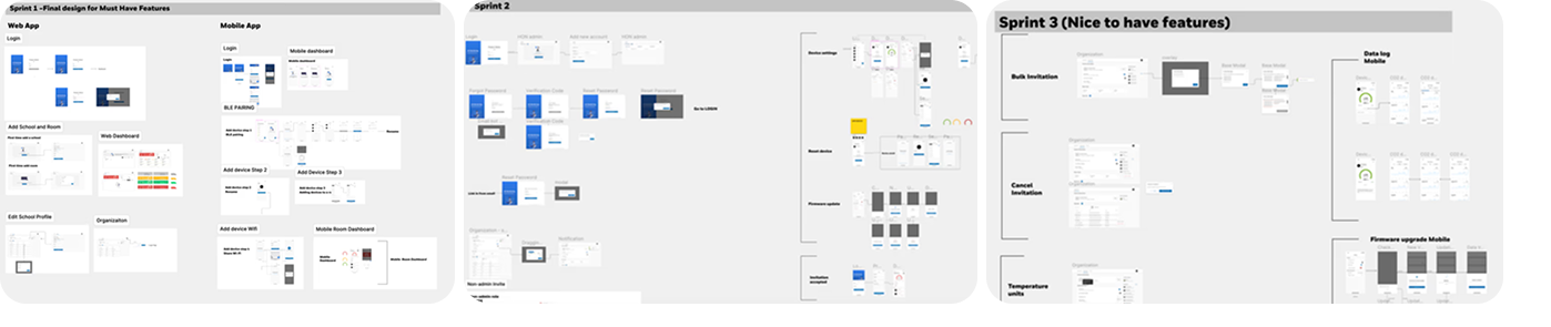
The project was organized into 4 core sprints for the initial MVO1. I worked with the global team to make sure developers core features made it into production. We were able to launch the application quickly as a result.
Value propositions
Value propositions
• Lower barrier for non-technical users (teachers, facility managers) to understand indoor air risk
• Use visual + auditory cues (traffic light, beeps) to communicate alerts that are consistent with mobile and web applications
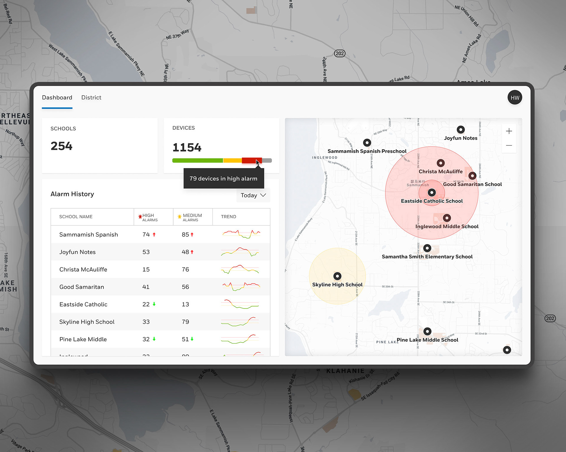
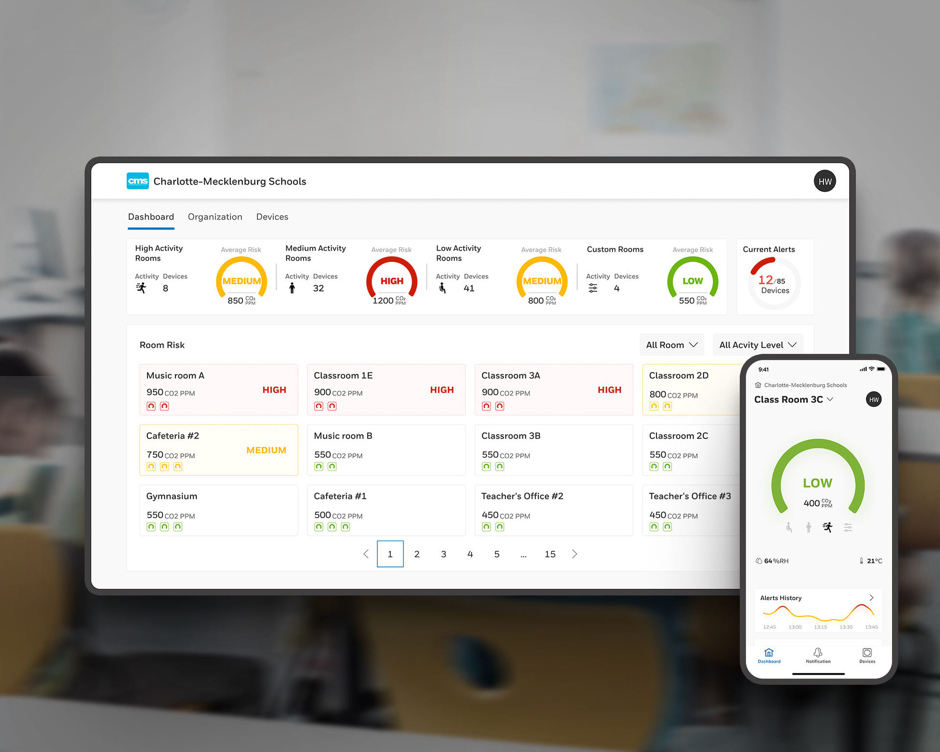
• Intuitively display average transmission risk scores at the district, school and room level
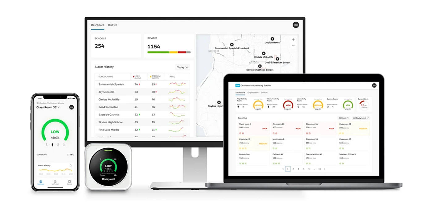
• Provide data visibility (dashboard, mobile app) for multi-device monitoring
• Enable integration with HVAC / BMS for automated mitigation
• Use visual + auditory cues (traffic light, beeps) to communicate alerts that are consistent with mobile and web applications
• Intuitively display average transmission risk scores at the district, school and room level
• Provide data visibility (dashboard, mobile app) for multi-device monitoring
• Enable integration with HVAC / BMS for automated mitigation
Problem with Context
With increasing awareness of indoor air quality, schools and indoor public spaces needed simple, real-time indicators to know when ventilation was inadequate. Traditional HVAC systems are often run on schedules rather than continuously adaptive to real occupancy or CO₂ buildup.
Challenges included:
• Non-technical users understanding on-device indicators
• Designing a simple and intuitive device setup via mobile and web app
• Scaling software to adapt seamlessly for large school districts, small schools and various room types
• Integrating with building systems (HVAC, BMS) for automated building response to CO2 levels
• Creating data visualizations for users unfamiliar with technical metrics
Research & Discovery
As UX Lead I helped conduct:
• User & stakeholder interviews with facility managers, teachers, school administrators — to understand their expectations, constraints, and workflows (preferences for visualizing and understanding data, how they would act on alerts with students in the room, setup the device with wifi and bluetooth).
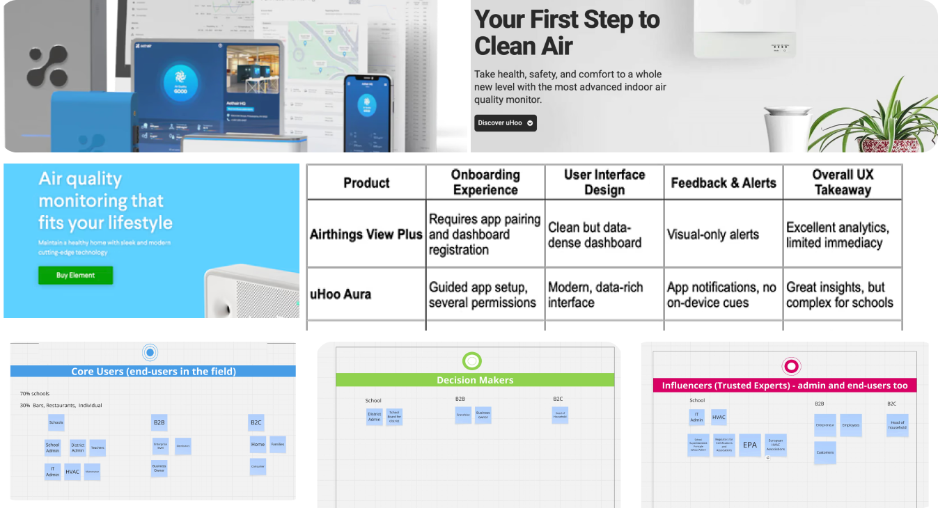
• Competitive / comparative analysis by examining existing air-quality monitors, CO₂-based ventilation tools, and dashboards (e.g. Airthings, IQAir, other IAQ devices) and their UI/UX — to understand how effectively people interpret alerts, color coding, dashboards, data vs. simplicity tradeoffs.
• Sensor & data domain research by working closely with hardware / firmware teams to understand sensor accuracy, alarm thresholds, algorithms for transmission risk and wifi network integration limitations.
• Technical constraints & edge case identification of offline scenarios, battery life, connectivity issues.
• Heuristic & accessibility audit to ensure visual alerts (traffic light colors) on device are supported with redundant cues (icons, text, beeps) on desktop and mobile app so color-blind or low-vision users are accommodated.
• User & stakeholder interviews with facility managers, teachers, school administrators — to understand their expectations, constraints, and workflows (preferences for visualizing and understanding data, how they would act on alerts with students in the room, setup the device with wifi and bluetooth).
• Competitive / comparative analysis by examining existing air-quality monitors, CO₂-based ventilation tools, and dashboards (e.g. Airthings, IQAir, other IAQ devices) and their UI/UX — to understand how effectively people interpret alerts, color coding, dashboards, data vs. simplicity tradeoffs.
• Sensor & data domain research by working closely with hardware / firmware teams to understand sensor accuracy, alarm thresholds, algorithms for transmission risk and wifi network integration limitations.
• Technical constraints & edge case identification of offline scenarios, battery life, connectivity issues.
• Heuristic & accessibility audit to ensure visual alerts (traffic light colors) on device are supported with redundant cues (icons, text, beeps) on desktop and mobile app so color-blind or low-vision users are accommodated.
Ideation, Workflows & Prototyping
During this phase I helped plan MVO1 sprints that included:
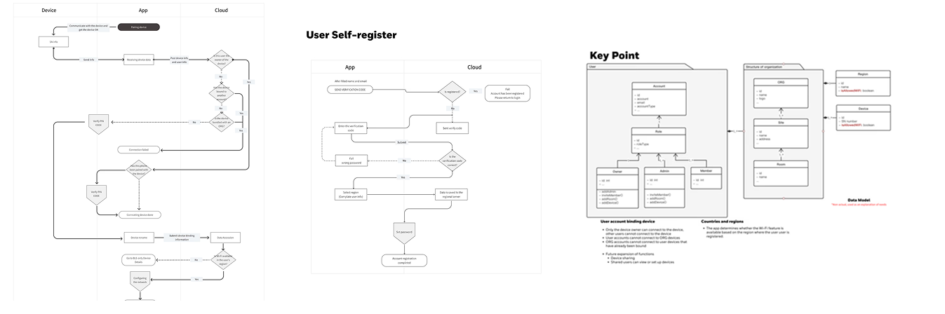
• Workflows for adding a device by Bluetooth for brand new devices without an owner, device access requests from users that don't have permission, device access requests from users that do have permission.
• Workflow for Honeywell admin enabling an admin to self-register a school and finally a workflow for an owner to share with another user.
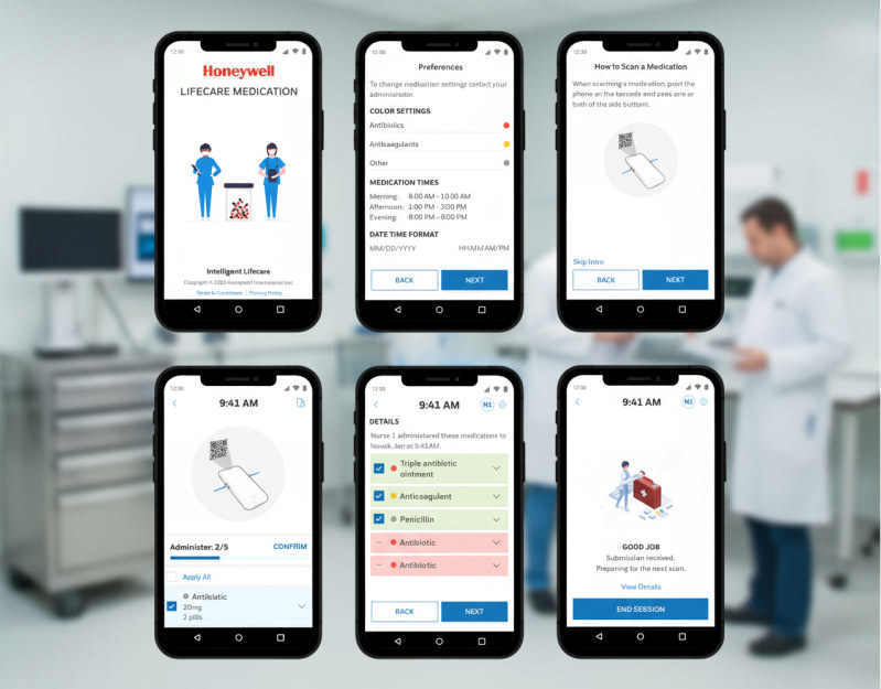
• Hifi designs that for device screen UI, mobile app setup with BLE, web dashboard setup, and school/room/device setup screens. These took place during sprints 1-4.
• Alerts that include visuals both on device and on app for green / yellow / red states with icons and text consistency.
• Onboarding / configuration flows demonstrating how a user sets the activity mode, links the device to a network, assigns room names and activity type
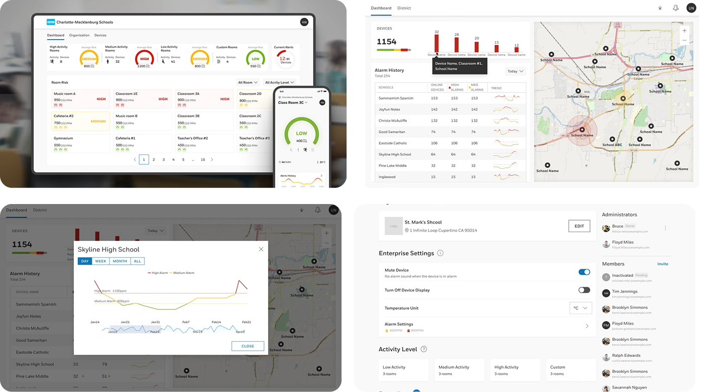
• Dashboard designs for multi-device monitoring (across classrooms, schools, devices) with trend graphs, alarm logs, filtering device types and room types.
• Prototypes for usability testing as well as interactive flows for configuring a device, interpreting an alert, and taking action.
Validation & Testing
I conducted usability testing and validation with facility managers or education users by presenting them prototype flows (e.g. connecting device, reacting to red alert, configuring activity) that informed the following:
• Alert comprehension trials to test whether users understand what “red / yellow / green”, icons and CO2 concentration values mean as well as what action to take at each level.
• Iterations that refined iconography, data visualizations, terminology, settings and thresholds (within allowable hardware constraints).
• Integration tests that simulate alarms and confirm the user sees the expected change in dashboard/alerts.
• Edge-case validations for battery low, network dropouts, unusual occupancy patterns.
• Accessibility checks for contrast ratios, audible vs silent modes.
Design Delivery
I help plan MVO1 as I led the design of comprehensive solutions across device, mobile, and web platforms throughout sprints 1-4. We delivered:
Alert state systems — Consistent visual language for green/yellow/red states across device and app interfaces, including coordinated icons and messaging
High-fidelity interfaces — Device screen UI, mobile app with Bluetooth setup, web dashboard, and school/room/device configuration screens
Onboarding flows — Step-by-step user journeys for setting activity modes, linking devices to networks, and assigning room names and activity types
Multi-device dashboards — Comprehensive monitoring interfaces with trend graphs, alarm logs, and filtering capabilities across classrooms, schools, and device types’
Interactive prototypes — Testable flows for device configuration, alert interpretation, and response actions used in usability validation sessions
These deliverables established a cohesive design system that scaled from individual device interactions to district-wide monitoring while maintaining consistency and usability for non-technical users.
Outcome & Impact
The device shipped with a simple, widely adopted UI that non-expert users could understand and act upon.
Positive outcomes from my work included:
• Increases in school administrator trust in indoor air quality monitoring in school / public settings.
• Facility team empowerment to setup devices seamlessly with existing infrastructure.
• Proactive teacher management of airborne illness risk in the classroom without disturbing the classroom.
• Air monitoring accuracy for school administrators for a holistic depiction of transmission risk at the school and event district level.
• Brand reinforcement for broader “Healthy Buildings” messaging within Honeywell.
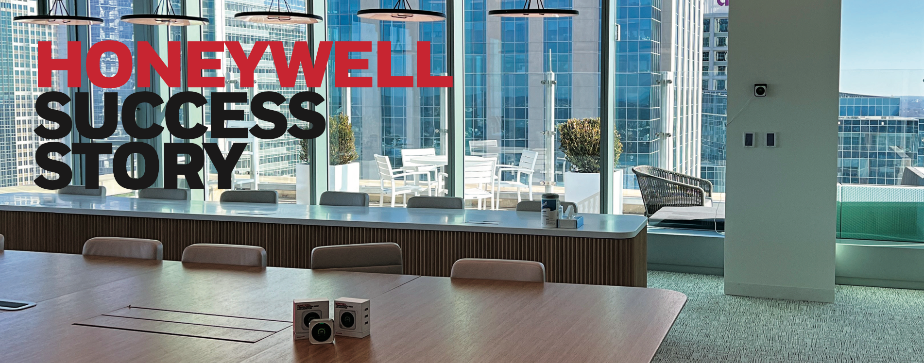
The project established foundational UX patterns for Honeywell air monitoring devices in educational environments, and the TRAM product was adopted in pilot school / building settings within Honeywell. The system’s integration with Honeywell's BMS (e.g. Niagara) allowed automated ventilation adjustments — turning red alerts into active mitigation (this is documented publicly in a press release for the Charlotte Headquarters)
Reflection & Learnings
Designing for non-technical audiences pushed me to simplify the ui and setup process. I learned the importance of consistent and redundant signaling (beeps, icons, text) in real-world alert systems both on device and on-app. Balancing data richness vs usability taught me that I can't expose too much sensor detail to overwhelm novice users. Collaboration across hardware, firmware, analytics, and building systems pushed me as a UX lead to be domain fluent This experience reinforced designing for trust, clarity, and inclusive communication in safety- and health-software solutions with IoT devices.