Honeywell Design System
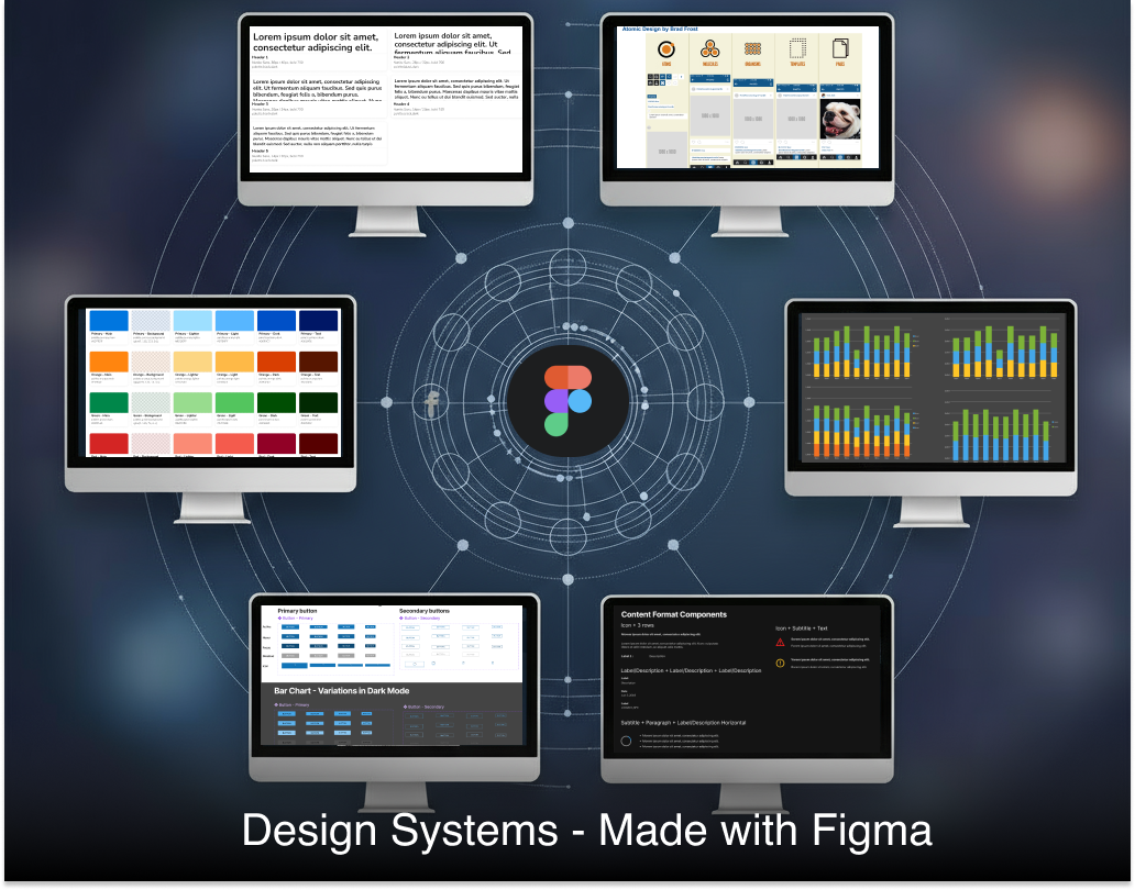
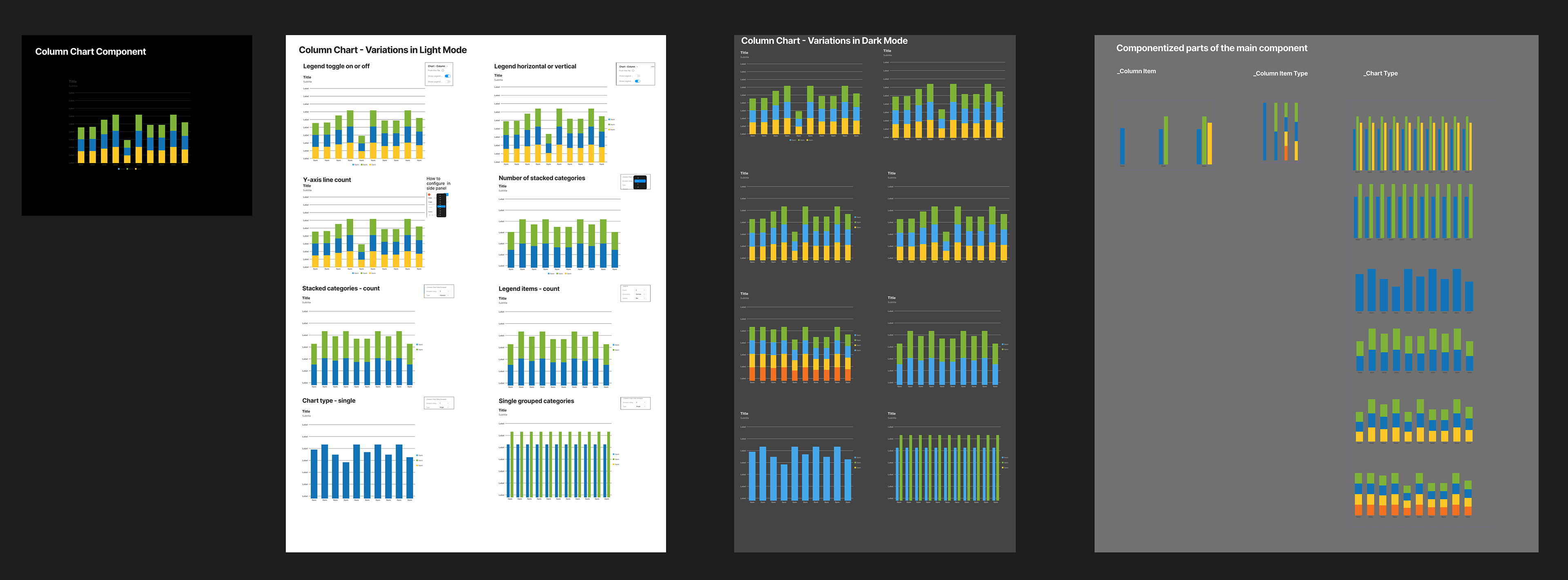
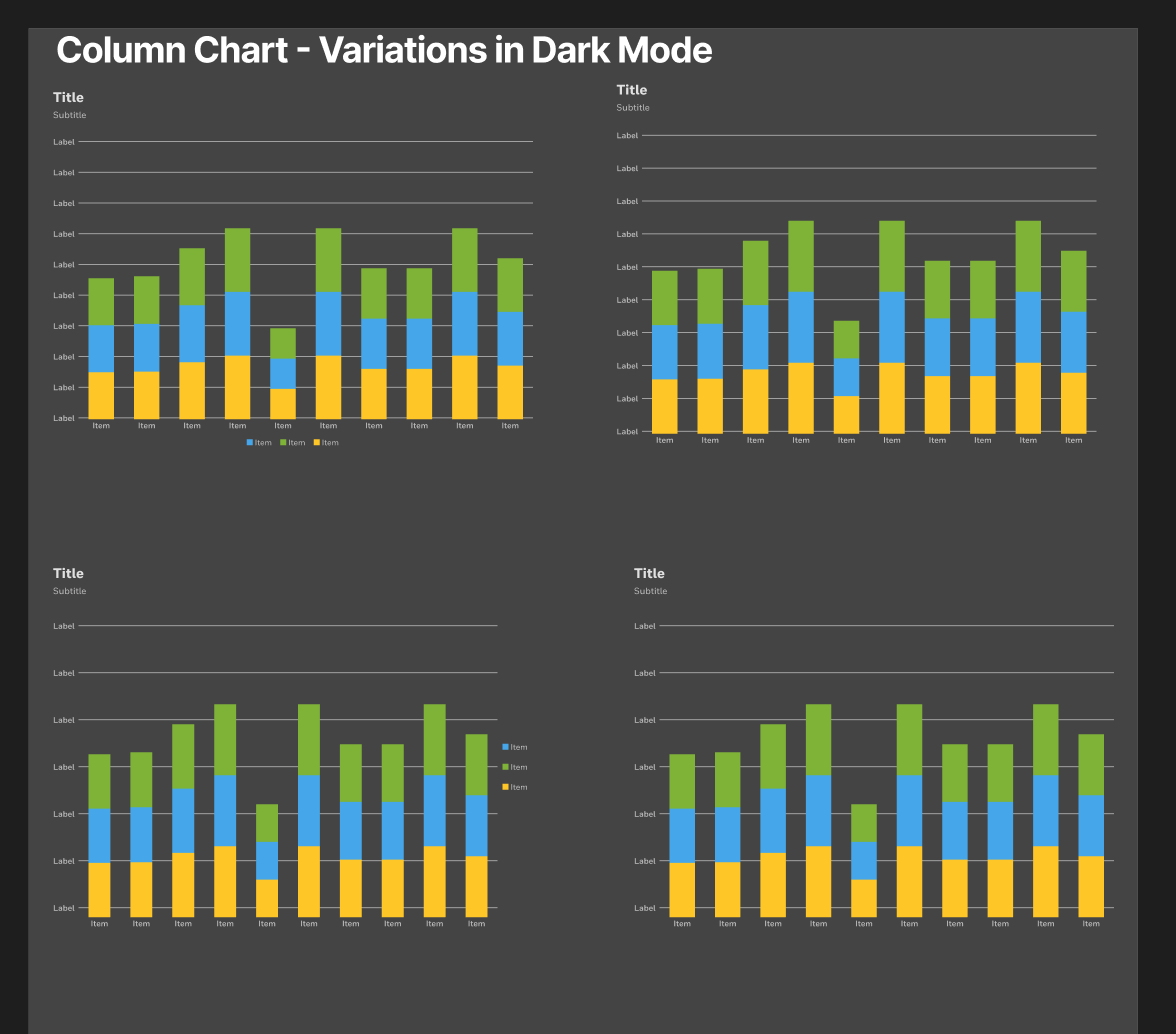
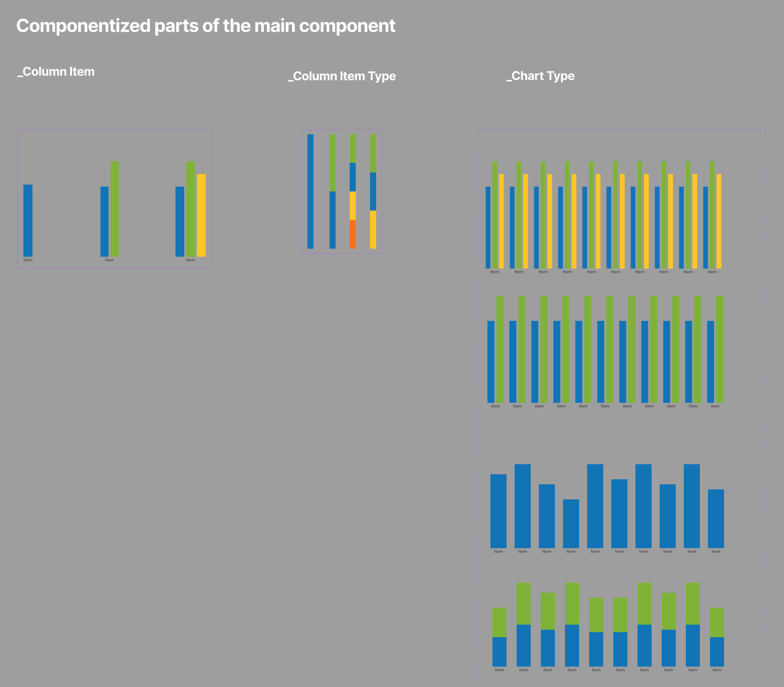
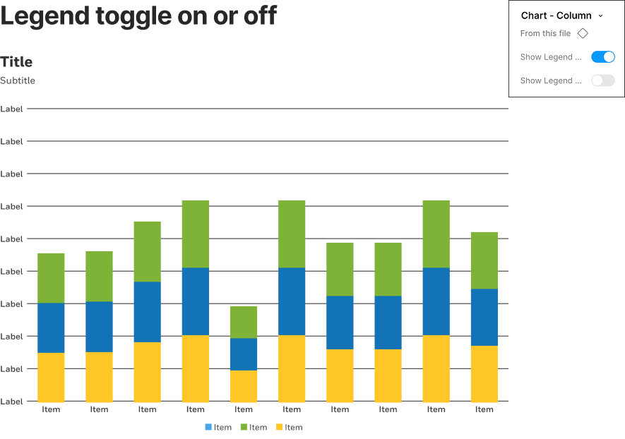
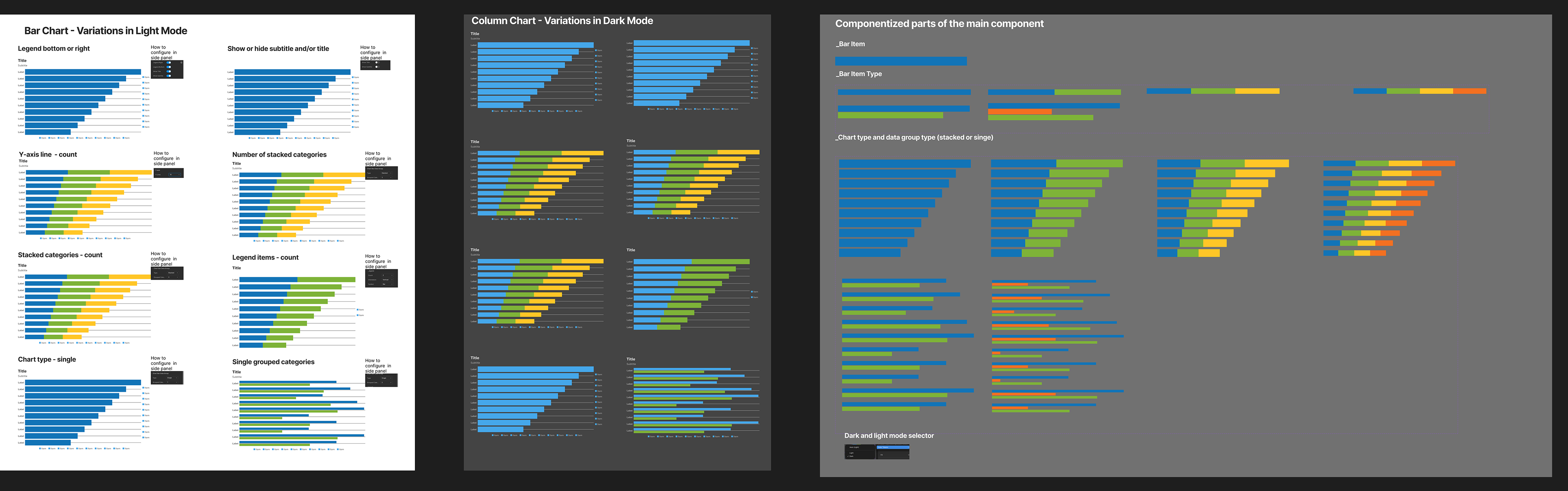
I led creation of a new Figma-based Honeywell alternate design system featuring over 500 component variations with responsive patterns, light and dark modes, and documentation across desktop, tablet, and mobile breakpoints. The “column chart” component shown here illustrates the methodology used to build this adaptable system.
Using component properties, variants, and Figma’s advanced swap-library feature (later migrated to variables), I developed a flexible, scalable system that helped transition a global team of 20+ designers to a Figma-first workflow. This initiative streamlined collaboration, improved design consistency, and ultimately saved Honeywell ~$500K over four years in licensing costs as we transitioned from Sketch/Invision/Abstract to Figma.
Gaining traction and widespread adoption
The following sections outline the process of creating, promoting, and maintaining Honeywell’s new Figma-native legacy design system. Early challenges—such as aligning global teams and migrating from legacy tools—became opportunities after demonstrating the system’s value in stakeholder meetings and team trainings. I extended core concepts from the initial rollout to onboard designers, encourage advocacy, and build confidence in the new workflow.
These efforts increased efficiencies, improved collaboration, strengthened consistency and empowered the team to share designs through a frictionless, streamlined workflow.
Note: Some images are blurred and text replaced with dashes to protect proprietary terminology.
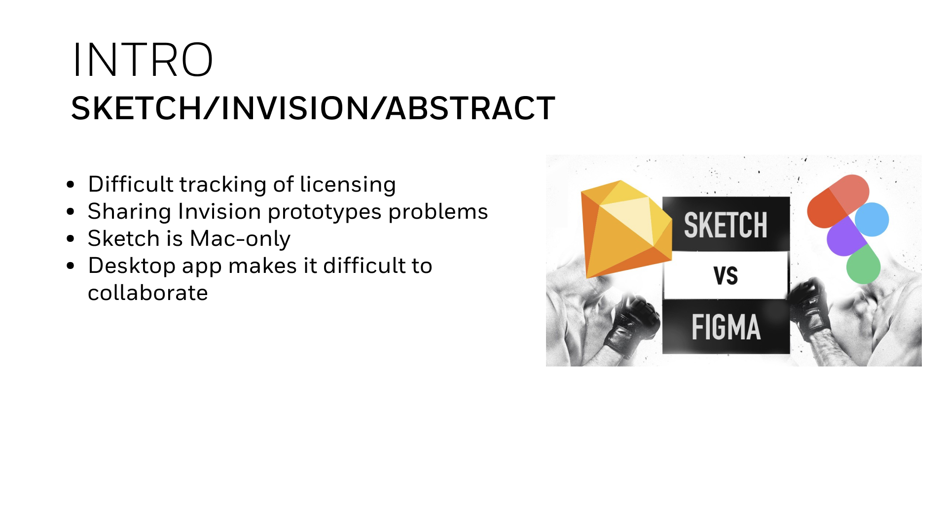
Tool Comparison and Workflow Challenges
Working with Sketch, InVision, and Abstract introduced a series of challenges—from managing multiple accounts to sharing prototypes and maintaining version control. Sketch’s Mac-only limitation and lack of cloud collaboration made cross-platform work difficult for Honeywell’s distributed teams.
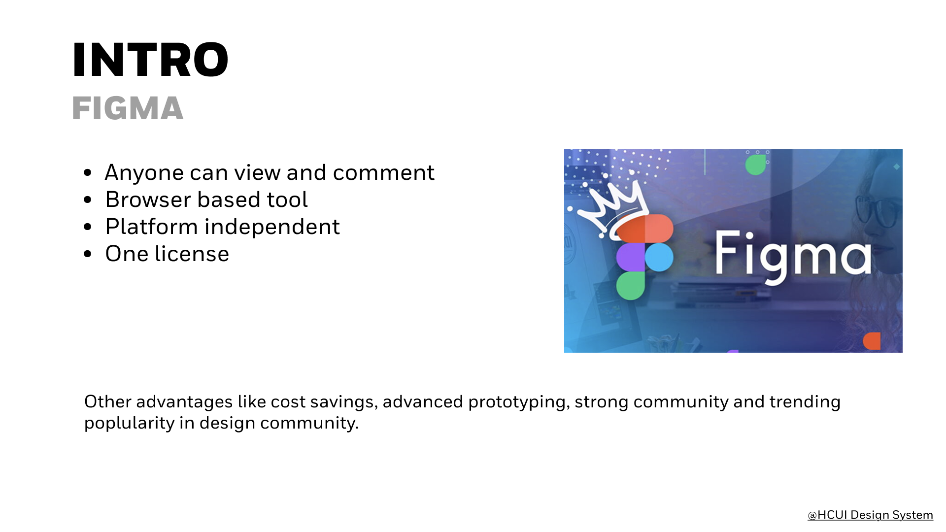
Figma quickly emerged as the clear solution with its browser-based platform, built-in collaboration tools, and all-in-one capabilities. Migrating from Sketch required careful rebuilding, as layers and components often broke during import. My expertise in both tools helped guide best practices for importing, restructuring, and optimizing the new Figma-based design system—ensuring a smooth transition and consistent component integrity.
Comparing legacy design tools revealed major collaboration and workflow gaps—prompting the shift from Sketch, InVision, and Abstract to a unified Figma environment.
I led Honeywell’s transition from Sketch to Figma, establishing a unified design workflow across global teams. The migration introduced cloud collaboration, eliminated tool silos, and set the foundation for a scalable, shared design system.
Details about the design system
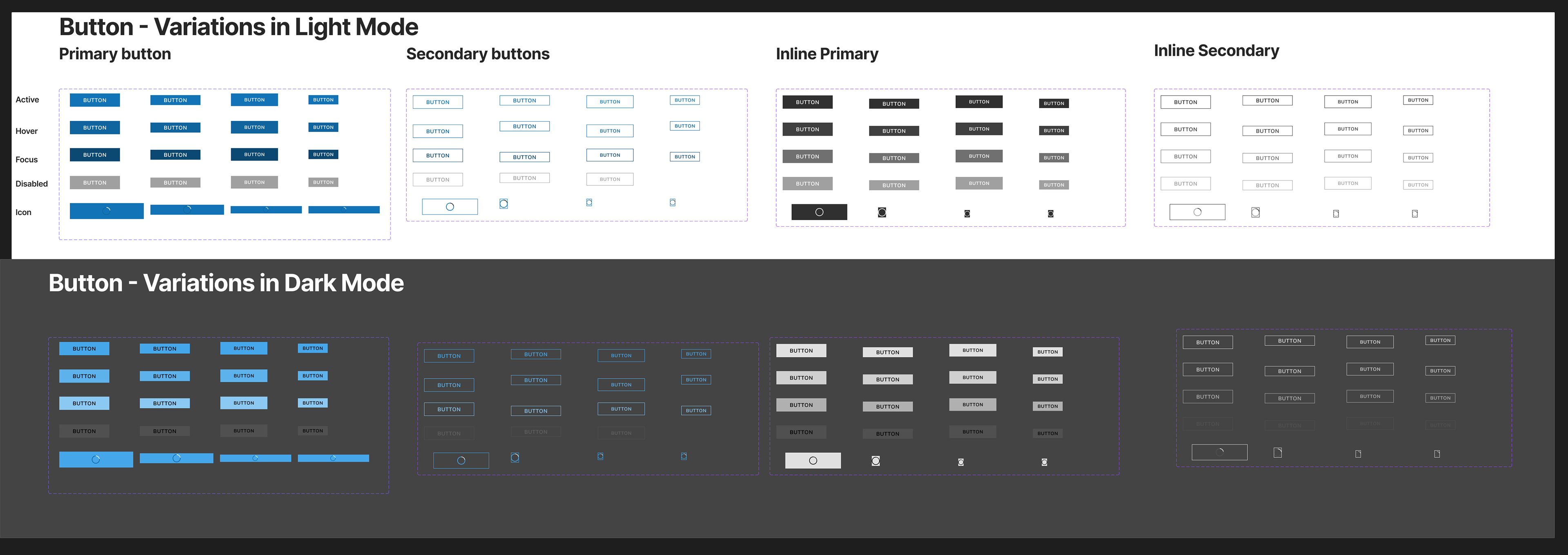
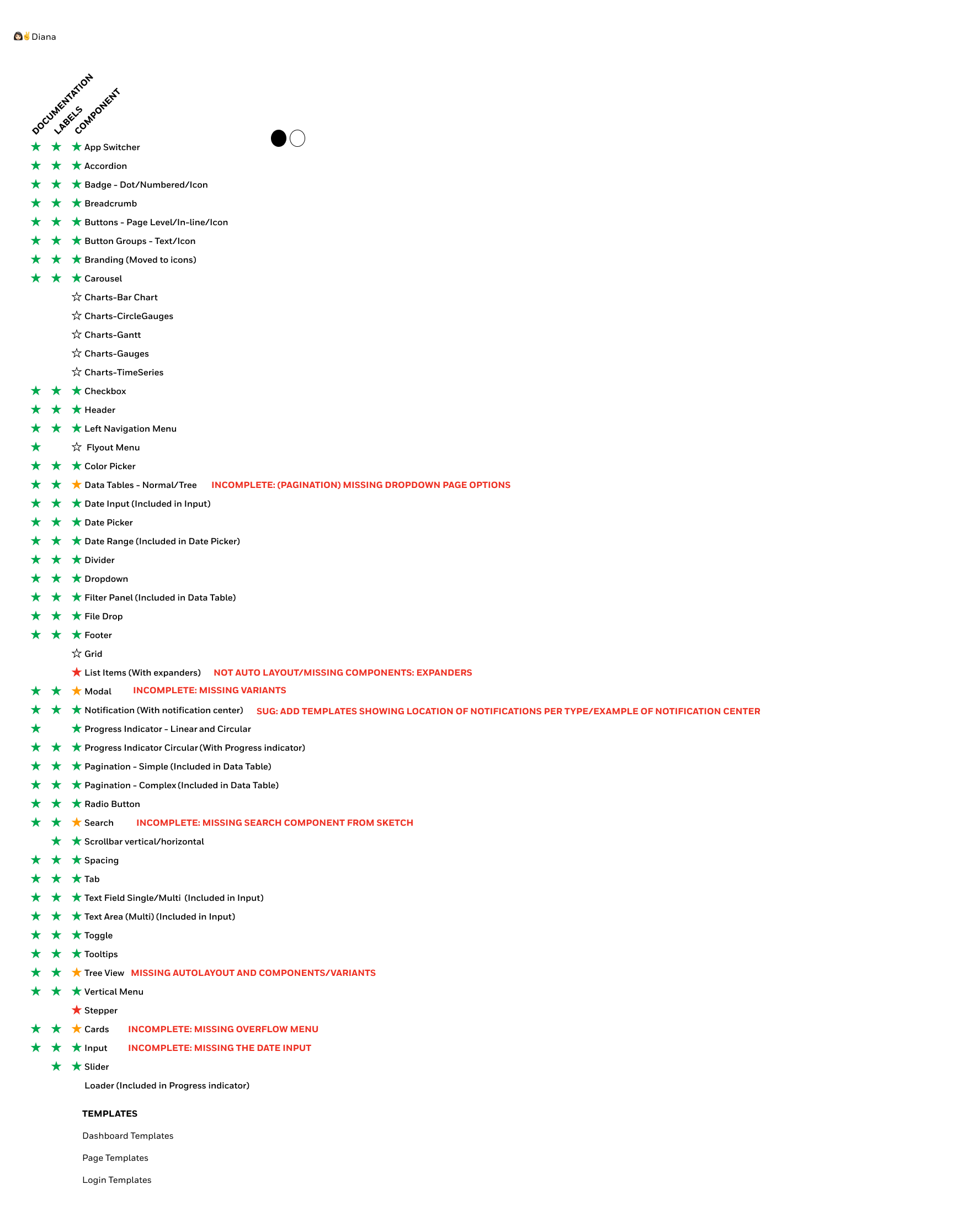
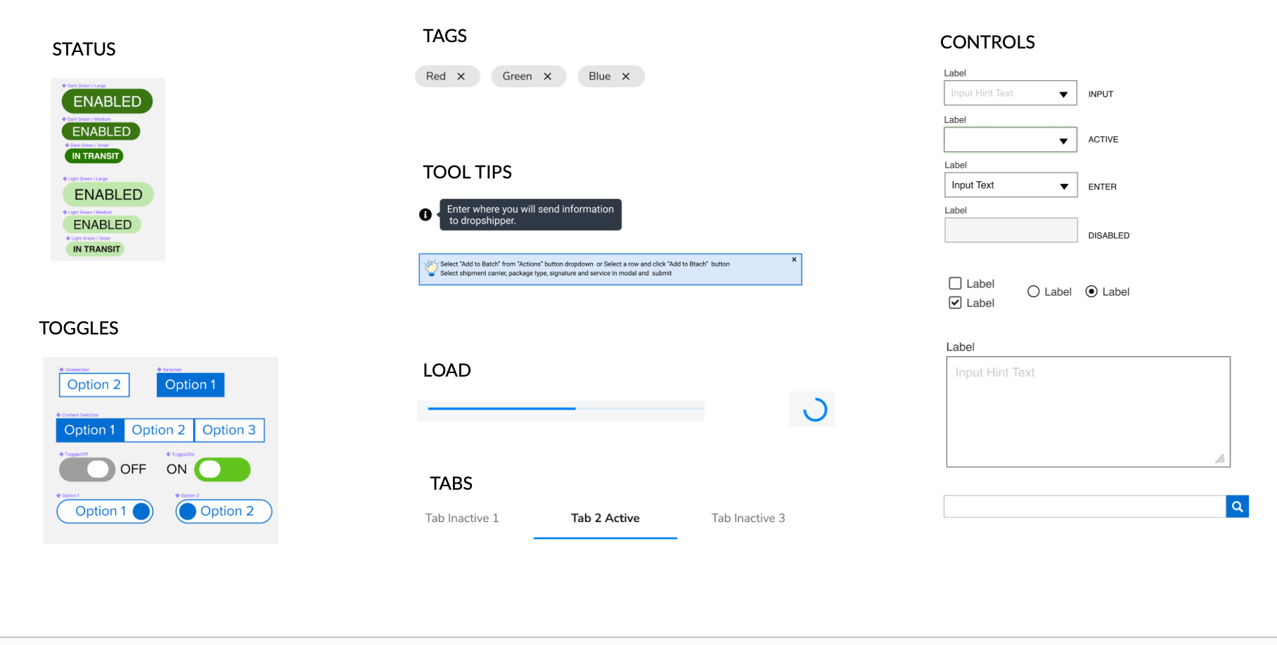
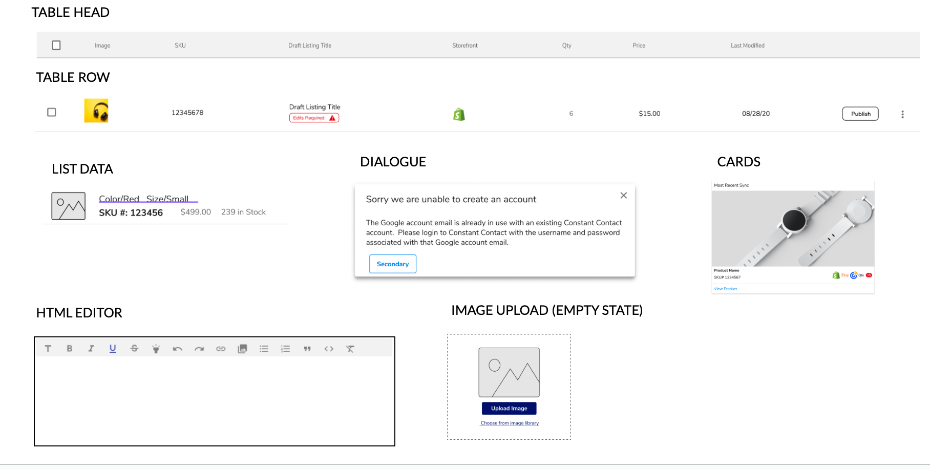
Existing components were rebuilt and enhanced to meet the evolving needs of designers across platforms. By creating flexible, versatile libraries, we reduced detached components and improved overall consistency in design execution.
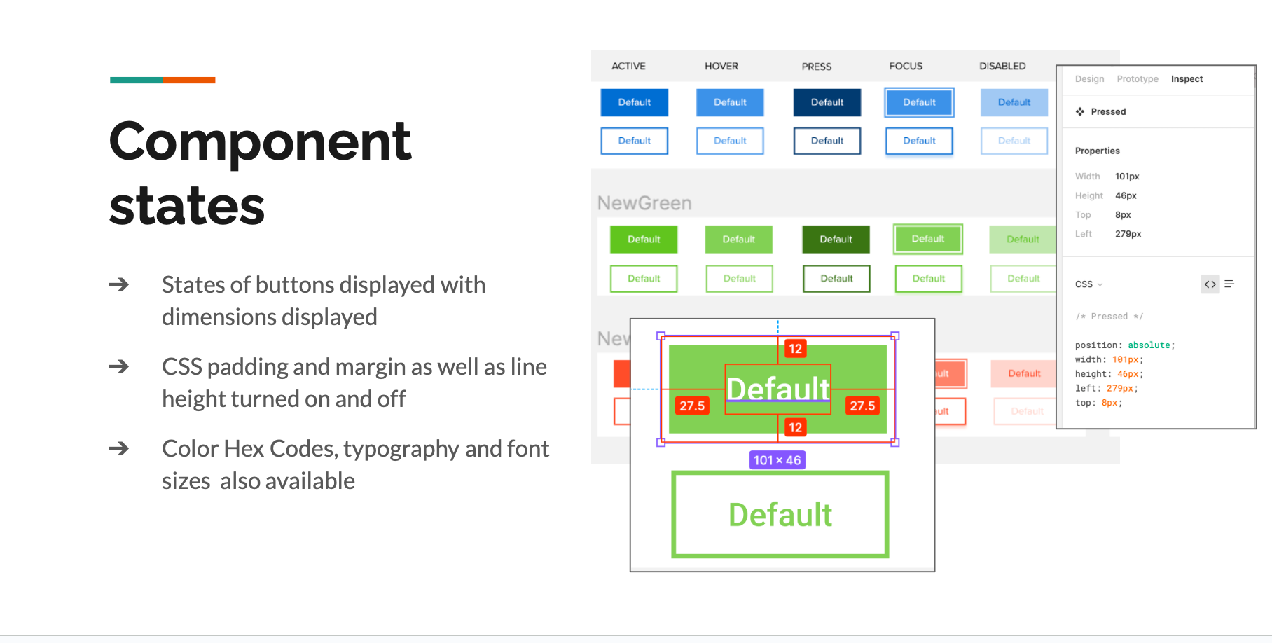
The core design system team and I introduced unified light and dark themes (prior to the release of Figma Variables), saving styles in separate libraries so designers could easily toggle between modes with a few clicks. We applied the same principle to spacing and typography—defining scalable tokens for both large and small font sizes—to ensure responsive, optimized layouts across all breakpoints.
Rebuilt core components with improved structure and responsive behavior, replacing legacy Sketch variations and unifying design patterns within Figma.
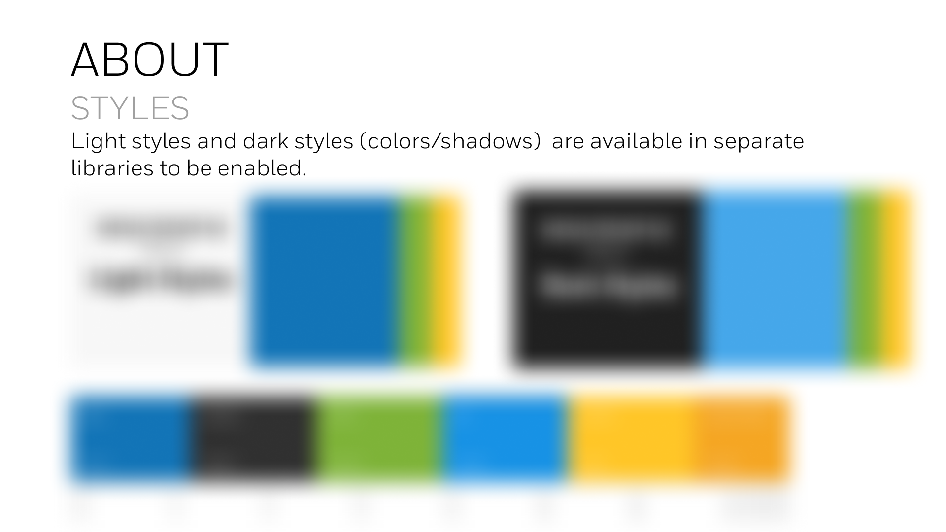
Defined consistent color, shadow, and theme libraries for light and dark modes, enabling quick toggling and maintaining visual harmony across products.
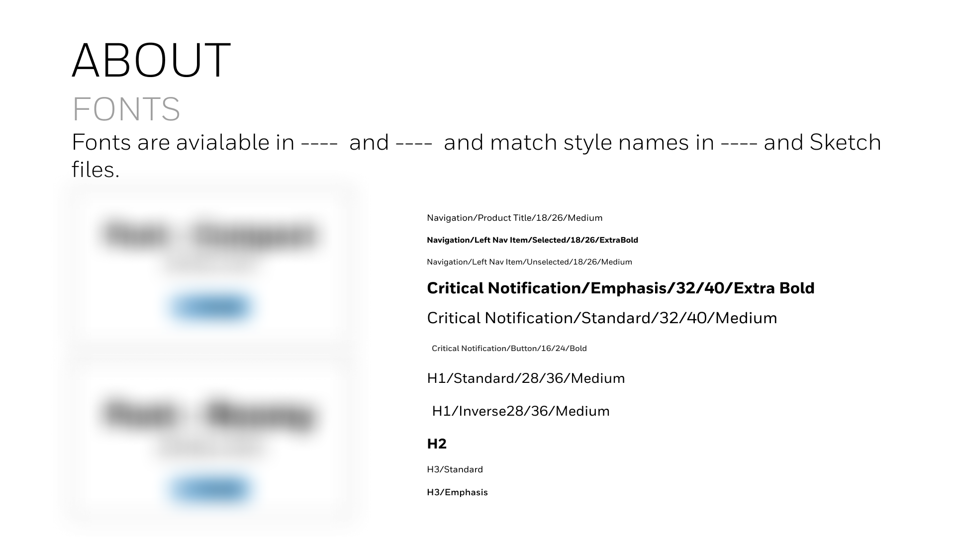
Standardized typography scale and hierarchy to match existing brand guidelines, ensuring legibility and balance across all screen sizes.
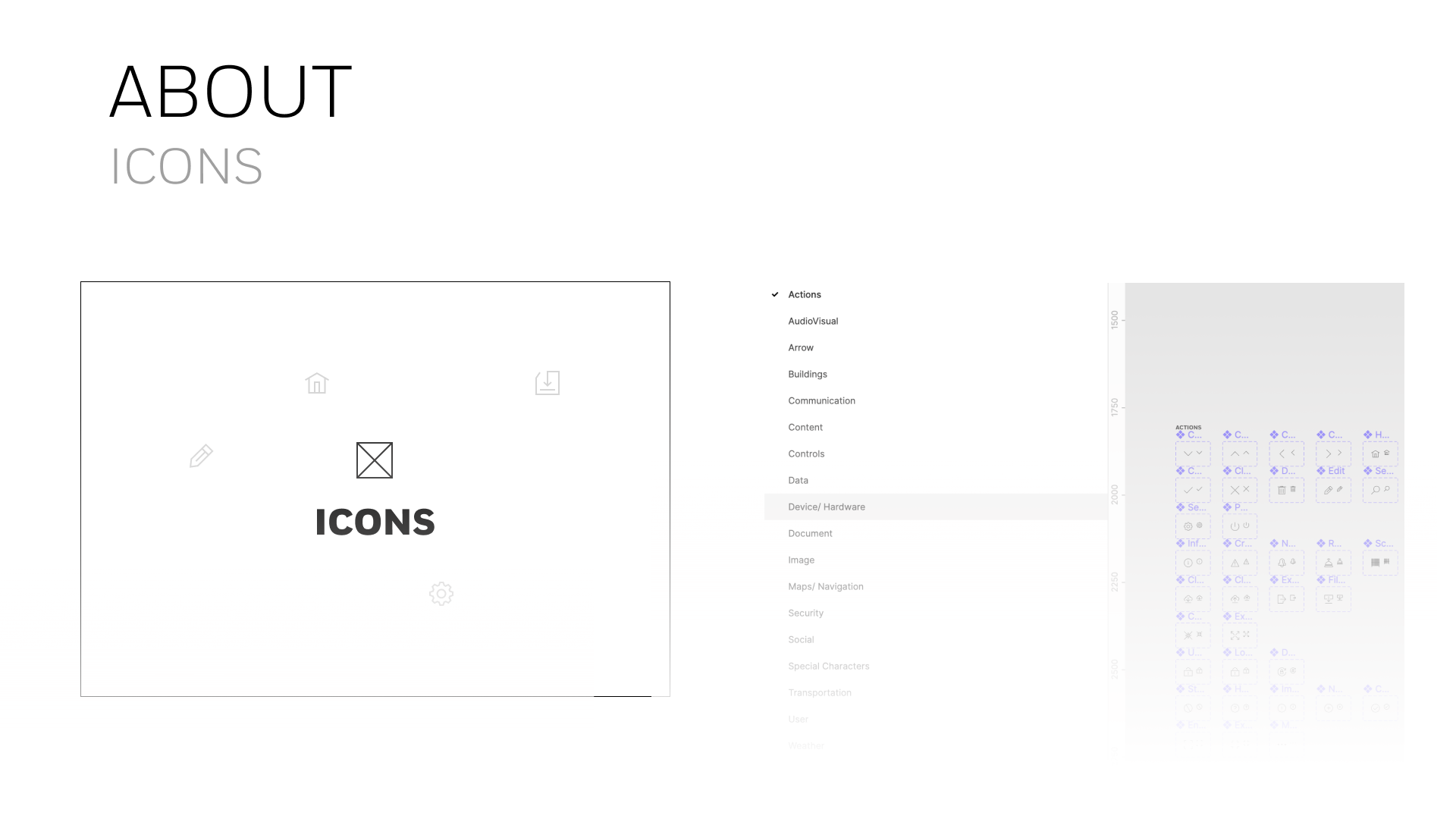
Created a unified icon library with scalable vector assets and standardized naming, simplifying updates and alignment across design and development teams.
Auto layout and annotations
Rebuilding design system components with Figma’s native features—such as auto layout—empowered designers to create responsive, scalable designs. Components could now adapt seamlessly between mobile and desktop breakpoints with minimal effort.
Additional improvements included the ability to swap libraries between light and dark modes, supported by style annotations that clarified color, type, and usage rules. These enhancements improved designer efficiency and developer alignment by making implementation details accessible directly within Figma.
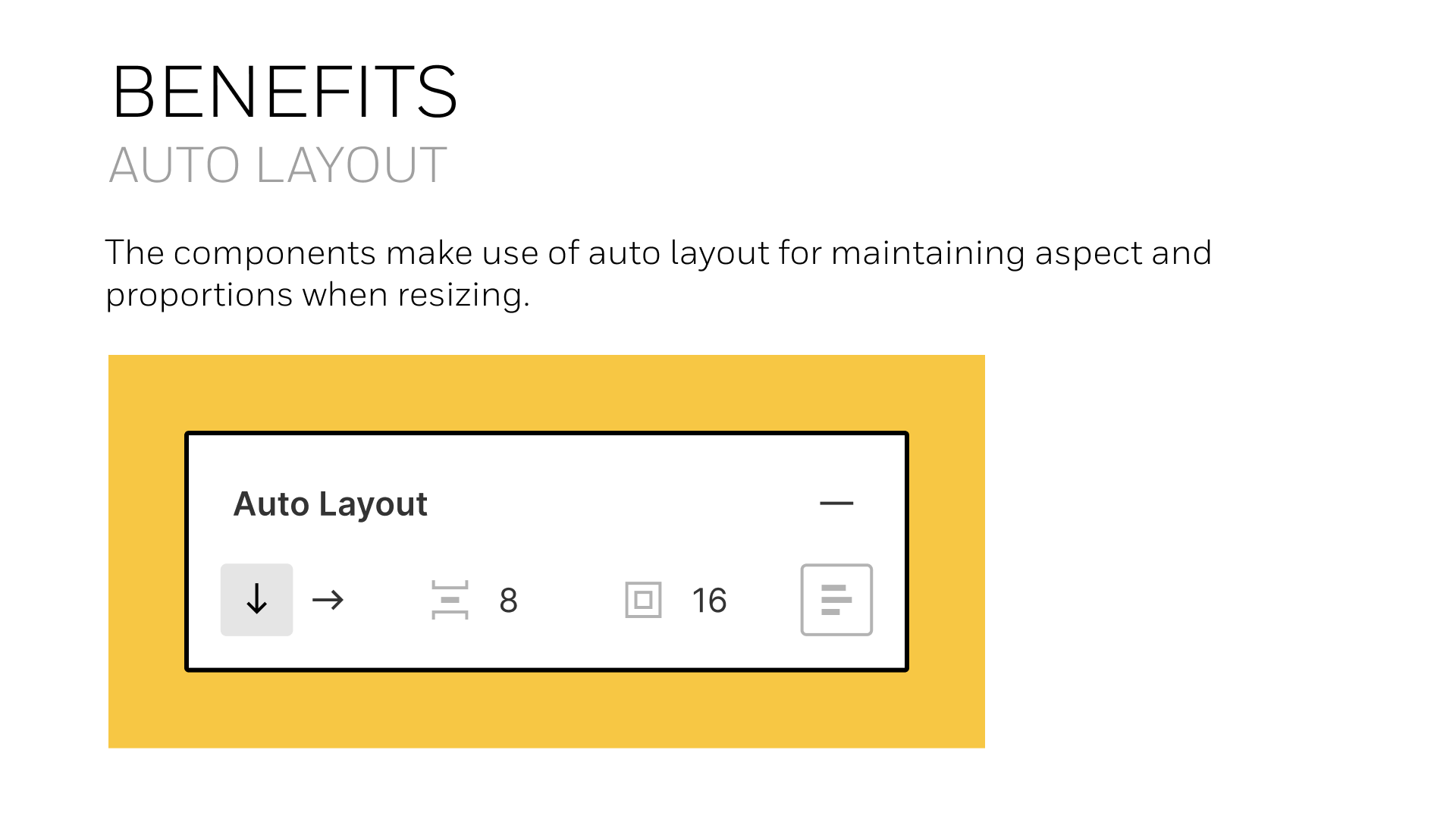
Auto layout enabled scalable, responsive components adaptable across breakpoints.
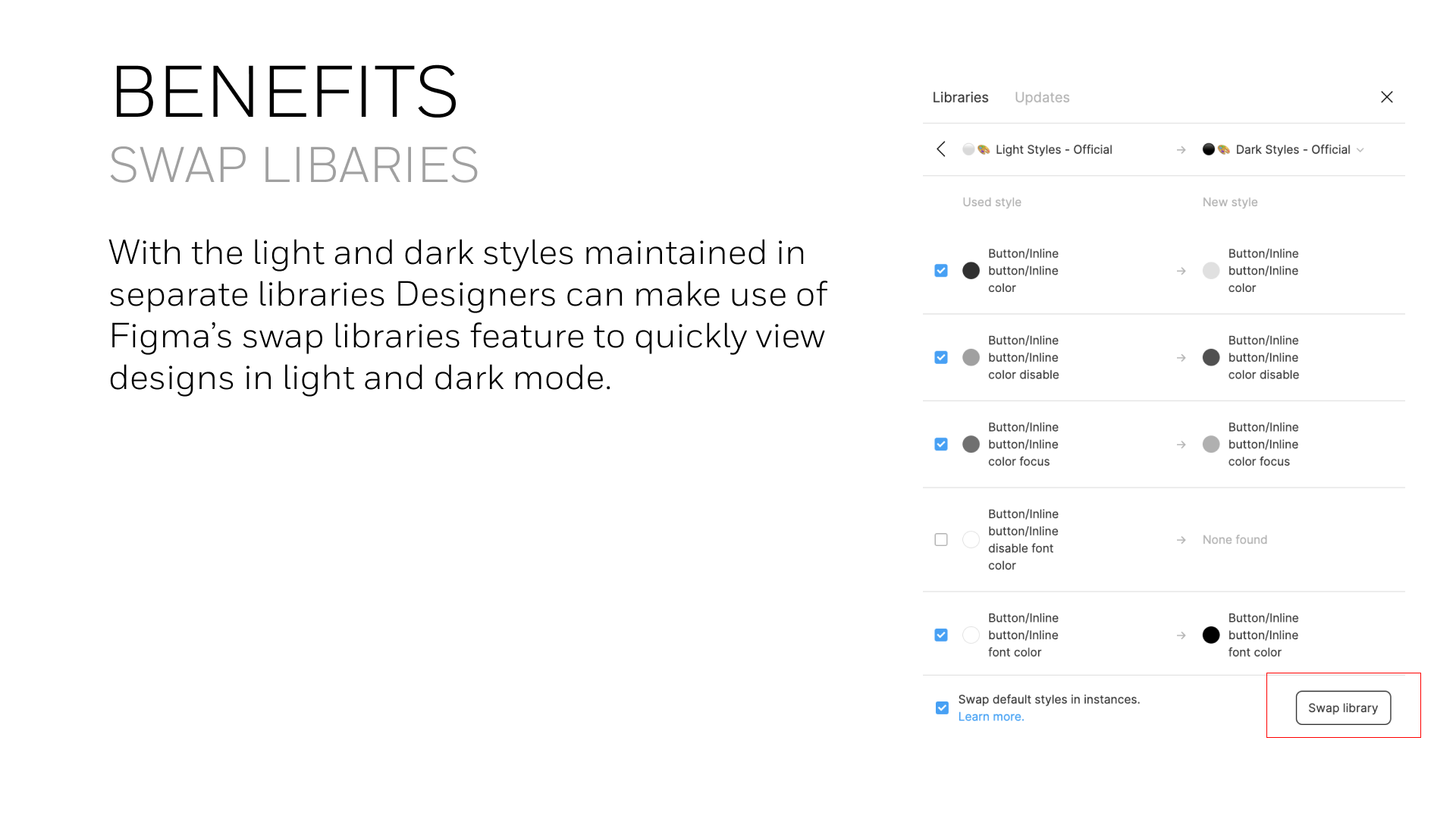
Swap libraries feature simplified switching between light and dark themes.
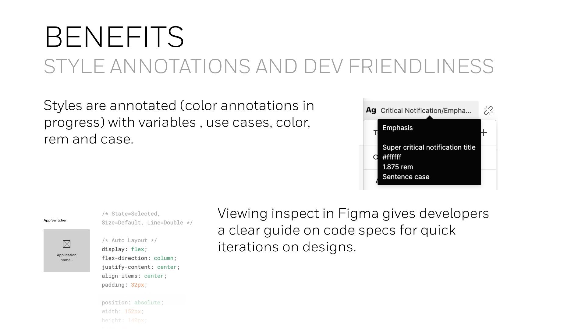
Annotations connected design intent with development specs for faster iteration.
Setup and Feedback
Building a new design system is only the first step—successful adoption requires clear guidance and continuous feedback. To ensure this, I developed training materials, setup instructions, and visual references that helped teams correctly implement the new system.
Designers could leave comments directly within Figma or through internal channels, creating a feedback loop that accelerated iteration and ensured system accuracy. This collaborative structure strengthened engagement and helped maintain design consistency across teams and regions.
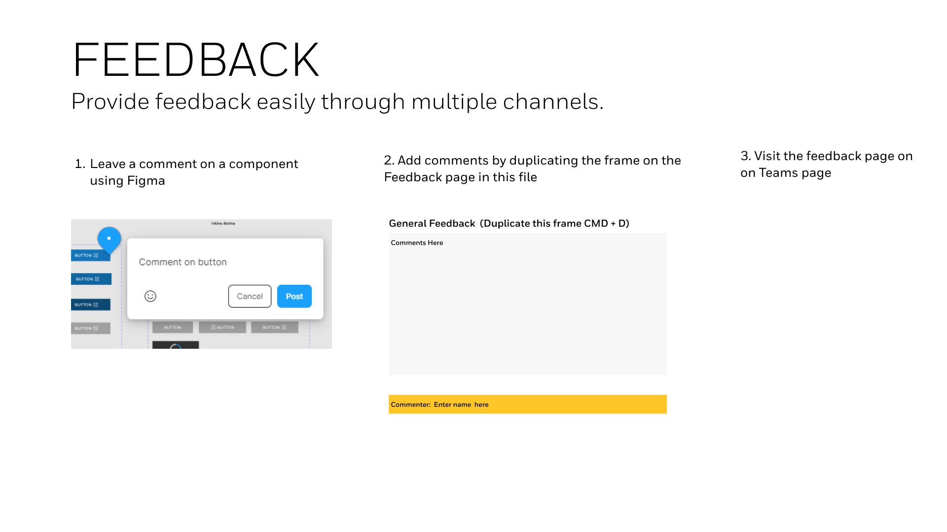
Feedback channels within Figma supported continuous system improvement.
Guided setup documentation ensured accurate implementation of libraries and styles.
Slide decks and training sessions enabled smooth adoption across design teams.
Managing the design system for the long term
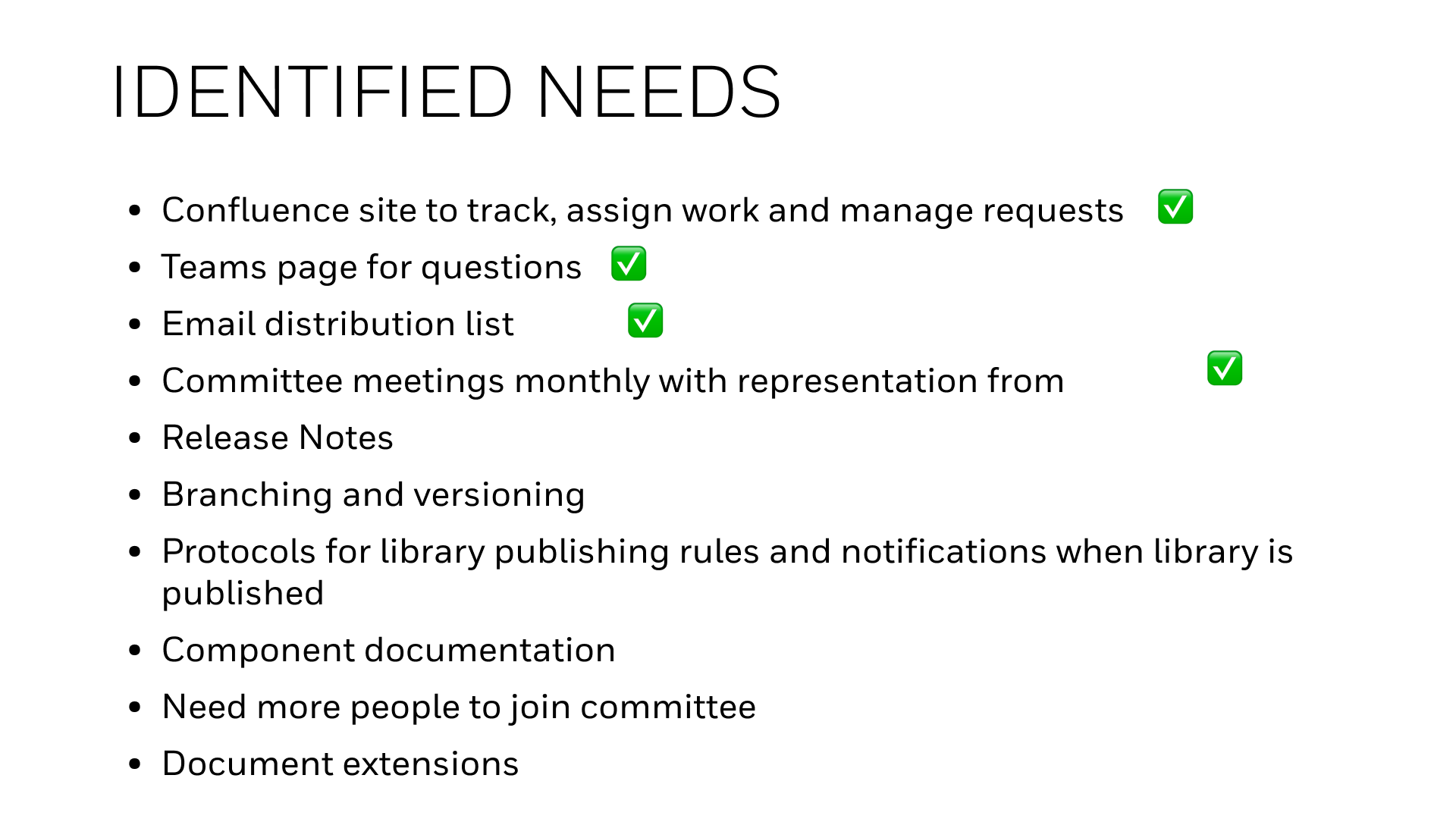
To ensure long-term adoption, our team identified future needs and established sustainable workflows for maintaining the design system. We integrated the system into existing Honeywell tools used by designers and developers, expanding participation beyond the core committee.
A dedicated Microsoft Teams group and Confluence site enabled collaboration, feedback, and version tracking, while an email distribution list ensured broad communication across global teams. The resulting governance model included regular release notes, branching and versioning protocols, publishing guidelines, and clear documentation standards—creating a foundation for scalable, ongoing evolution of the Honeywell Design System.
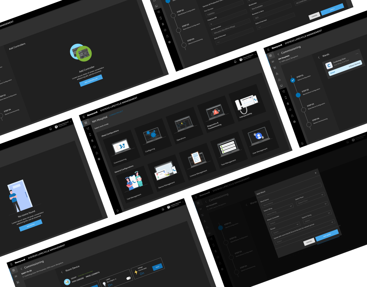
Design system for specialized interfaces
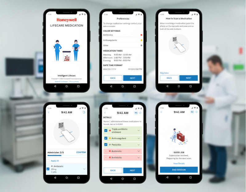
The next phase of my Honeywell design system work involved creating a specialized subset system for the Vertex gas detection platform used in high-tech semiconductor fabs. This touchscreen interface required new patterns tailored to high-containment, glove-compatible environments while maintaining alignment with Honeywell’s enterprise design standards.
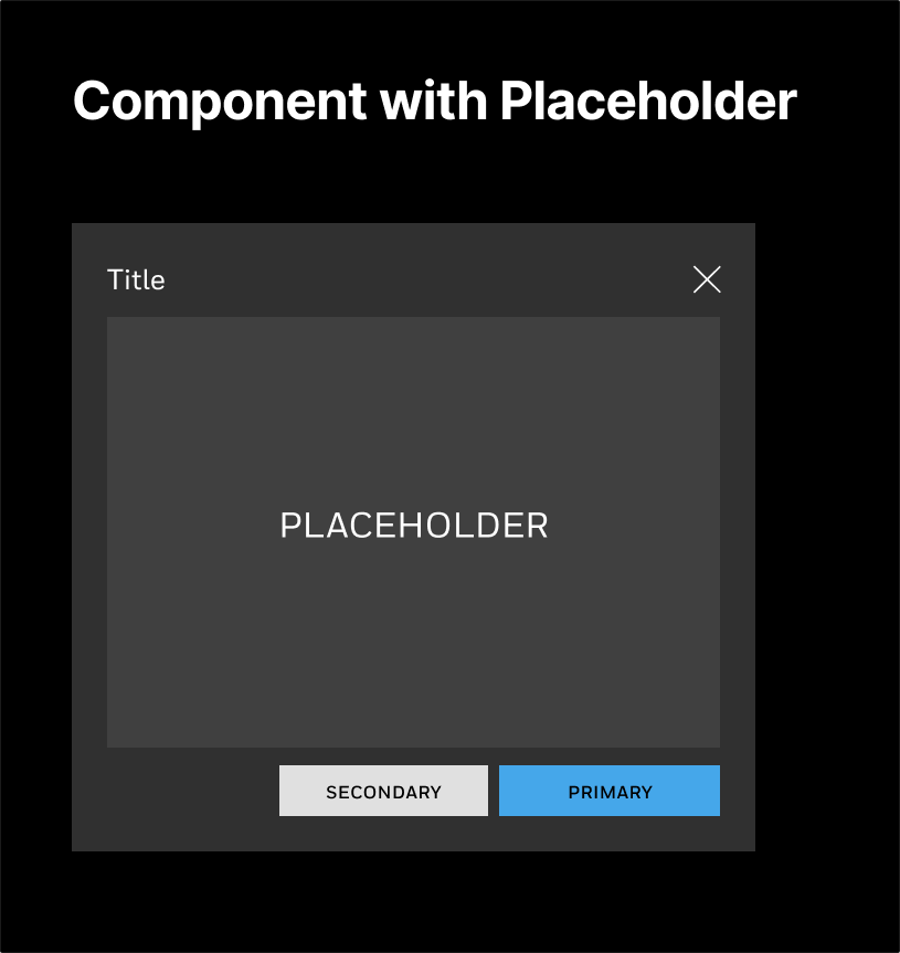
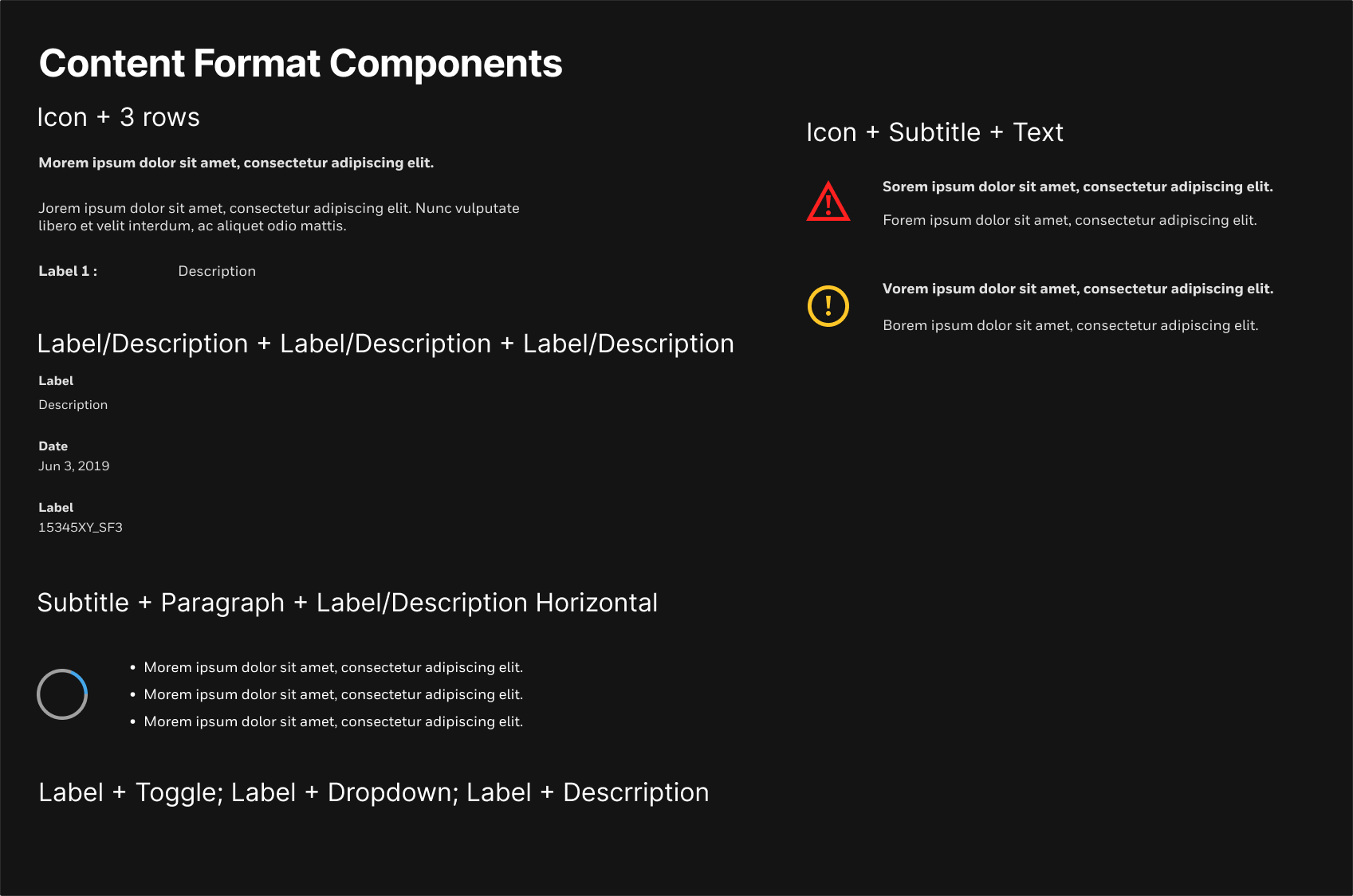
I developed reusable components with dynamic placeholders and a patterned content-block system designed for touchscreen interfaces. Because each screen typically serves one key function or call to action, this approach reinforced consistency and simplified layout creation across multiple device types.
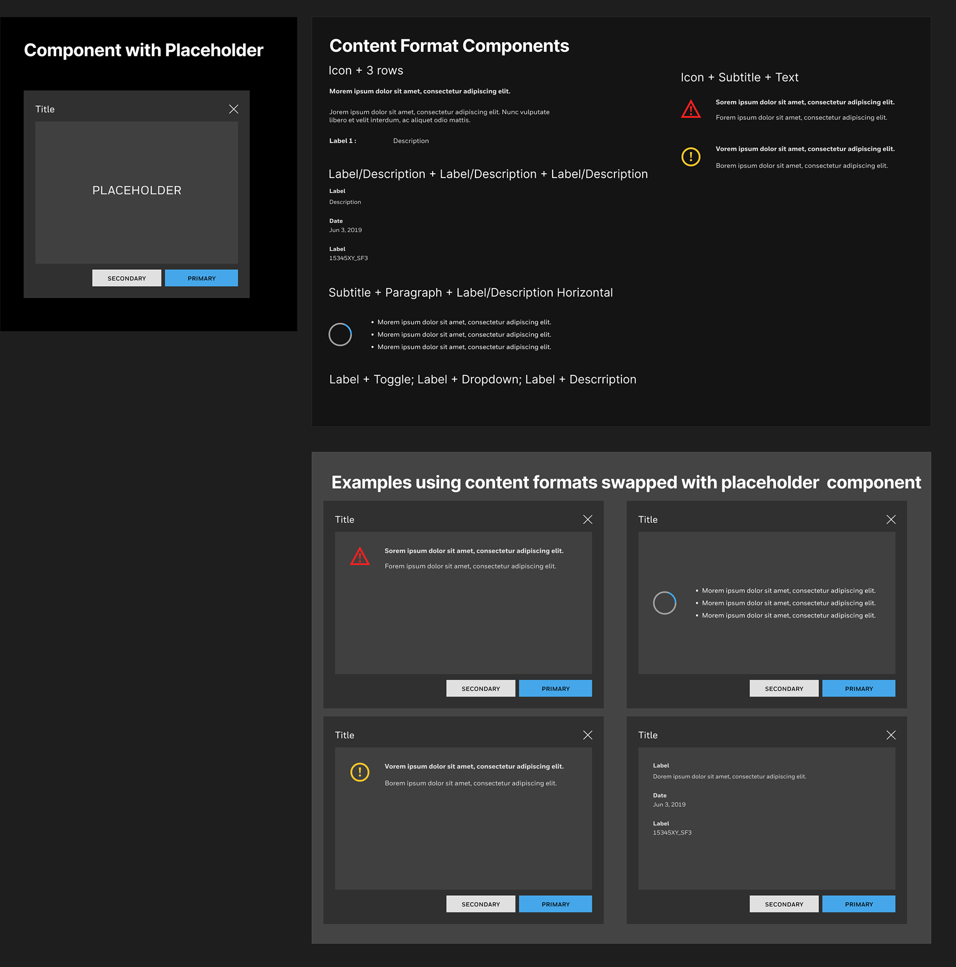
To meet unique constraints, I developed scalable templates that extended the existing design system to support touch-based workflows. Leveraging Figma Variables, I defined adaptive layouts, typography, and spacing tokens across multiple breakpoints, ensuring the interface rendered consistently on various screen sizes and resolutions.
I also introduced improved documentation, developer-friendly annotations, and measurement layers to streamline handoff and reduce ambiguity between design and engineering. These innovations transformed the Vertex subset into a flexible design foundation—one that not only supported this niche product but also informed future Honeywell HMI frameworks across industrial applications.
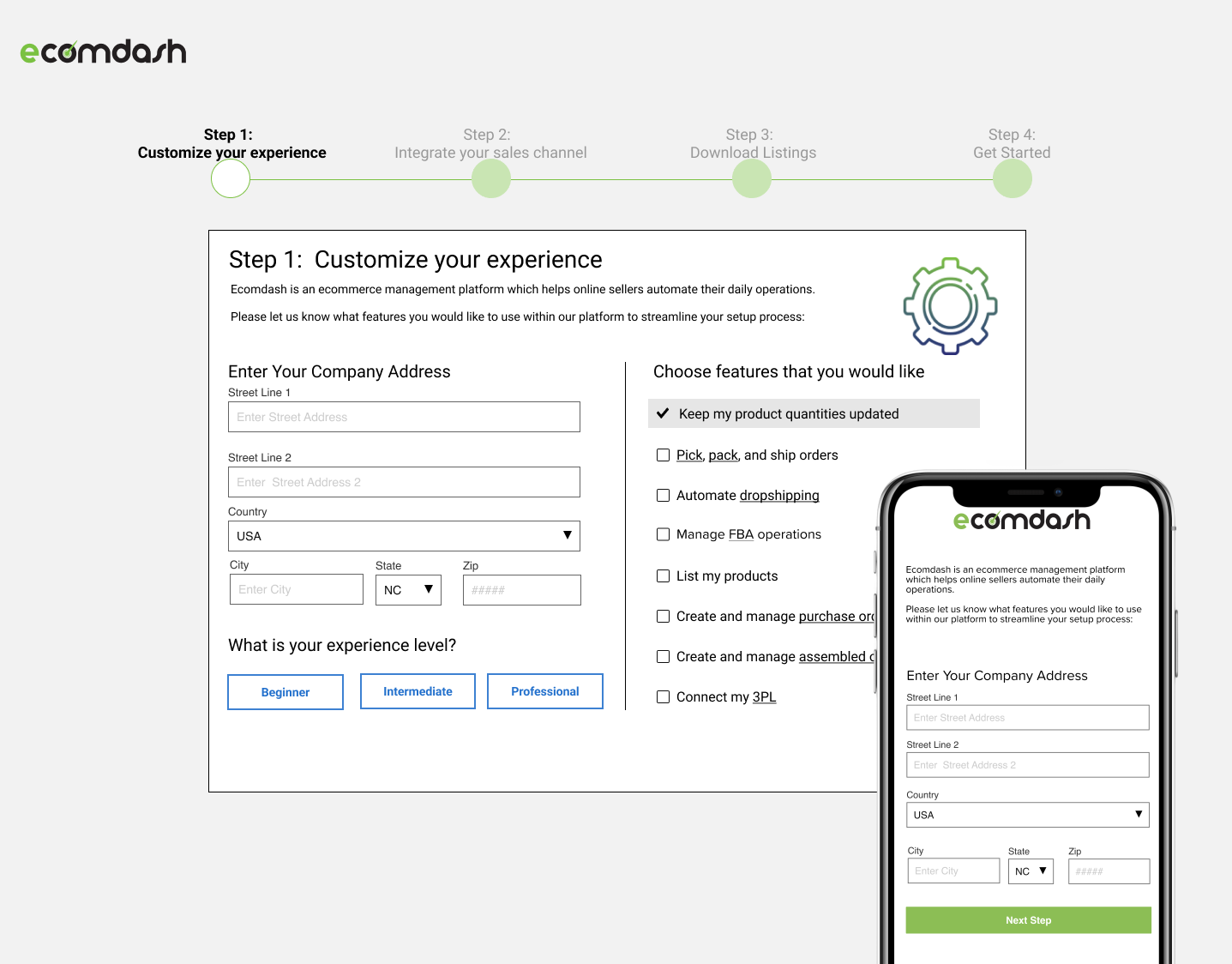
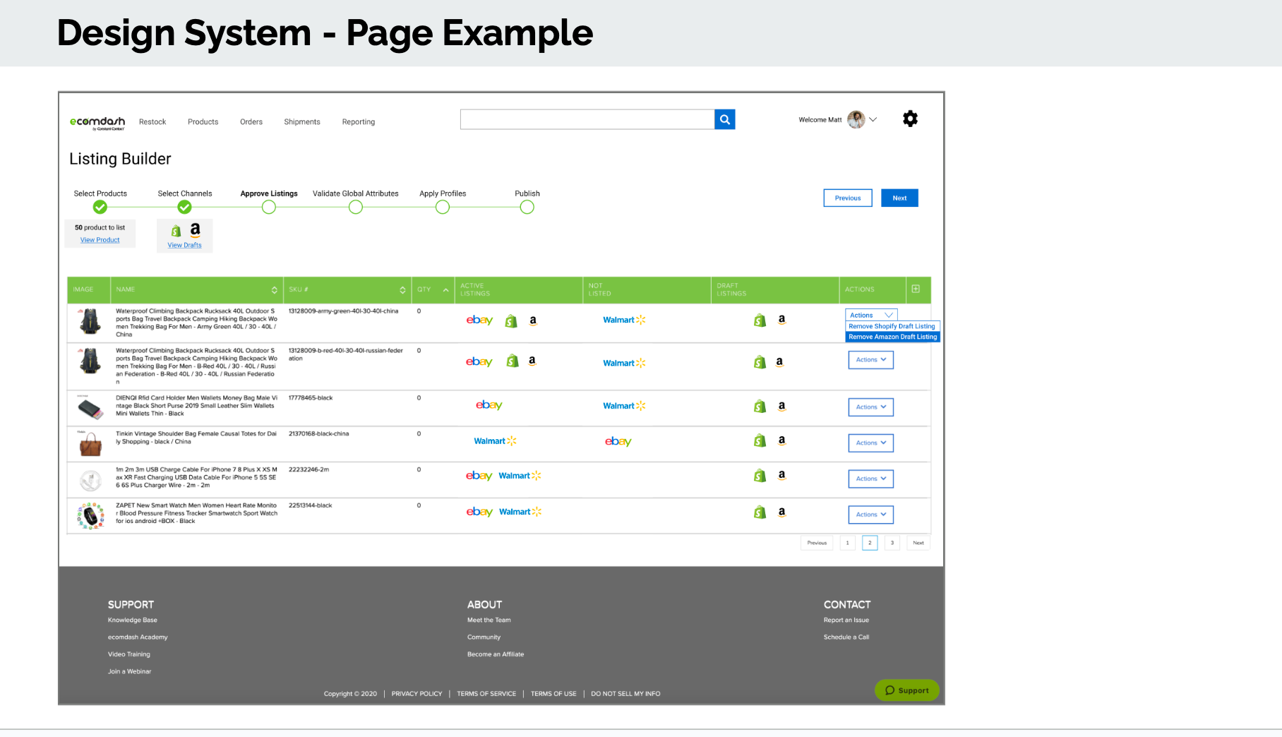
Ecomdash Design System
I built Ecomdash’s first comprehensive design system, transforming an inconsistent interface into a scalable foundation that strengthened the brand and improved usability across web and mobile platforms. The existing interface suffered from major usability and consistency issues that affected both user experience and perceived value to investors. Without a unified system, the applications had become a mix of inconsistent font sizes, colors, and components.
The new design system introduced a cohesive visual language with precise spacing, detailed color documentation, and defined button states for hover, focus, disabled, active, and inactive. The goal was to simplify a complex interface and establish consistent patterns—colors, typography, inputs, toggles, loaders, and tabs—so developers and designers could onboard quickly and build confidently. The design system improved UI consistency, reduced onboarding time, and ultimately contributed to Ecomdash’s successful acquisition by Endurance Group, the parent company of widely-used software Constant Contact at the time.
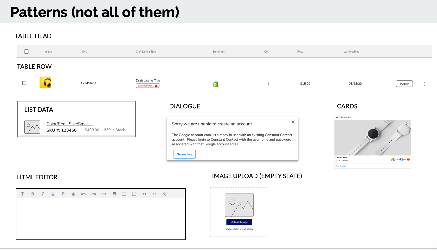
Atomic Design
Loosely following Brad Frost’s atomic design methodology, the team and I enhanced a system of reusable building blocks, patterns, and page templates that developers could easily reference and understand. Our process was steady and intentional, recognizing that this fast-paced startup had never before invested in a design system. This mindset minimized back-and-forth communication and streamlined collaboration. After implementation, metrics from the customer support team showed a marked reduction in user confusion.