Safety Suite
Safety Suite was a digital transformation project designed to unify and modernize legacy safety applications into a "single pane of glass". The goal was to replace an aging, unintuitive software ecosystem with a sleek new interface to attract customers back to the product. Safety Suite was the predecessor to Enterprise Worker Safety and replaced software no longer supported.
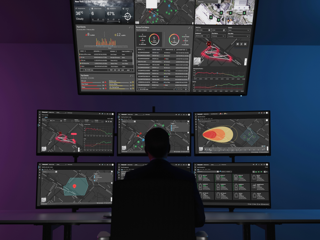
Real Time Monitoring of Safety Equipment and Workers
The configurable dashboard intuitively live events on a real time map (critical alarms and alerts) as well as active workers (connected, all alarms and alerts), device status (active devices, offline, alarms, alerts), device bumps/calibrations overdue and needed in the future. The header features a site selector enabling users to switch between sites, see an indicator of the number of alarms and alerts as well as notifications and upgrades needed.
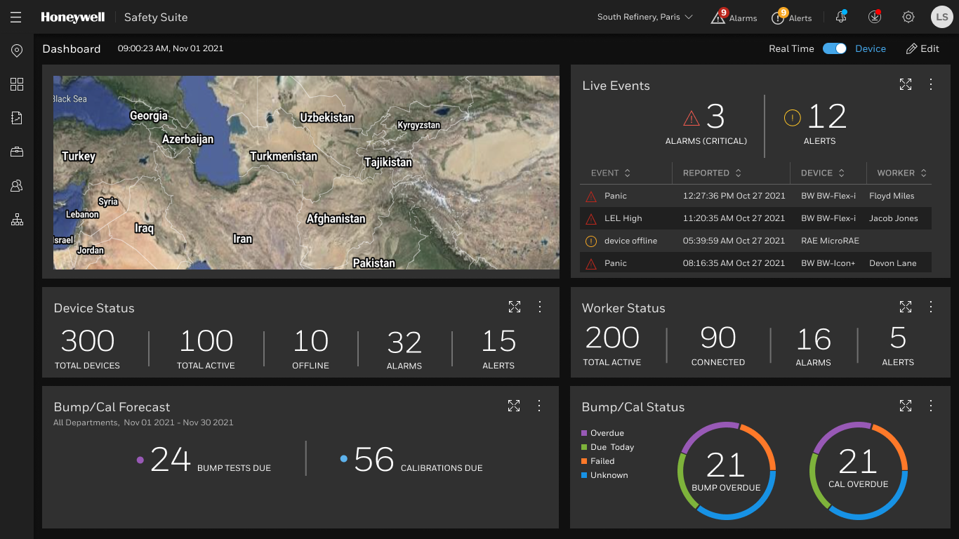
Critical alarms can't be ignored
When a real time alarm banner is displayed it is accompanied by a loud sound that interrupts the operator's workflow until the alarm is silenced or closed. The modern, dark-mode UI is a standard design technique, specifically used in control rooms, to reduce eye strain and make colored alerts pop.
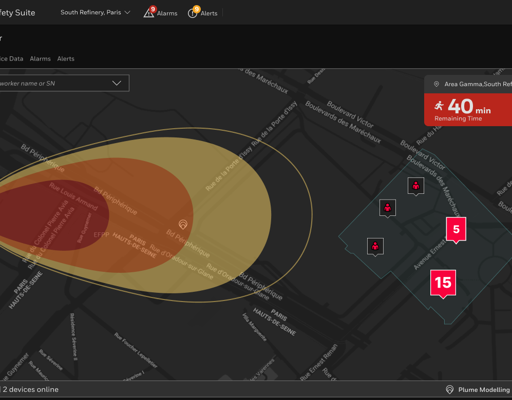
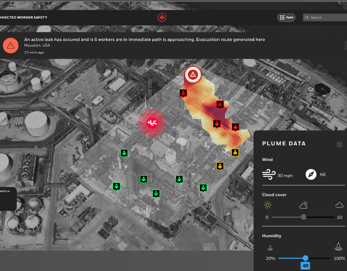
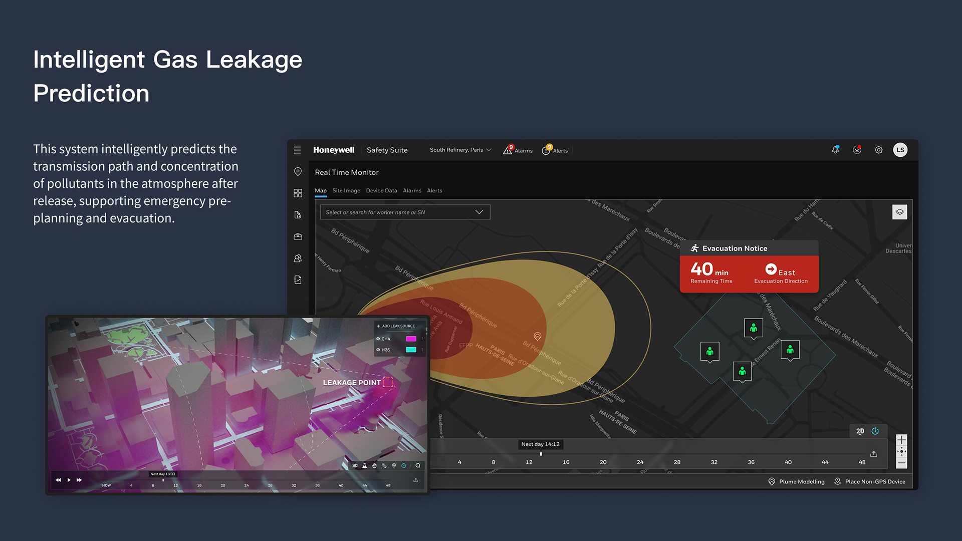
Plume Modeling
The plume modeling visualizations offer intuitive color schemes, diagrams and iconography so operators can act quickly to notify authorities when workers are in harm's way. The plume representation informed by multi-variant factors such as wind speed, gas type, height of leak, and concentrations.
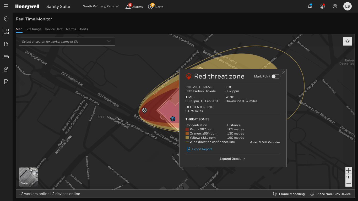
Plume threat zone details
Operators can view a "Red threat zone" overlay with details about spread of a hazardous gas over a geographic reagionw the gas including time, wind, and a legend that correlates color to specific gas concentration. The detailed overlay does not detract from the situational awareness as operators can also see active workers online and devices online.
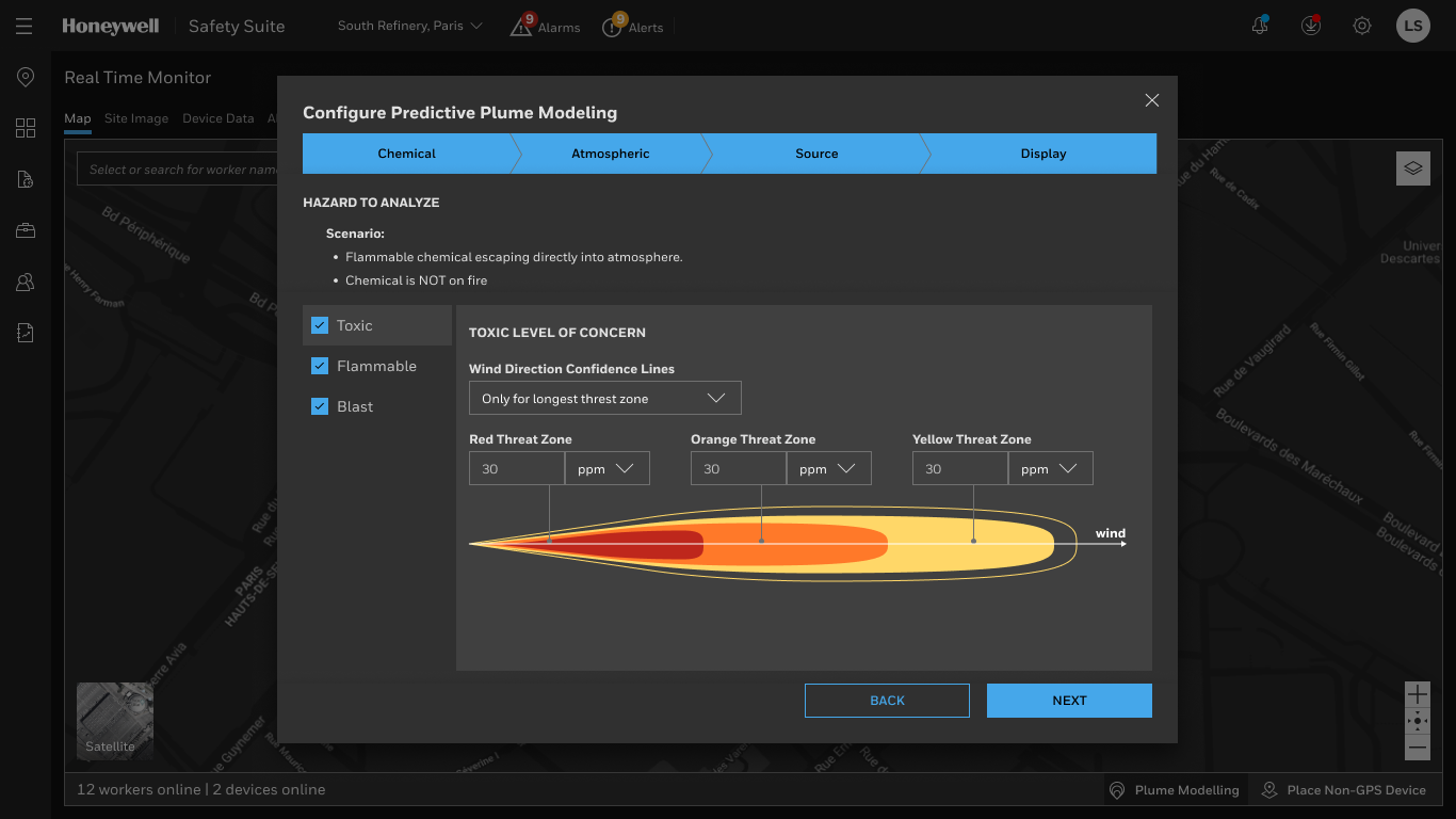
Configure Plume Parameters
A guided step-by-step configuration screen enables administrators to manually adjust plume metrics like Chemical properties, Atmospheric metrics, chemical source). This "wizard" style experience ensuressafety engineers don't miss critical steps when defining predictive models with granular control over alarm thresholds and visualizations.
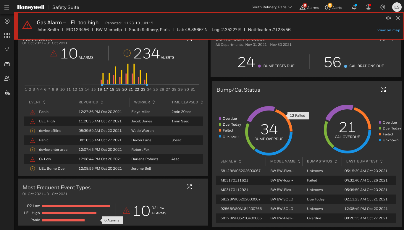
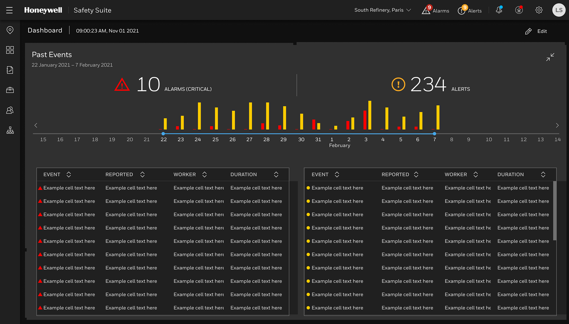
Alarm Data Analytics
The data-intensive detail screen displays an intuitive column chart and timeline spanning dates like Jan 22 – Feb 7. that visualizes the volume of incidents. It distinguishes between Critical Alarms (red) and Alerts (yellow/orange). Previously safety managers navigated spreadsheet-like interfaces with no visual indicators making it more time-intensive to uncover insights.
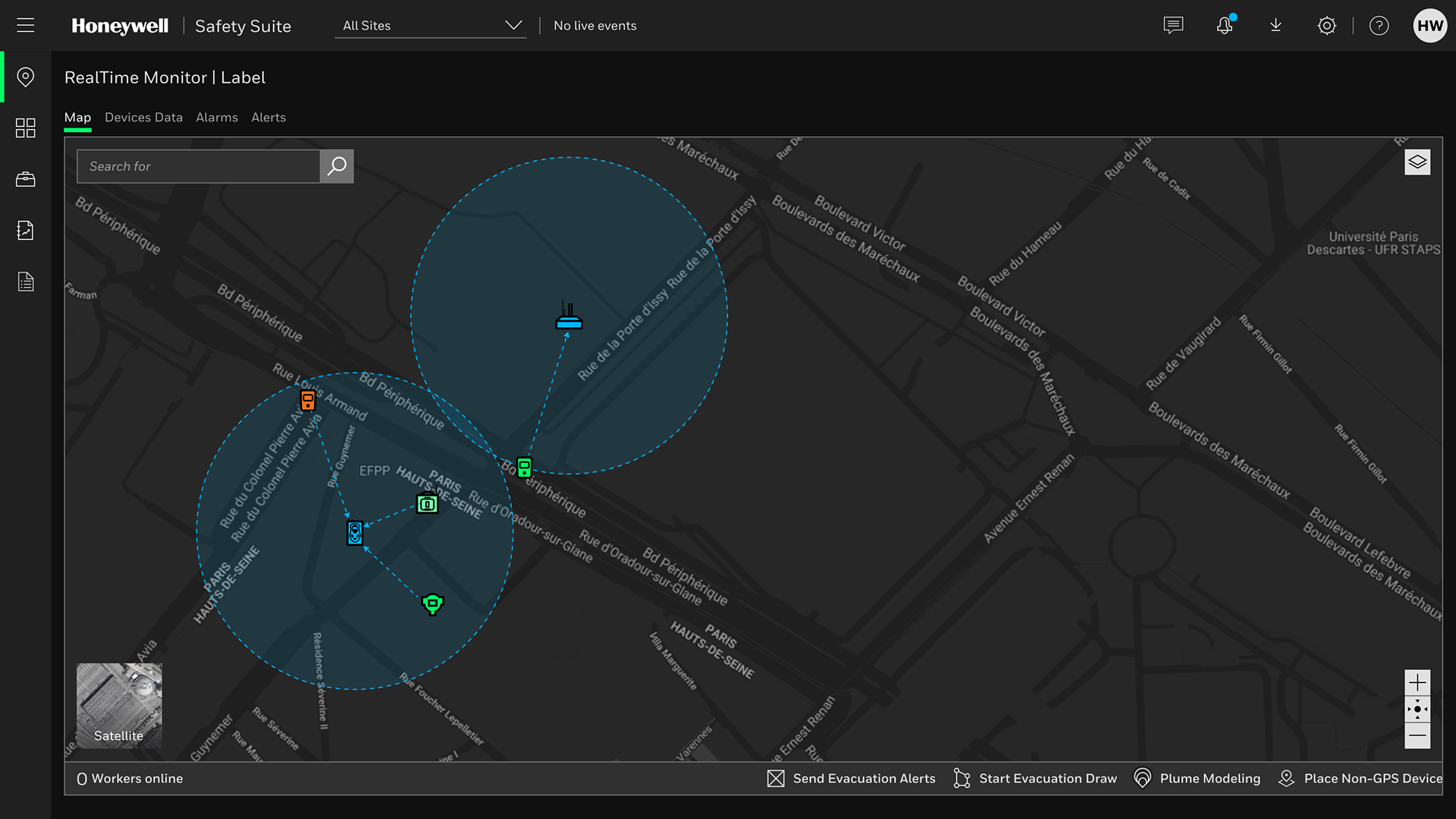
Real time monitor of wirelessly connected devices
The real time map that displays the geographic location of devices and how they are connected so operators can diagnose any potential connectivity issues for workers on the group. The map provides immediate context, allowing operators to see exactly where workers are relative to hazards. The dark mode map is intended to reduce eye strain for operators working long shifts and ensures that colored alerts stand out clearly against the background.
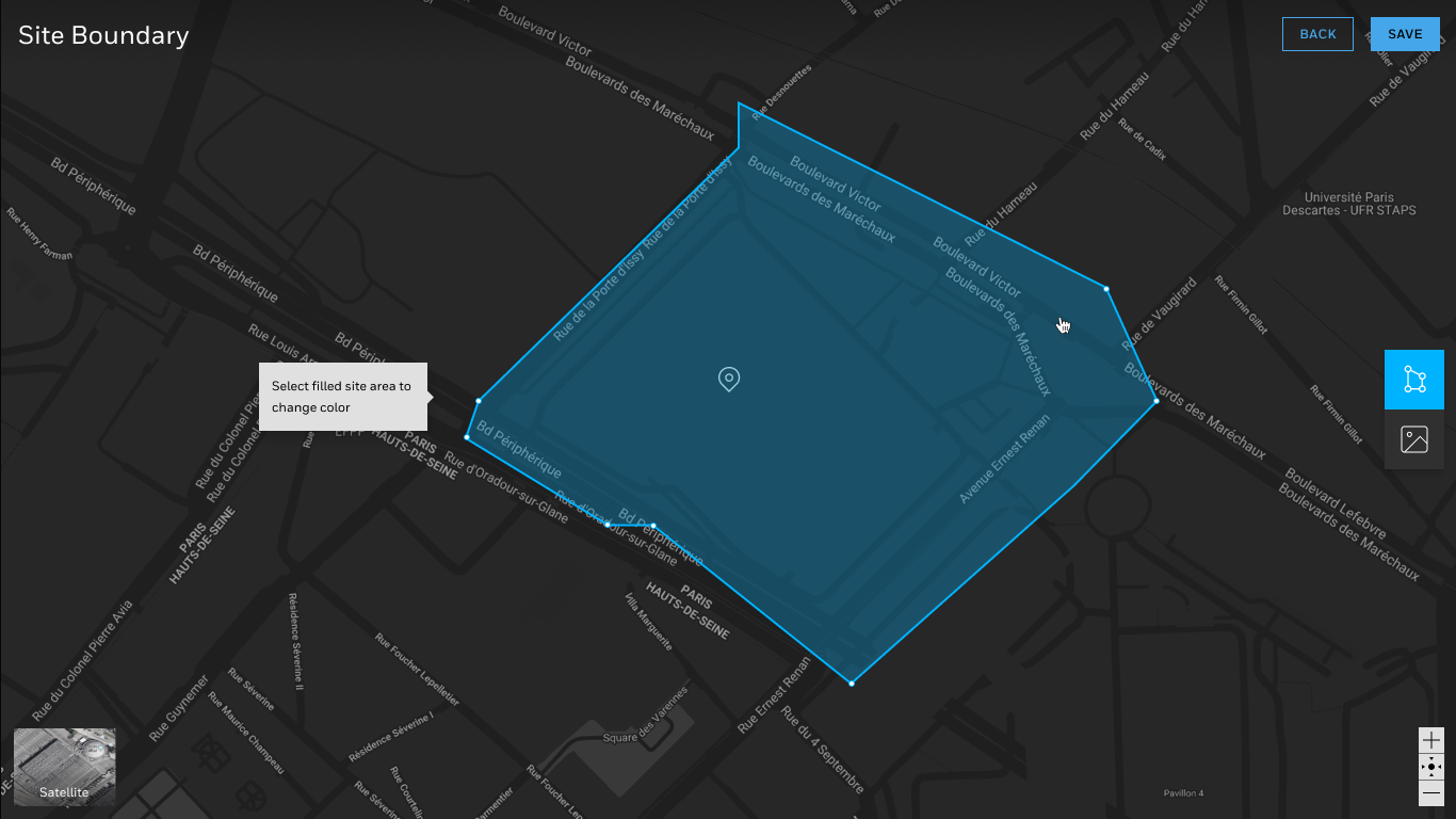
Site mapping with custom overlays
System administrators can dynamically geofence site locations using drawing tools baked into the interface. Using vector-based tools the design is forgivable so the user can adjust the shape. An site image can also be uploaded and customized for a view of building floorplans.